Tips
Notion Website Design: How to Improve Layout, Navigation, and Branding

8 Min Read
Notion website design is not only about making a public page look cleaner. It is about helping visitors understand where they are, where to go next, and whether they can trust the content in front of them.
Share article:


Start with the job your Notion website needs to do
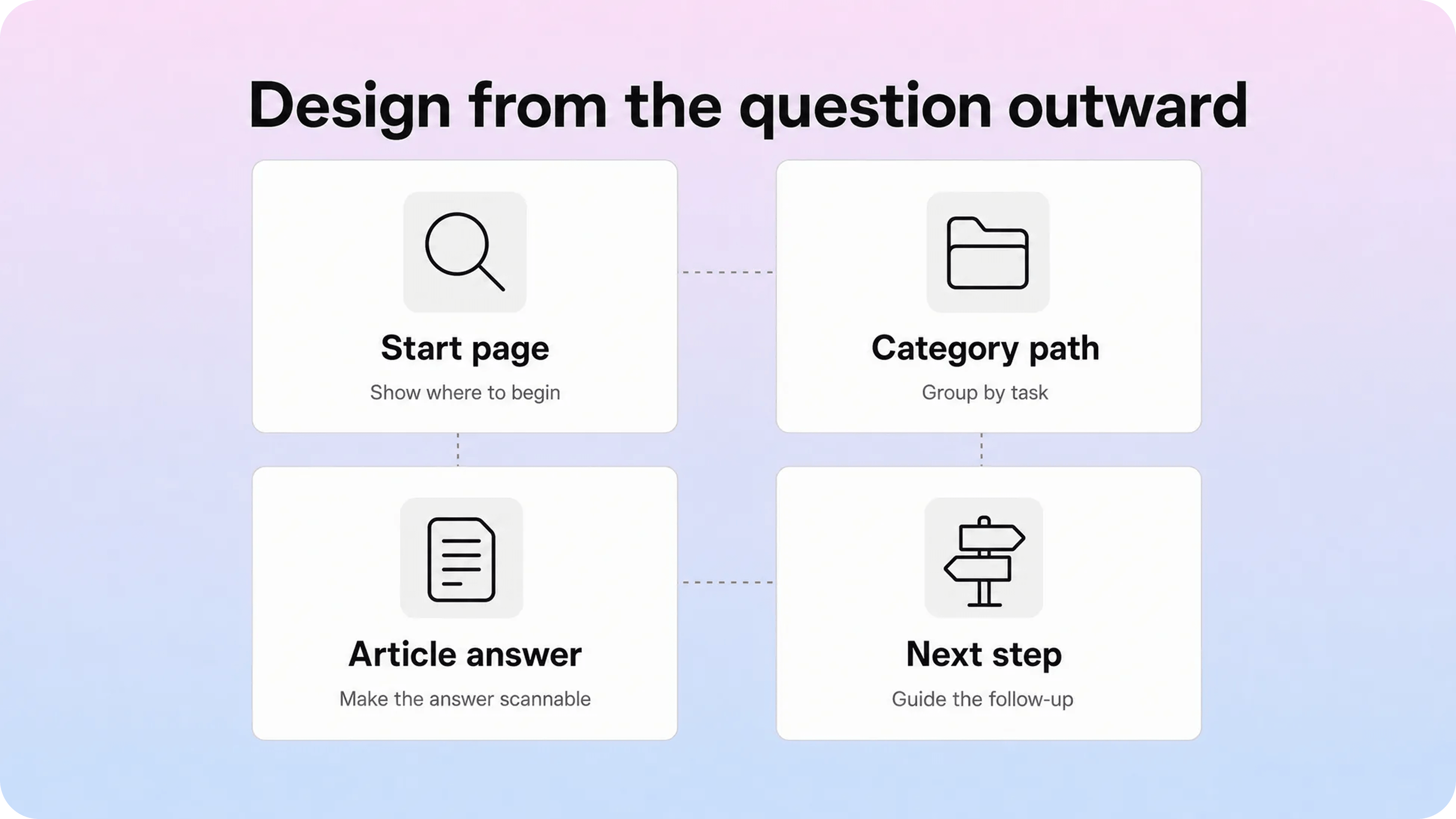
The easiest way to make a Notion website look messy is to design it from the workspace outward. Internal pages, team folders, random databases, and old project notes rarely translate into a good public experience.
Start from the visitor instead. What are they trying to do when they land on the site?
For a public Notion website, the answer might be:
understand what your company offers
browse a resource hub
read product documentation
find a help article
download a template
check pricing or onboarding details
contact the right team
Those jobs should shape the layout before colors, covers, icons, or typography. A simple page that routes visitors cleanly is better than a beautiful Notion page that makes every reader guess.
This is especially important for support and documentation. A customer who arrives with a question does not care how your workspace is organized. They care whether the page helps them move from problem to answer quickly. That is why design decisions such as hierarchy, navigation labels, article titles, spacing, and calls to action matter more than surface polish.
If the site is small, native Notion Sites may be enough. Notion lets teams publish pages to the web, expose subpages, customize slugs on paid plans, and turn on search engine indexing when the site should be discoverable. Notion also notes that published Sites can take time to appear in search results, so the public experience should be planned carefully before launch.
The practical design question is simple: what should a visitor understand in the first few seconds, and what should they be able to do next?
Build page hierarchy before polishing individual blocks
Notion makes it easy to create pages inside pages. That flexibility is useful, but it can also hide structure problems. A public Notion website needs a hierarchy that makes sense to someone who has never seen your workspace before.
For most Notion site design projects, start with four levels:
Homepage or landing page
Main category pages
Focused content pages or articles
Follow-up links, related articles, or contact paths
The homepage should not try to explain everything. It should help visitors choose the right path. A resource hub might show featured guides, topic categories, and a search prompt. A product help site might show setup, billing, account, troubleshooting, and integrations. A company website might show the offer, proof, use cases, and conversion path.
Category pages do the next job. They should group content around user intent, not internal ownership. Labels like Getting started, Billing, Account settings, Troubleshooting, and Integrations are useful because people recognize them quickly. Labels like Ops, Lifecycle, Enablement, or Version 2 notes may make sense internally, but they are weaker public navigation.
Individual pages should stay focused. One page should answer one primary question or support one action. If a page tries to be a setup guide, a pricing explanation, a troubleshooting article, and a product announcement at once, the layout will feel heavy no matter how well it is styled.
Good Notion website layout usually comes from removing choices, not adding more of them. If every page links to everything, visitors have no guidance. If every category contains a long unsorted list, browsing becomes work. A cleaner pattern is to show the most common paths first, then offer deeper links for people who need them.
Make navigation obvious and boring on purpose

Navigation is where many Notion websites start to feel like shared documents instead of real sites. The content may be useful, but the visitor has to work too hard to understand the map.
Native Notion Sites customization can help. Notion’s current site customization docs say paid users can customize the header, turn breadcrumbs on or off, expose search, add pages to the navigation bar, customize the favicon, set a theme, edit share previews, and connect Google Analytics. Those controls are useful, but they only help if the underlying labels and routes are clear.
Use navigation labels that describe destinations plainly:
Docs
Help center
Pricing
Templates
Changelog
Contact
Getting started
Avoid clever labels when people are trying to solve a problem. A visitor should not need to decode your brand voice to find billing, setup, or support.
For content-heavy Notion websites, search should be easy to find. But search should not be the only navigation system. Search works best for visitors who already know what to type. Categories help people who are still orienting themselves. Related links help people who found one article but need the next step.
That gives you three navigation layers:
Global navigation: the top-level pages visitors may need anywhere on the site.
Browse navigation: categories, topic groups, and article lists.
Contextual navigation: links inside pages that guide the next step.
If the site is a help center or documentation library, contextual navigation matters a lot. A setup article should link to troubleshooting, account permissions, billing requirements, and related feature guides when relevant. A public FAQ should link to deeper answers instead of becoming a dead end.
Google’s link guidance is useful here beyond SEO: good anchor text should be descriptive, concise, and relevant to the source and destination page. That is also good UX. Link text like Notion custom domain setup or Notion analytics tracking tells people what they will get. Link text like read more does not.
For a Helpview-style content system, this is where a dedicated public layer becomes useful. Notion can remain the place where the team writes, while the public site gets stronger categories, search, related articles, and support-focused navigation than raw Notion pages usually provide.
Use typography and spacing to make pages easier to read
Notion page design can look polished at first glance and still feel hard to read. The usual problem is not bad taste. It is weak rhythm.
A readable public page needs enough contrast between heading levels, paragraph text, lists, callouts, and links. Visitors scan before they read, especially on mobile. If every block has the same visual weight, they cannot tell what matters. If every heading is oversized, nothing feels important. If the page is packed with columns, toggles, embeds, and dense databases, the reader slows down.
Use headings as structure, not decoration. The page title should make one promise. H2s should mark the main decisions or tasks. H3s should break down steps, examples, or exceptions. Avoid using headings just to make text big.
Spacing should create pauses. Long pages need breathing room between sections, but not so much that the page feels disconnected. Lists should be short enough to scan. Paragraphs should usually be compact. Large quote blocks, callouts, and dividers should be used only when they clarify the page.
If you are looking for Notion website design inspiration, this is the useful part to copy: not a specific color palette, but the reading rhythm. For public Notion web design, these habits help:
Keep the opening section short and clear.
Use H2s for the main scan path.
Break long explanations into short paragraphs.
Use bullets for grouped options, not every sentence.
Avoid nesting toggles too deeply.
Keep databases and embeds out of core reading paths unless they are essential.
Preview the page on mobile before publishing.
Mobile readability deserves special attention. A layout that feels spacious on desktop can become awkward on a phone if it relies on wide columns, large tables, oversized covers, or long side-by-side blocks. If the page is important, read it on a phone from top to bottom and remove anything that makes the answer harder to reach.
Accessibility guidance points in the same direction. The W3C text spacing criterion is about making sure content still works when users adjust line height, paragraph spacing, letter spacing, and word spacing. You do not need to turn every Notion page into a technical accessibility audit, but the underlying idea is practical: readable content should survive real reading conditions.
Treat branding as trust, not decoration
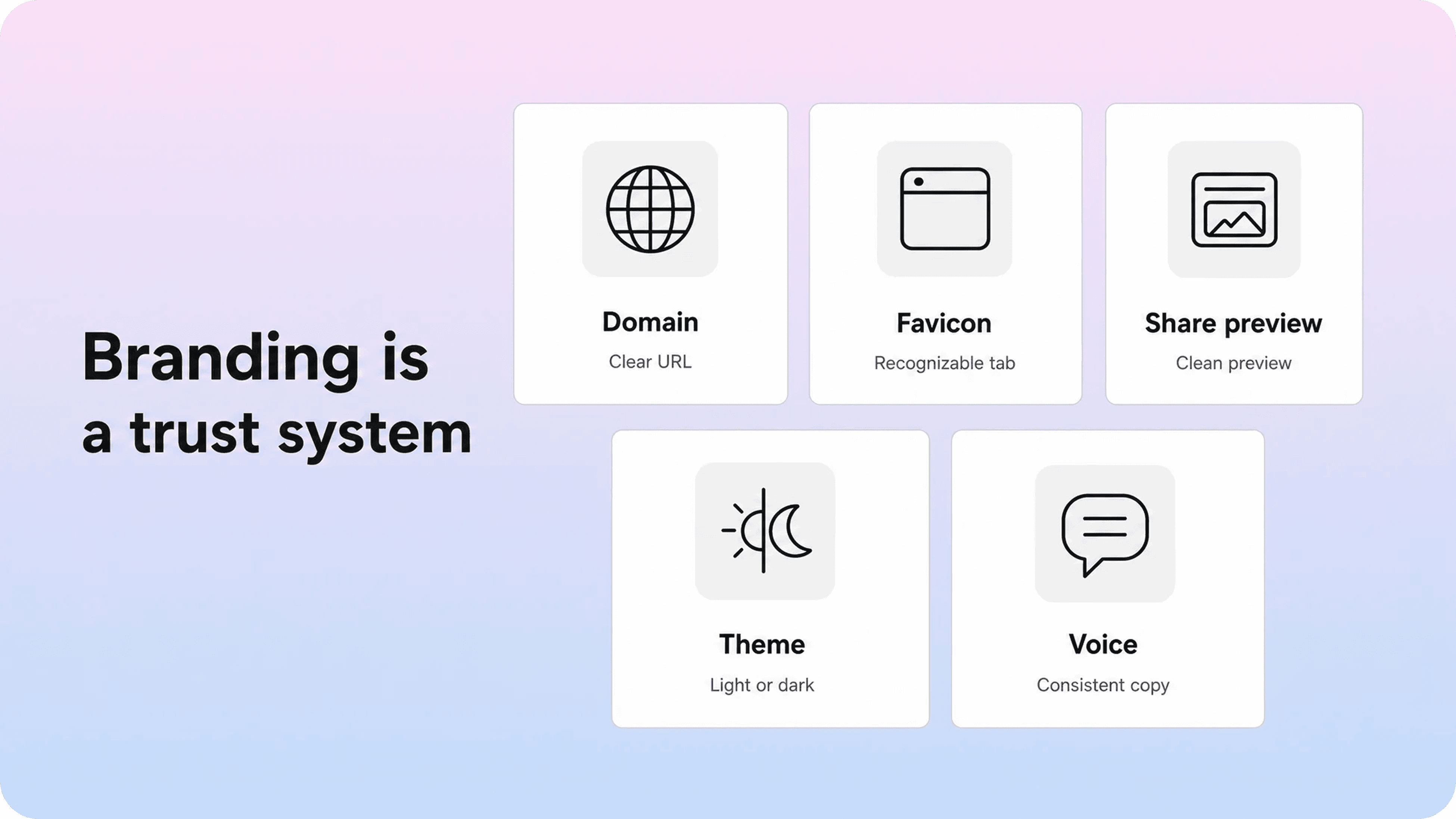
Branding on a Notion website should answer one quiet question: is this really from the team I meant to visit?
That trust comes from several small signals working together:
a recognizable custom domain
a favicon that matches the brand
a clear page title and share preview
consistent page icons or covers
familiar language and tone
navigation that matches the rest of the product or website
calls to action that send people to the right next place
Native Notion website customization can improve some of those signals. Paid Notion Sites users can customize share previews, set light or dark theme, customize the favicon, adjust header settings, add navigation pages, and connect Google Analytics. Notion’s custom-domain setup also lets teams publish a Site on a domain they already own through a paid add-on.
Those controls make a public Notion site feel more intentional. They do not, by themselves, create a complete brand experience. A custom domain can make a weak page look official without making it easier to use. A nice cover image can make the first viewport prettier without improving the path to an answer.
Think of branding as a layer of consistency around the user journey. If your main product uses plain, direct language, your public Notion docs should not sound like a different company. If your support experience promises fast answers, your help pages should not bury the useful part below a long introduction. If your website uses a clear visual system, your Notion page should not use random icons, colors, and cover images on every page.
For a simple landing page or portfolio, Notion’s native styling may be enough. For a customer-facing help center, product documentation site, or branded knowledge base, teams usually need more control over layout patterns, article templates, category pages, search states, feedback prompts, and related content. That is where Helpview fits: it keeps the Notion editing workflow, but turns the public layer into a more polished help experience.
Design calls to action around the reader’s next step
A call to action is not only a button at the end of a landing page. On a Notion website, a CTA is any path that helps the visitor continue.
For a marketing page, the next step might be joining a waitlist, booking a demo, viewing pricing, or opening a product tour. For a resource page, it might be reading the next guide, downloading a template, or subscribing for updates. For a help article, it might be checking related setup steps, contacting support, or returning to the category page.
The mistake is using the same CTA everywhere. A visitor reading a troubleshooting article may not be ready for a sales demo. A visitor reading a pricing page probably does not need a beginner setup guide. A customer stuck in onboarding may need a direct support route, not another broad resource hub.
Map CTAs by page type:
Page type | Best CTA pattern | What to avoid |
|---|---|---|
Homepage | One primary action plus a few clear browse paths | Too many equal buttons |
Category page | Featured articles, popular paths, and search | Long unsorted page lists |
Help article | Related articles, contact option, and next setup step | Generic “learn more” links |
Landing page | One conversion path repeated naturally | Competing offers in every section |
Resource hub | Topic filters, featured resources, and subscription path | Burying the best content below old items |
For Notion website customization, this means thinking beyond visual styling. If you want to customize a Notion website well, make sure each page ends with a useful decision. If someone finishes the page and still has to open a new tab, search again, or contact support because the next step is missing, the design is incomplete.
Keep content structure consistent as the site grows
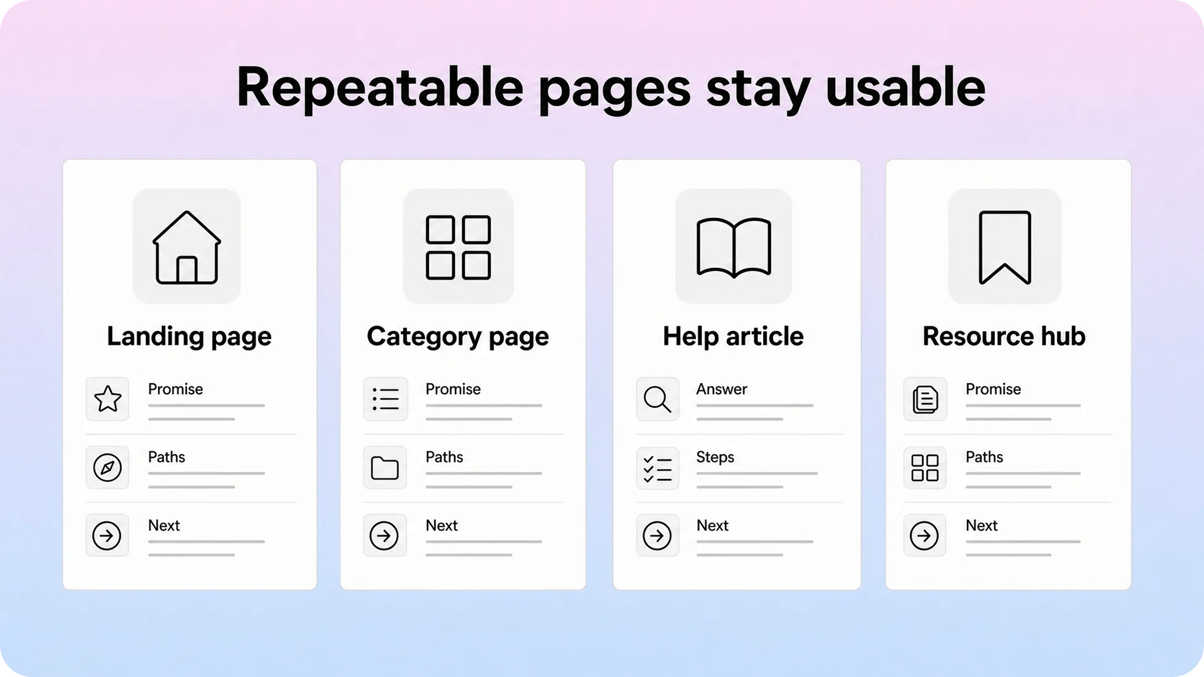
A single beautiful Notion page is easy. A consistent Notion website is harder.
Once a public site has more than a few pages, design depends on repeatable structure. You need page templates, naming rules, category logic, and publishing habits that keep the experience coherent even when multiple people contribute.
Start with simple content types:
landing page
category page
help article
comparison page
template or download page
changelog or update page
contact or support page
Each type should have a default structure. A help article might use problem, short answer, steps, notes, related articles, and support CTA. A category page might use a short intro, featured articles, common tasks, and all articles. A landing page might use promise, proof, use cases, details, FAQ, and CTA.
This prevents every page from becoming a design decision. It also makes the site easier to improve later. If support notices that users often miss related articles, the fix can become part of the article template. If search traffic lands on pages with weak introductions, the intro pattern can be improved across the library.
Content structure is also how you reduce cannibalization. Helpview already has separate articles on Notion Sites for documentation, Notion SEO, Notion custom domains, and Notion analytics. A Notion website design article should not repeat those guides in full. It should focus on layout, navigation, branding, readability, and the public experience, then link readers to deeper articles when their next question is SEO, domains, or measurement.
That is the same discipline your own Notion website needs. Give every page a clear job. Link related topics instead of merging them into one giant page. Keep the public structure cleaner than the internal workspace.
When native Notion website design is enough
Native Notion website design is enough when the site is small, simple, and easy to understand without a specialized publishing layer.
It can work well for:
portfolios
small landing pages
event pages
public roadmaps
lightweight resource hubs
simple template pages
early documentation
small internal-to-external guides
In those cases, speed is the advantage. You can write in Notion, publish quickly, update the page without a developer, and use built-in controls for the public surface. If the site has a clear purpose and only a few pages, that may be exactly what you need.
Native Notion site design starts to feel limited when the public experience needs to do more:
users need strong search across many articles
categories need to behave like a real help center
article templates need to stay consistent
related articles and next steps matter
branding needs to feel closer to the product
SEO and analytics need to work across a larger library
support teams need content gaps, feedback, and deflection signals
At that point, the issue is not whether Notion can publish a website. It can. The issue is whether the published site is helping visitors move through the content with enough clarity.
For many teams, the best setup is not replacing Notion. It is separating the writing layer from the public experience. Keep Notion where the team already works, then add a customer-facing layer designed for search, navigation, structure, branding, and support outcomes.
Conclusion
Good Notion website design is practical before it is visual. Start with the visitor’s job, build a clear hierarchy, use plain navigation, make pages readable on desktop and mobile, treat branding as a trust signal, and give every page a useful next step. Native Notion Sites can be a strong fit for simple public pages, portfolios, lightweight resource hubs, and early docs. When the site needs to behave like a real customer help center, the better move is often to keep writing in Notion and publish through a layer built for structure, search, design, and customer-facing clarity.
Frequently asked questions
What makes good Notion website design?
Good Notion website design makes the public page easy to understand, browse, read, and trust. The strongest improvements usually come from clearer hierarchy, better navigation labels, focused page titles, readable spacing, consistent branding, and useful next steps.
How do I improve a Notion website layout?
Can you customize a Notion website?
Is Notion good for web design?
What is the best way to make a Notion website look professional?
Share article:
2 free months of Pro
Turn Notion pages into help center answers.
Keep writing in Notion and publish a real, searchable Notion help center.

Articles
Keep reading