Tips
5 Notion Website Examples and What Makes Them Work

15 Min Read
These Notion website examples show how public pages can work as portfolios, service sites, client resource hubs, job boards, and lightweight personal websites. Use them for practical Notion website inspiration, not just visual ideas: the strongest examples make the page easy to understand, easy to browse, and easy to update from Notion.
Share article:


What good Notion website examples have in common
Notion can publish a page quickly, but a useful Notion website still needs editorial discipline. A public page has to do a job for someone who does not know your workspace, your naming system, or where the useful information lives.
Notion’s own publishing docs make the appeal clear: a page can become a public Notion Site from the Share and Publish flow, visitors can view it on the web, and edits in Notion update the live site automatically. That is why so many Notion site examples start as portfolios, resumes, job boards, resource pages, landing pages, or simple docs. The hard part is not getting a page online. The hard part is making that page feel intentional once a visitor lands on it.
The best examples tend to share a few habits:
The homepage has one clear purpose.
The first screen explains what the site is.
Page titles are plain and specific.
Navigation labels are familiar.
Sections are ordered around visitor intent.
Visual personality supports the content instead of fighting it.
Related pages, project cards, resource groups, or database views give the visitor a next step.
That matters because a Notion website can easily reveal too much of the workspace underneath. Random databases, nested pages, old internal labels, oversized covers, and scattered callouts may feel useful to the owner, but they can make the public page harder to use. Good Notion website design examples feel edited. They do not show every possible block Notion can make. They show the blocks that help the page do its job.
This is also where native Notion Sites and Notion website builders differ in practice. Native Notion Sites can be enough for simple public pages. A publishing layer can become useful when creators want stronger styling, custom domains, navigation control, or a more website-like presentation. For support and documentation, the same principle applies at a higher standard: the writing can stay in Notion, while the public experience may need stronger search, categories, related articles, and support-specific structure.
Example | Site type | What to notice |
|---|---|---|
Josh Millgate | Portfolio | Clear positioning, tight project grouping, direct scan path |
The Notion Bar | Service and creator site | Strong voice, service clarity, trust-building content |
David Fernandez | Personal advisory site | Compact offer, simple navigation, clear conversion path |
Notion Affiliate Program Resource Center | Partner resource center | Audience-focused organization, centralized resources, clear grouping |
The Financial Club Job Board | Public job board | Database-driven structure, scannability, repeatable listings |
Example 1: Josh Millgate
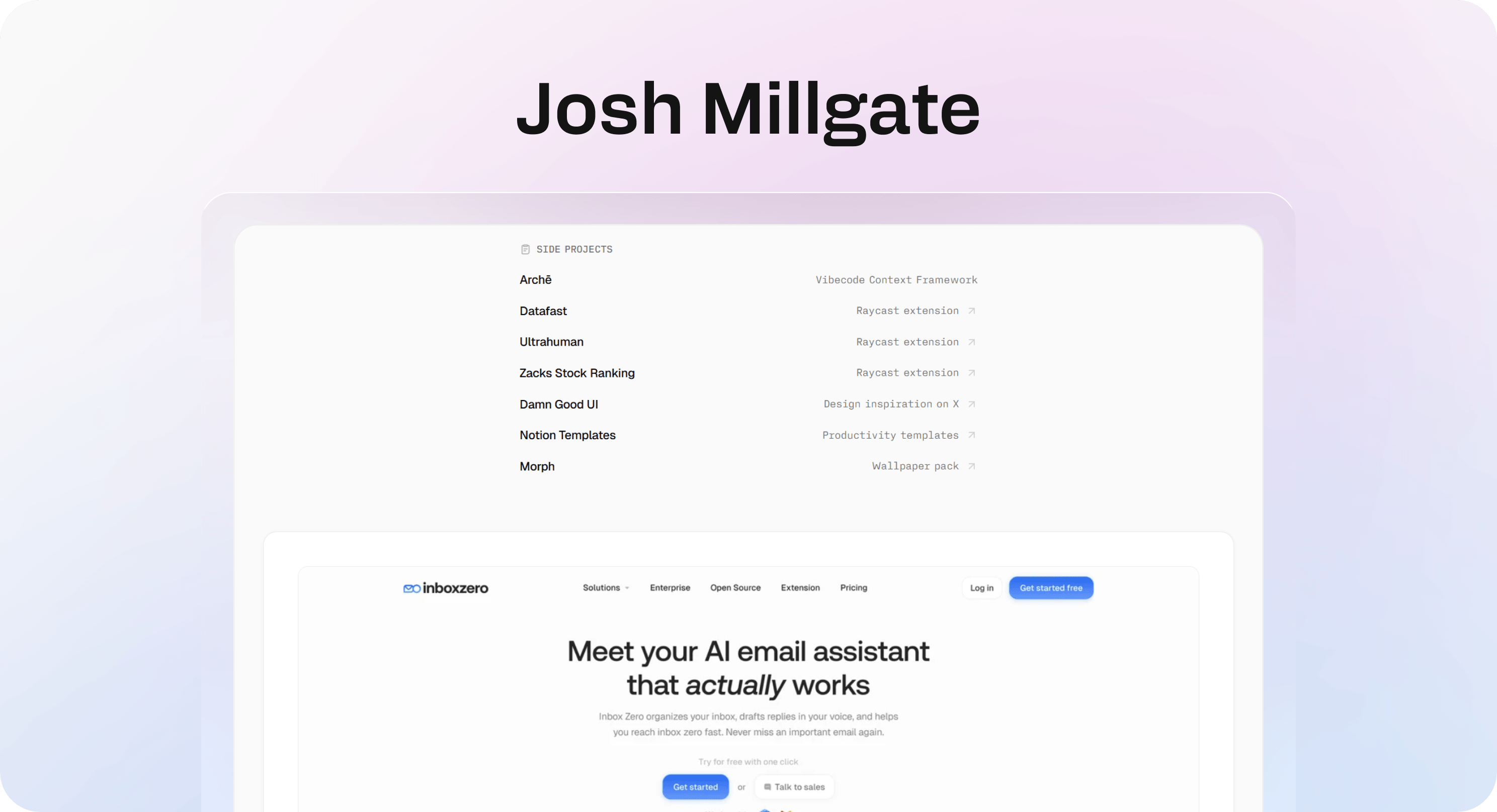
Josh Millgate’s site is a useful Notion website example because it does not ask the visitor to decode the portfolio. The page opens with the name, role, and a short positioning statement, then moves quickly into products, design work, components, and side projects.
That structure works because it matches how someone evaluates a designer. A visitor wants to know who this is, what kind of work they do, whether the work is credible, and where to click next. The site answers those questions in a compact sequence instead of turning the homepage into a long biography.
The strongest detail is the grouping. Products are separated from design work, design work is separated from components, and side projects have their own area. That makes a varied body of work feel organized. A less structured portfolio would flatten everything into one mixed list, forcing the reader to infer which projects matter most.
This is the useful lesson for other Notion page examples: use sections to create judgment. If every project appears with the same weight, the visitor has to do the sorting. If the portfolio groups work by type, maturity, or business value, the visitor can scan faster.
Josh’s page also shows why minimal personal sites can work well in Notion. A portfolio does not always need a complex CMS, animation system, or custom backend. It needs a sharp intro, strong project selection, concise descriptions, and links that do not bury the best work.
Use this pattern when your Notion website needs to present a person, studio, advisor, consultant, or independent product builder. Keep the opening direct. Group the proof. Make the next click obvious.
Example 2: The Notion Bar
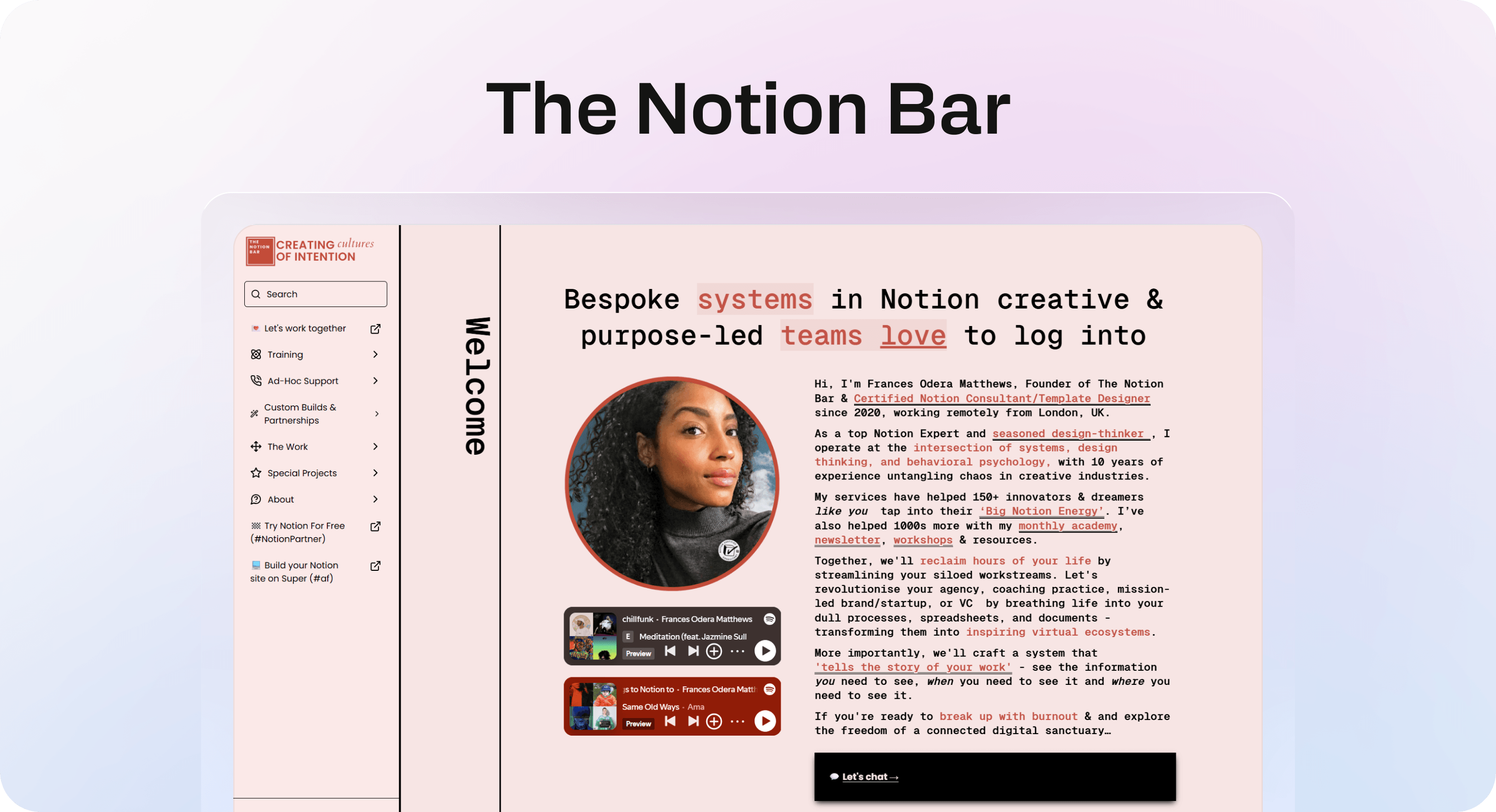
The Notion Bar is a different kind of Notion website inspiration. It is not trying to be neutral. It has a strong voice, a clear founder presence, and a service-led structure that makes the page feel personal without losing the business purpose.
That is useful because many service websites made with Notion fall into one of two traps. Some feel too much like a resume, with credentials but no clear offer. Others feel too much like a landing page template, with generic claims but no real person behind them. The Notion Bar lands closer to a founder-led service site: the page introduces the consultant, explains the kind of work she does, and gives visitors several clear routes into services, projects, workshops, and contact.
The site also shows how brand voice can carry a Notion page when the offer depends on trust. A consultant does not only need to list services. They need to make the visitor believe they understand the problem. The copy gives the site a point of view around systems, creative teams, behavioral psychology, and workstream clarity. That makes the page more memorable than a generic “Notion consultant for hire” site.
The lesson is not to copy the tone. The lesson is to make the public page sound like the actual business. If your Notion site is for a calm B2B product, keep it precise. If it is for a creator, coach, or consultant, a more distinctive voice can help visitors decide whether there is a fit.
This example also reinforces the value of a simple site map. Notion websites can become nested quickly, especially when they include services, resources, workshops, projects, and affiliate links. A visible site map gives visitors another way to orient themselves after the first impression.
Use this pattern when a Notion website needs to sell expertise. Lead with the specific problem you solve, add enough personal credibility to build trust, and make the service paths easy to find.
Example 3: David Fernandez
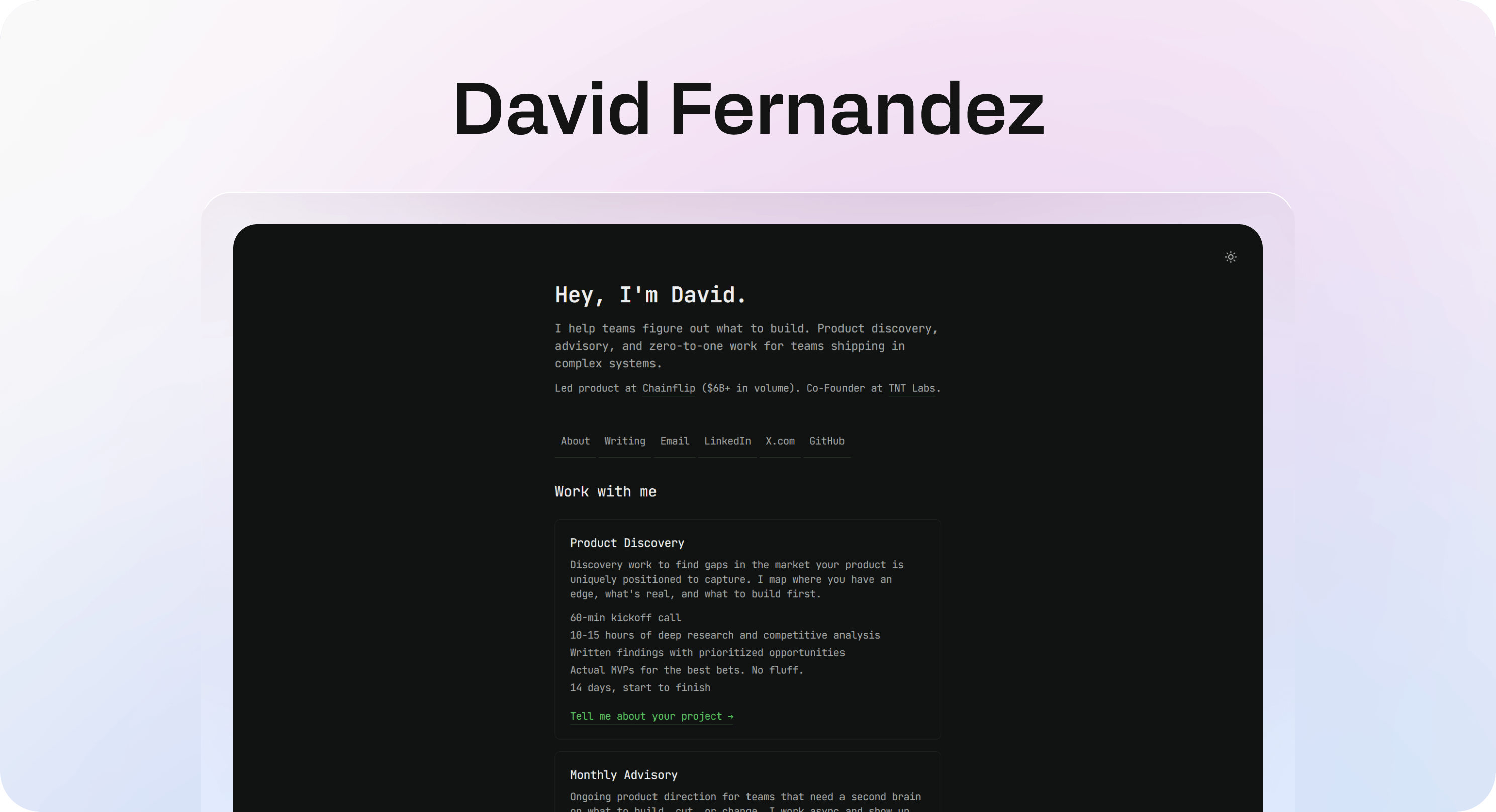
David Fernandez’s site is a strong example of a compact Notion-powered personal website. It does not try to behave like a large agency site. It gives the visitor a clear role, a specific audience, and a small set of next steps: About, Writing, Work with me.
That restraint is the main reason it works. The homepage explains the offer in plain language: product discovery, advisory, and early product direction for teams shipping in complex systems. Then it supports that offer with a work-with-me section and recent writing.
This structure is especially useful for advisors, fractional leaders, operators, consultants, and solo experts. The site does not need ten pages before it can be effective. It needs a crisp statement of who the work is for, a clear description of the engagement, and enough proof of thinking to help the right visitor continue.
The recent writing section matters because it turns the website into more than a digital business card. A visitor can evaluate how the person thinks before booking or reaching out. That is one of the underrated strengths of Notion site examples: if your site and writing both live close to the same content system, you can keep the public surface fresh without rebuilding pages manually.
For public Notion page examples like this, the risk is thinness. A minimal site works only when the offer is specific. If the headline says “I help teams grow” and the sections are vague, the page feels unfinished. If the offer names the audience, problem, and kind of work, the simplicity feels deliberate.
Use this pattern when you need a lightweight personal website that can stay current. Keep navigation short, make the offer specific, and use writing or project links as proof instead of adding decorative sections.
Example 4: Notion Affiliate Program Resource Center
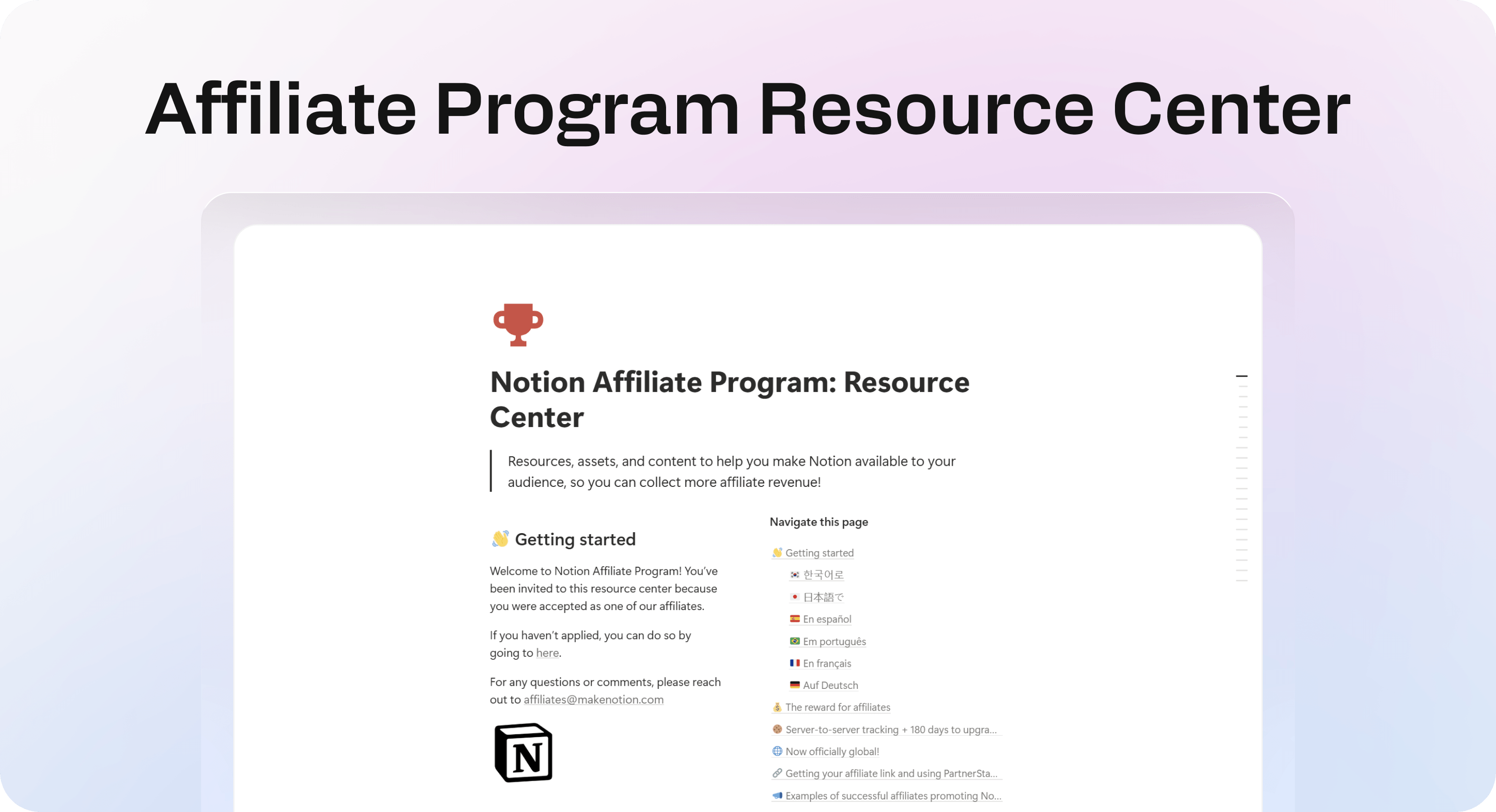
Notion’s Affiliate Program Resource Center is a useful example of Notion being used as a public resource destination for a specific external audience. Instead of behaving like a marketing homepage, the page gives affiliates one place to find program information, tracking guidance, resources, assets, and other materials they may need repeatedly.
This is different from a portfolio or service site. The visitor is not mainly there to evaluate the brand. They already have a reason to use the resource. The important question is whether they can find the right material without asking someone where it lives.
That makes organization more important than visual complexity. A resource center works when content is grouped around recognizable needs, labels make sense to people outside the internal team, and important materials do not disappear inside a long page of unrelated links.
This is one of the strongest use cases for native Notion publishing. Teams already use Notion to maintain guides, program information, collateral, and shared resources. Publishing selected content as an external hub removes the need to copy every update into another CMS.
The tradeoff appears as the content library grows. A focused resource collection can work with headings, linked pages, and clear categories. A larger knowledge destination may eventually need stronger search, analytics, content relationships, feedback, or different experiences for different audiences.
That is especially relevant for customer-facing support. The underlying principle is similar: keep the internal editing workflow simple, but design the public experience around the person trying to find an answer. A partner resource center can stay relatively lightweight. A help center usually needs a more specialized retrieval and navigation layer.
Use this pattern when partners, affiliates, clients, customers, or community members need repeat access to a curated set of resources. Organize around their tasks, not your internal folder structure, and keep the page focused on finding useful material quickly.
Example 5: The Financial Club Job Board
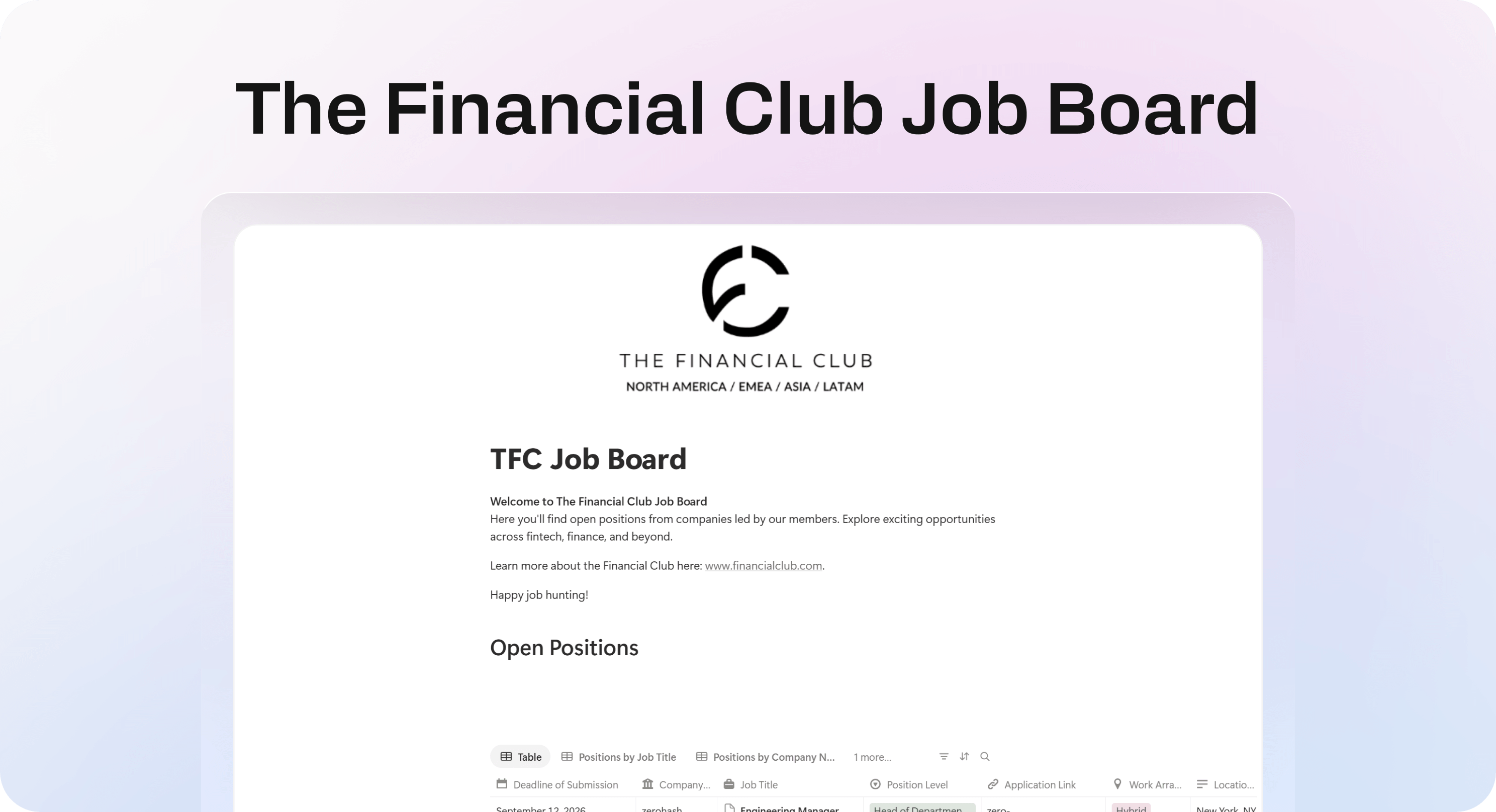
The Financial Club Job Board is useful because it demonstrates a different strength of Notion websites: databases can become the public experience rather than simply sitting behind a landing page.
A job board is naturally repetitive. Every listing needs a similar set of information, and visitors need to compare many entries quickly. That makes a structured Notion database a reasonable fit. Instead of manually designing a new section for every role, the publisher can add another database entry and keep the overall format consistent.
The lesson here is scannability. Public databases work best when visitors can understand the important fields without opening every page. A role title, company, category, location, or other relevant property can help someone decide which entries deserve a closer look.
This pattern can work beyond jobs. The same approach can support directories, resource libraries, startup lists, event collections, reading lists, public roadmaps, or other websites where many items share the same basic structure.
The risk is exposing too much database logic. Internal properties, inconsistent naming, empty fields, or too many views can make the page feel like a workspace someone accidentally made public. A useful public database should feel curated even if the underlying content is easy to maintain.
That distinction becomes important as the website grows. Notion makes repeatable content easy to manage, but the public experience still needs an obvious purpose, useful defaults, and enough context for someone who did not build the database.
Use this pattern when your Notion website is centered on a repeatable collection of items. Define the fields that matter to visitors, remove internal-only clutter, and make the default view useful before adding more filters or views.
How to borrow from these Notion website examples
The right thing to copy is rarely the surface design. A portfolio, consultant site, advisory page, partner resource center, and job board should not all look the same. What they can share is the discipline behind the layout.
Start by naming the job of the site. A Notion website might need to:
prove someone’s work
explain a service
publish public documentation
support customers
collect resources
publish a directory or job board
share a roadmap
host a lightweight blog
present careers or hiring information
Once the job is clear, choose the smallest structure that supports it. A one-page portfolio may only need an intro, selected work, proof, writing, and contact. A service site may need services, outcomes, process, testimonials, and a booking path. A resource center needs clear groups and reliable links. A database-driven site needs useful fields, views, and consistent entries. A help center needs search, categories, articles, related content, and support fallback routes.
This is where a lot of Notion website examples go wrong. They start from blocks instead of intent. They add callouts, columns, cover images, icons, databases, embeds, and toggles because those tools are available. The better move is to decide what the visitor needs first, then use only the blocks that support that path.
If you are building in native Notion Sites, pay attention to the settings that shape the public experience. Notion supports publishing, site customization, search engine indexing, custom slugs on paid plans, and additional paid-plan options such as SEO customization, themes, Google Analytics, and custom domains. Those settings can make a public page feel more finished, but they cannot replace clear structure. Helpview has separate guides for Notion website design, Notion SEO, Notion custom domains, and Notion analytics when you need those next steps.
If you are using a Notion website builder, decide what the builder is solving. It may give you a custom domain, cleaner styling, better navigation, faster deployment, or stronger control over the public layer. That is useful, but the underlying Notion content still has to be well organized.
For customer-facing docs, be stricter. A public Notion page can work for early guides, lightweight resources, or a simple documentation hub. A serious help center needs the patterns users expect: fast search, categories, consistent article templates, related articles, feedback, and a support path. Helpview is built around that model: teams keep writing in Notion, then publish through a customer-facing layer designed for help-center structure. For more on that tradeoff, see Helpview’s guide to Notion Sites for documentation.
A quick checklist for your own Notion website
Use this checklist after studying the examples:
Can a first-time visitor explain what the site is within five seconds?
Does the homepage guide the most important action or browse path?
Are the navigation labels plain enough for someone outside your workspace?
Are project cards, resources, database items, article lists, or categories grouped by visitor intent?
Does every important page have a useful next step?
Does the site still work on mobile without awkward columns or oversized embeds?
Are public subpages meant to be public?
Do page titles, descriptions, and share previews look intentional?
Is the site easy to update without breaking the public structure?
If it is a help center, can visitors recover when search or browsing does not solve the problem?
The last question is the one teams often miss. A site can look polished and still create support work if people cannot find the right answer. For portfolios, resource pages, and small public databases, clear organization may be enough. For help centers and documentation, structure is part of the product experience.
When Notion is enough and when to add a public layer
Notion is enough when the website is small, clear, and mostly straightforward to browse. A personal portfolio, simple resume, event page, one-page service site, lightweight public roadmap, partner resource center, public directory, or small set of docs can work well as a Notion website. The main advantage is speed: you can write, edit, organize, and publish without moving content into a separate CMS.
Notion starts to feel limited when the public site needs to behave like a system. That usually happens when:
the content library has many articles or categories
visitors need strong search
article templates need to stay consistent
related content matters
support teams need feedback and content gap signals
brand trust depends on a more polished public experience
SEO, analytics, and custom domains become part of the workflow
multiple teammates edit content and the public structure needs governance
At that point, the choice is not “Notion or a website.” The better question is what Notion should be responsible for. In many teams, Notion should remain the writing and collaboration layer. The public website should be responsible for search, navigation, branding, analytics, and user flow.
That separation is especially useful for support content. A support team should not have to give up the Notion workflow just to give customers a better help center. But customers should not have to navigate an internal-looking workspace to find answers.
Conclusion
The best Notion website examples are not impressive because they use every possible Notion block. They work because the public page has a clear job. Josh Millgate shows how to group portfolio proof. The Notion Bar shows how a service site can use voice and trust. David Fernandez shows how a compact personal site can make an offer quickly. Notion’s Affiliate Program Resource Center shows how Notion can become a focused external resource hub. The Financial Club shows how a structured database can become a useful public job board.
The common lesson is simple: start with what the visitor needs to accomplish, then make Notion support that path. For small and focused sites, the native experience can be enough. When the site becomes a customer-facing knowledge system, especially for support or documentation, the public layer needs to do more than publish pages.
Frequently asked questions
Can you build a website with Notion?
Yes. Notion lets you publish pages to the web and use them for portfolios, service websites, resource hubs, job boards, documentation, and other simple public sites. The strongest Notion websites treat the page like a real website rather than exposing an unorganized internal workspace.
What types of websites can you make with Notion?
What makes a good Notion website?
Do you need a Notion website builder?
Is Notion good for a help center or documentation website?
Share article:
2 free months of Pro
Turn Notion pages into help center answers.
Keep writing in Notion and publish a real, searchable Notion help center.

Articles
Keep reading