Tips
In-App Contextual Help: How to Guide Users at the Right Moment

10 Min Read
In-app contextual help gives users guidance that matches the screen, action, state, or workflow they are already in. This guide explains how to use tooltips, inline explanations, empty states, checklists, prompts, and targeted documentation without turning the product into a wall of interruptions.
Share article:


What in-app contextual help actually means

In-app contextual help is guidance that appears because of what the user is doing right now. It might explain a field, suggest the right article on a billing page, guide a new admin through setup, clarify why a list is empty, or point a user to troubleshooting steps after an error.
The important word is contextual. The help is not just inside the product. It is connected to the user's current situation.
That makes it narrower than the broader category of in-app customer support. In-app support can include widgets, live chat, AI assistants, contact forms, help centers, embedded articles, and human escalation. In-app contextual help focuses on the guidance layer inside that system: the small explanations, prompts, links, and suggested answers that appear at the right moment.
The goal is not to document the interface line by line. It is to reduce hesitation when the product alone does not give enough context. A user should not need to leave the screen, open a generic help center, search broadly, and guess which answer applies if the product already knows the page, role, plan, task, or error state they are dealing with.
Good contextual help usually answers one of five questions:
What does this option mean?
What should I do next?
Why am I seeing this state?
Which article matches this screen?
What should I send support if I still need help?
That last question matters because contextual support should not become a dead end. Sometimes the right answer is a tooltip. Sometimes it is a full help article. Sometimes it is a contact form that already knows the user's screen, account type, and error state.
For teams that already write docs in Notion, the cleanest setup is often to keep the reusable answer in a structured Notion help center and surface the most relevant parts inside the product. That prevents product copy, support replies, and help articles from drifting into separate versions of the truth.
Why contextual help works better than generic guidance
Generic help asks the user to translate their problem into a search query. Contextual help starts with the context the product already has.
That difference is practical. A user looking at a permissions screen should not have to search "roles," "team access," "user type," and "admin settings" before finding the right explanation. The product can show a short inline note, then link to the exact permissions article if the user needs the full details.
Contextual help works because timing changes how people learn. Nielsen Norman Group's guidance on empty states describes in-context learning cues as more useful than forced tutorials because users can apply the guidance while they are exploring the system. Their empty-state guidance also points out that an empty panel is an opportunity to explain what the feature is for and how to get started, instead of leaving users wondering whether something is broken.
That same principle applies beyond empty states. Help is easier to trust when it appears near the moment of need:
A tooltip explains an unfamiliar setting before the user makes a choice.
Inline text clarifies a field before the user submits a form.
An empty state tells the user how to create the first item.
A checklist turns onboarding into real progress instead of a tour of the interface.
A help widget suggests articles for the current page instead of showing the same list everywhere.
A support form carries the current screen and recent article into the handoff.
The best in product contextual help is not louder than the interface. It is calmer than asking support and faster than hunting through documentation.
This also helps the content team. If users repeatedly open help on the same screen, ignore a tooltip, search the same term, or contact support after viewing a suggested article, the product is showing where guidance is weak. Helpview's guide to knowledge base analytics covers the wider measurement system; for contextual help, those same signals become screen-level feedback.
Common contextual help examples
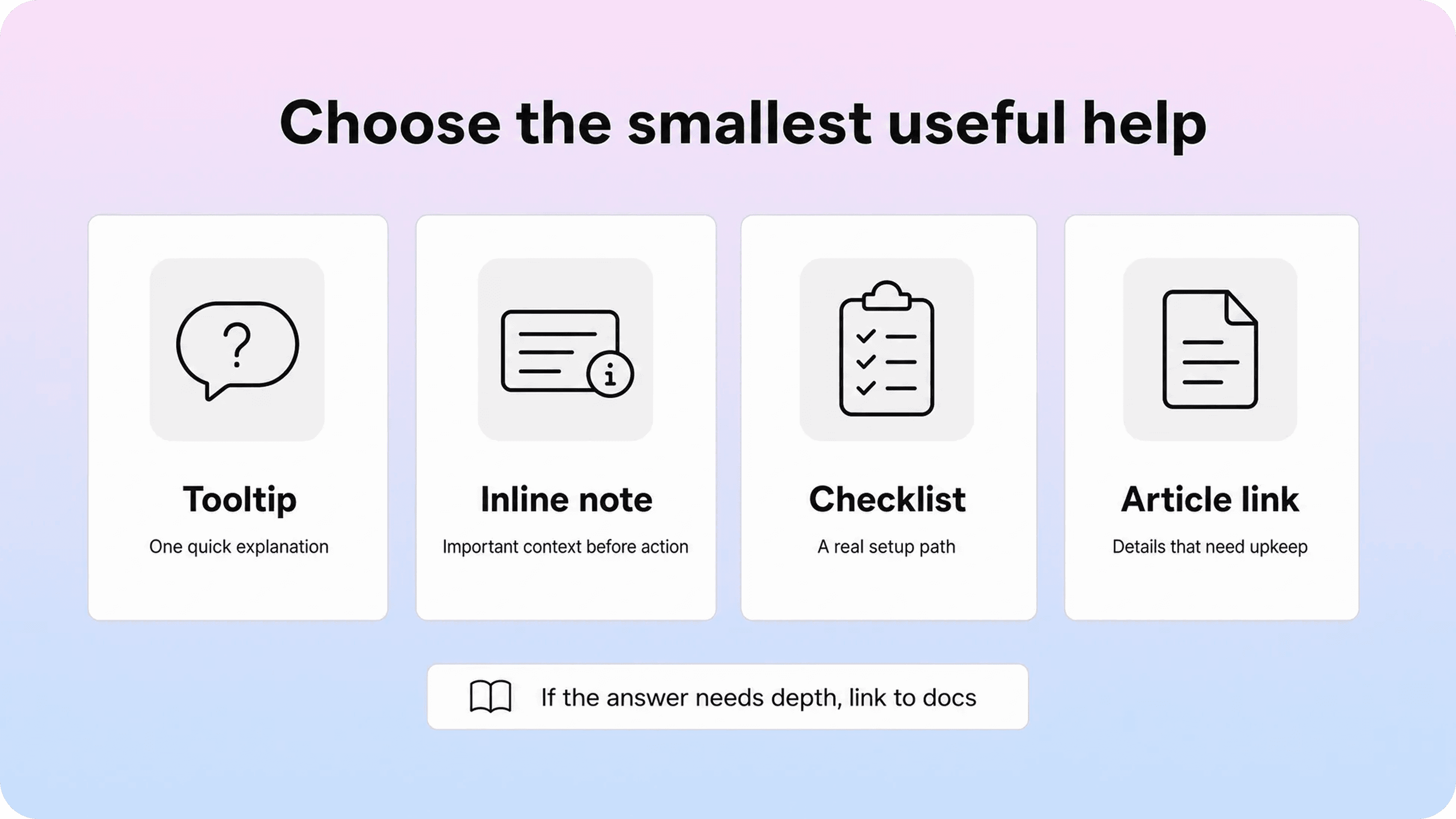
Contextual help examples are easiest to understand by matching the pattern to the user's level of uncertainty. A small question needs a small answer. A multi-step workflow needs something more durable than a tooltip.
Pattern | Best for | Avoid when |
|---|---|---|
Tooltip or info icon | Explaining one label, icon, field, or setting | The answer needs steps, screenshots, or policy detail |
Inline explanation | Clarifying a form, permission, limit, or requirement | The text repeats what the interface already says |
Empty state | Helping users understand why nothing is there and what to do next | The state is actually an error or loading problem |
Checklist | Guiding activation, setup, or a short workflow | The list becomes a second navigation system |
Contextual article link | Sending users to the exact doc for the current screen | The article is too broad or not maintained |
Prompt or nudge | Calling attention to a useful action at the right time | It appears because the company wants attention, not because the user needs help |
Support form suggestion | Deflecting repeat questions before contact | The issue is sensitive, urgent, or account-specific |
Tooltips are the most familiar pattern, but they are also the easiest to overuse. Adobe Spectrum's contextual help guidance makes a useful distinction: a tooltip gives inline information about the element a user hovers or focuses on, while contextual help can be a larger help experience connected to the current interface. In other words, a tooltip is one tool, not the whole strategy.
Use tooltips for short explanations that would interrupt the layout if they were always visible. Examples include "Only workspace admins can change this," "This setting affects future invoices," or "Exports include completed items only." If the tooltip needs more than a sentence or two, it probably belongs as inline copy or a help article.
Inline explanations work better when the user must understand the guidance before acting. A permission warning, plan limit, data deletion note, or billing change should not hide behind a hover state. Put the important part on the screen, then link to more detail if needed.
Empty states are especially useful for contextual in app help because they appear when the user has a clear question: "Why is this page empty?" A good empty state tells users whether they have no data yet, filtered everything out, lack permission, or need to complete a setup step. If the fix is documented, the empty state should link to that article.
Checklists are best for real activation paths. They should help users complete meaningful actions, not show a product tour disguised as progress. A checklist for "Connect your domain," "Invite your team," and "Publish your first article" is useful. A checklist that says "Click settings," "Look at reports," and "Open the help menu" is usually noise.
Contextual documentation links are the most maintainable pattern for anything that changes. If pricing rules, permissions, integrations, or troubleshooting steps live in a help article, the product should point to that article instead of hardcoding a long explanation that nobody remembers to update.
How to decide which help pattern to use
The easiest way to choose a contextual help pattern is to classify the user's question by depth.
If the user only needs a label clarified, use a tooltip or short inline note. If they need to understand a consequence before acting, use visible inline copy. If they need a sequence of steps, link to a help article or show a compact checklist. If they are blocked by an error, show the reason, the next action, and a path to troubleshooting or support.
Ask four questions before adding any in app guidance:
What triggered the need? A page visit, field focus, failed action, empty state, plan limit, user role, repeated search, or onboarding milestone.
How much help does the user need? One sentence, a few bullets, a sequence, a decision, or a full article.
How often will the answer change? Stable microcopy can live in the product; changing details should live in documentation.
What should happen if the help fails? Another article, a contact form, a chat handoff, or a support request with context attached.
This keeps the help surface proportional. It also reduces one of the biggest mistakes in product guidance: solving every uncertainty with the same component.
A tooltip is not a substitute for a help article. A help article is not a substitute for clear product copy. A checklist is not a substitute for simple onboarding. A support form is not a substitute for fixing an unclear workflow.
For documentation teams, this is where product documentation structure matters. Helpview's guide to product documentation for SaaS users frames strong docs around user moments like getting started, completing a task, fixing a problem, and understanding limits. Those same moments should shape where contextual help appears in the product.
Connect contextual help to targeted documentation

The strongest contextual help systems do not try to put every answer inside the interface. They connect the interface to the right documentation.
That connection should be specific. A generic "Learn more" link is better than nothing, but it still asks the user to guess whether the next page is relevant. A stronger link says what the article solves:
Learn how plan limits work
Fix a failed integration
Download invoices and receipts
Set up team permissions
Troubleshoot missing search results
The article also needs to be shaped for contextual use. If a user opens an article from inside a product screen, the top of the article should confirm the situation quickly. It should not start with a long definition if the user is already stuck in the workflow.
A good contextual article usually has:
a title that matches the user's task or problem
a first paragraph that confirms when the article applies
clear prerequisites, permissions, or plan limits
steps that match the current product language
troubleshooting notes for common failure states
related links for the next likely question
a clear route back to support when the issue is account-specific
This is also where help center navigation matters. If a contextual link points to a page that is buried in a confusing library, the in-product experience may still feel broken. Helpview's guide to help center navigation explains why customer language, category structure, and related links matter even when users arrive from a direct link.
For teams writing in Notion, the advantage of a Notion-based help center is that the maintained article can serve several surfaces at once: public help center, in-app widget, contextual link, suggested support answer, and AI source content. The product should not become a second documentation system.
The practical workflow looks like this:
Write or update the canonical help article.
Add the article to the right help center category.
Attach the article to the relevant product screen, state, or workflow.
Use a short in-product summary only where it helps the user decide whether to open the article.
Review the article and the in-app reference together when the product changes.
That last step is the one teams miss. A product change can make both the article and the contextual prompt stale. If a button moves, a role changes, or a plan limit shifts, the screen text, help link, and article all need to stay aligned.
Design contextual help without interrupting users
Contextual help should feel like assistance, not commentary. The product should become easier to use, not more narrated.
Start with the most obvious principle: do not explain everything. If every setting has an info icon, every empty state has a long paragraph, and every new feature launches a modal, users learn to dismiss the guidance instead of reading it.
Use interruption only when the user's situation justifies it. A blocking error, risky action, irreversible change, or important setup step may deserve a visible prompt. A normal page visit usually does not.
Good contextual help is:
timely: shown when the user can act on it
specific: tied to the current screen, action, role, or state
short: enough to move the user forward, not enough to become an article
dismissible: easy to close or ignore when the user already knows what to do
accessible: reachable by keyboard and readable without hover-only behavior
maintainable: connected to a source of truth when details change
Mobile and smaller screens need special care. A desktop tooltip or side panel can cover the exact field a user is trying to edit on mobile. A product tour step can point at an element that moves between breakpoints. A help widget can block a primary action. Test contextual help where the product is actually used, not only in a polished desktop mockup.
Language matters too. The copy should sound like the product is helping, not marketing. Avoid vague prompts such as "Boost productivity with advanced settings." Use concrete guidance: "Only admins can invite teammates" or "Connect Stripe before publishing paid plans."
The best writing rule is simple: say what changed, what it means, or what to do next. If the copy does not answer one of those jobs, it probably does not belong in the interface.
Build a contextual help workflow
Contextual help gets messy when it is owned only by whoever added the first tooltip. Over time, product managers add prompts, support adds help links, success adds onboarding notes, and engineering hardcodes copy in the product. Nobody means to create clutter, but the guidance slowly becomes inconsistent.
A simple workflow prevents that.
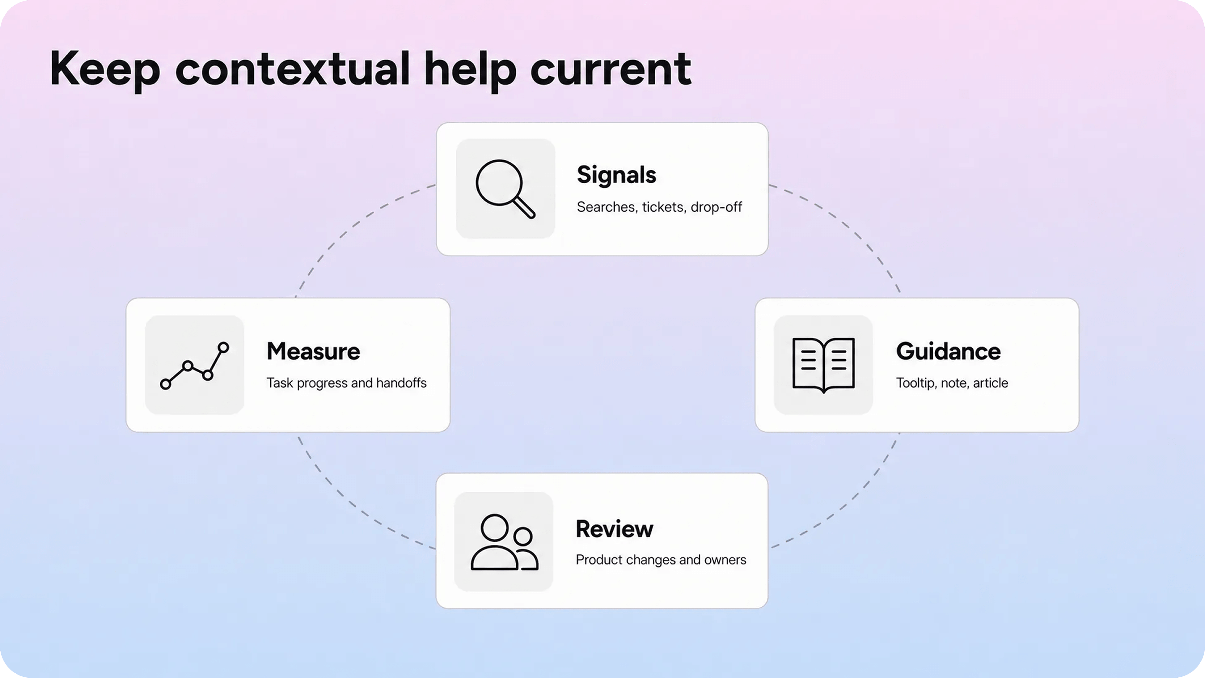
Start with evidence. Look for the screens and workflows that already create support demand:
repeated tickets about the same screen
help widget searches from a specific page
users opening contact after viewing an article
onboarding drop-off
failed actions or validation errors
product analytics showing repeated backtracking
article feedback tied to a workflow
release changes that introduce new terms or limits
Then decide whether the fix belongs in the product, the documentation, or both. Helpview's guide to turning support questions into documentation is useful here because not every repeated question needs a new article. Some need a better title, a stronger intro, a contextual link, a clearer empty state, or a support form that collects better details.
For each contextual help item, track a small set of fields:
screen or workflow
trigger
user segment or role
help pattern
source article, if any
owner
review trigger
success signal
Review triggers are more useful than vague calendar reminders. Update contextual help when a UI label changes, a plan limit changes, a role changes, an article is renamed, an integration flow changes, or support sees new confusion around the same screen.
The maintenance loop should be lightweight:
Identify high-friction screens.
Match each issue to the smallest useful help pattern.
Connect changing details to maintained documentation.
Ship the guidance.
Measure whether users still search, abandon, or contact support.
Clean up prompts that no longer earn attention.
This is also how teams avoid prompt debt. Contextual help should be removed when the product becomes self-explanatory, the workflow changes, or the guidance no longer improves behavior. A product full of old nudges feels less trustworthy than a product with fewer, sharper answers.
How to measure contextual support
The success of contextual support is not "we added four tooltips." It is whether users move through the product with less confusion and better outcomes.
Measure the surface where the help appears and the outcome after it appears.
Useful signals include:
tooltip opens and dismissals
article clicks from a specific screen
search terms inside an in-app widget
zero-result searches from a product area
checklist completion and skipped steps
empty-state action clicks
support form starts after contextual help
tickets tied to the same workflow before and after a change
task completion, setup completion, or conversion for the relevant flow
negative article feedback from users arriving through the product
Do not read any one metric alone. A tooltip with high opens may be useful, or it may mean the label is unclear. A contextual article with low clicks may be unnecessary, or it may be hidden in the wrong place. A support form with fewer submissions may mean the article solved the issue, or it may mean users gave up.
The strongest measurement is issue-level. Pick one workflow, define the confusion, add a targeted improvement, and compare behavior before and after. For example:
Before: users on the integrations page search "permission error" and contact support.
Change: add an inline permission note and a contextual link to the integration troubleshooting article.
After: more users open the article, fewer contact support immediately, and support tickets include clearer context when they do escalate.
That is more useful than claiming contextual help reduced support overall. It shows which moment improved.
Use the same discipline for cleanup. If a tooltip is ignored, a checklist is skipped, or a prompt creates more dismissals than useful actions, remove it or replace it with clearer product copy. The point is not to maximize guidance. The point is to help users make progress.
Conclusion
In-app contextual help works when it is tied to the user's real situation: the screen they are on, the action they are taking, the state they are seeing, or the workflow they are trying to finish. Use tooltips for small uncertainty, inline copy for important context, empty states for next steps, checklists for real activation paths, and targeted documentation when the answer needs depth or maintenance. Keep the system connected to support signals and product changes, and the product can guide users at the right moment without overwhelming them.
Frequently asked questions
What is in-app contextual help?
In-app contextual help is guidance that appears inside a product based on the user's current screen, action, state, role, or workflow. It can include tooltips, inline notes, empty states, checklists, prompts, contextual article links, and support suggestions tied to the moment where the user needs help.
What are common contextual help examples?
How is contextual help different from in-app customer support?
When should you use a tooltip instead of a help article?
How do you measure whether contextual help is working?
Share article:

2 free months of Pro
Turn Notion pages into help center answers.
Keep writing in Notion and publish a real, searchable Notion help center.

Articles
Keep reading