Tips
In-App Customer Support: Methods, Examples, and Best Practices

12 Min Read
In-app customer support helps users find answers, get unstuck, and contact your team without leaving the product. This guide explains the main in-app support methods, where each one works best, and how to design a support experience that feels helpful instead of intrusive.
Share article:


What is in-app customer support?
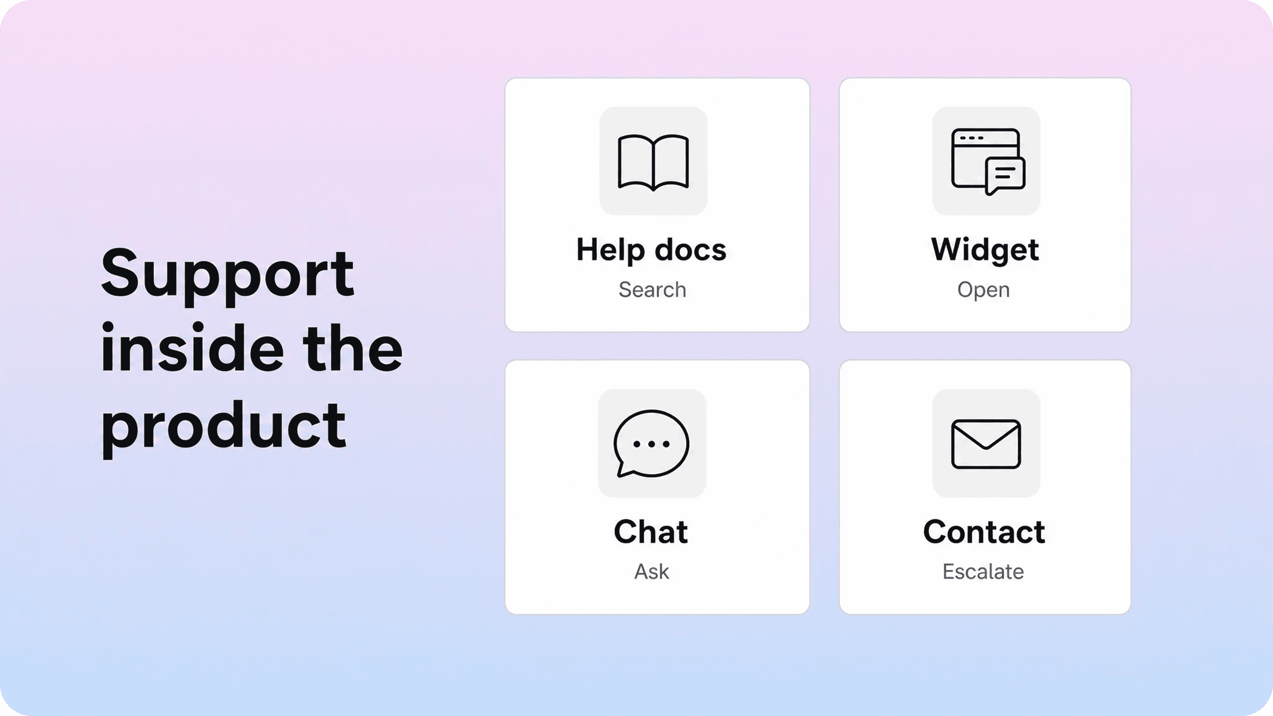
In-app customer support is any support experience that appears inside your product instead of sending users to a separate help destination first. It can be as simple as a help icon in the corner of the app, or as advanced as contextual documentation, live chat, AI answers, product tours, tooltips, and contact forms that adapt to the user's current screen.
The goal is not to replace the help center. It is to bring the most useful parts of support closer to the moment of confusion. A customer who is stuck on a billing screen should not have to open a new tab, find the help center, search for "invoice," and guess which result applies. The product can show the right billing article, a short explanation, or a contact path right there.
This is why in-app support is different from a traditional help center. A help center is a structured library of answers. In-app support is the delivery layer that decides where those answers, prompts, and contact options should appear inside the product. Helpview's guide to help center best practices makes the same distinction: answers work better when they are easy to find, easy to scan, and placed where questions happen, not hidden behind a generic footer link.
Good in-app support usually does three jobs:
It helps users self-serve without breaking their workflow.
It gives support teams better context when a user still needs help.
It turns repeated product confusion into signals for better documentation and product UX.
That last point matters. In-app customer service is not just a support channel. It is a feedback system. When users keep opening help on the same screen, searching the same phrase, or abandoning the same tour, the product is telling you where the experience is unclear.
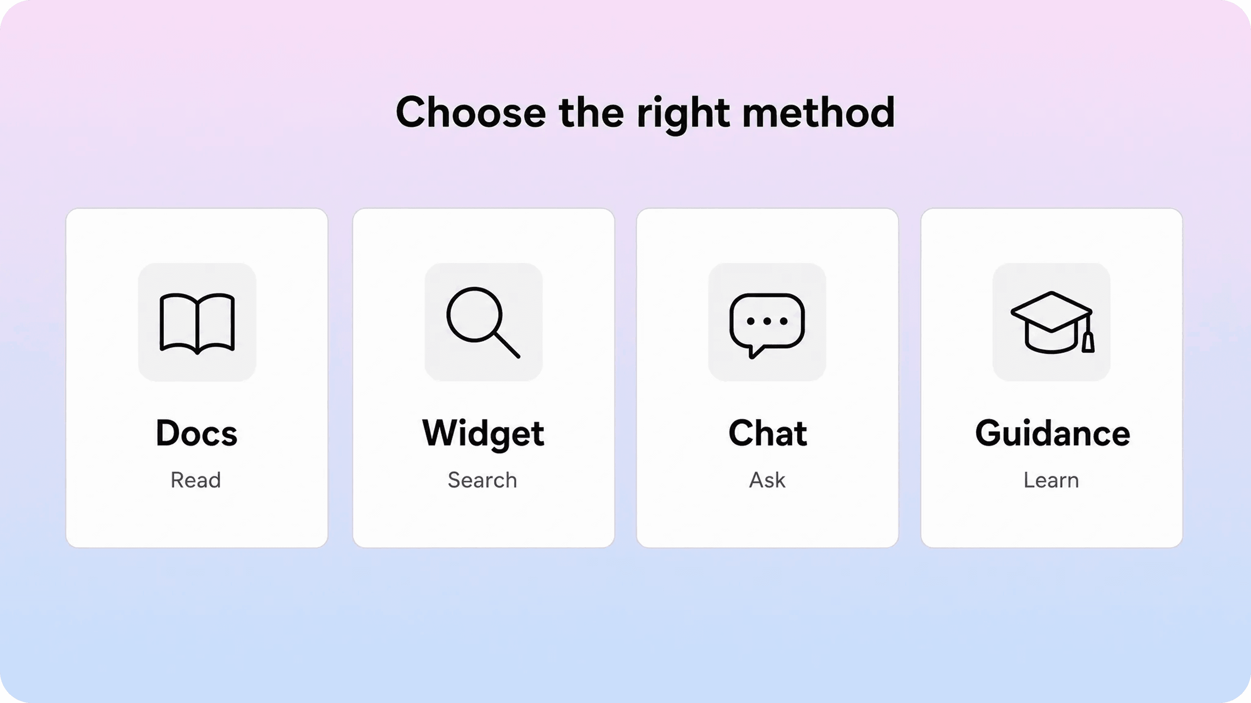
The main methods of in-app support
Most teams do not need every in-app support tool at once. They need a clear mix of methods, each with a specific job. The easiest way to choose is to ask what kind of problem the user has: Do they need a quick hint, a full answer, a guided workflow, a conversation, or a handoff to support?
Method | Best for | Watch out for |
|---|---|---|
Embedded documentation | Repeat questions, setup tasks, troubleshooting, policy answers | Articles that are too long or too generic for the current screen |
Help widget | Searchable self-service, suggested articles, contact options | A widget that opens but does not contain useful contextual content |
Live chat or messaging | Urgent, unclear, account-specific, or high-value issues | Creating an expectation of instant support when the team cannot staff it |
Contextual guidance and tooltips | Small moments of uncertainty, new features, hidden settings | Over-explaining the UI or interrupting experienced users |
Product tours and checklists | Onboarding, activation, workflow education | Long linear tours that users skip because they are not task-based |
AI assistants | Fast answers from existing knowledge sources | Weak source content, unclear escalation, or answers without confidence boundaries |
Contact forms and escalation paths | Issues that need human review, private context, or attachments | Generic forms that make users repeat information the app already knows |
This table is a planning tool, not a shopping list. A small SaaS product might start with an embedded help widget and a few contextual links. A larger product might add segmented onboarding, article suggestions in contact forms, live chat for certain customers, and an AI assistant trained on approved support content.
The point is to make each support surface earn its place. If a tooltip explains what a button does, the help widget should not repeat the same sentence. If an AI assistant can answer a setup question, the escalation path should collect the exact details a human needs when the answer fails. Each layer should reduce friction instead of adding another thing for the user to dismiss.
Embedded documentation inside the product
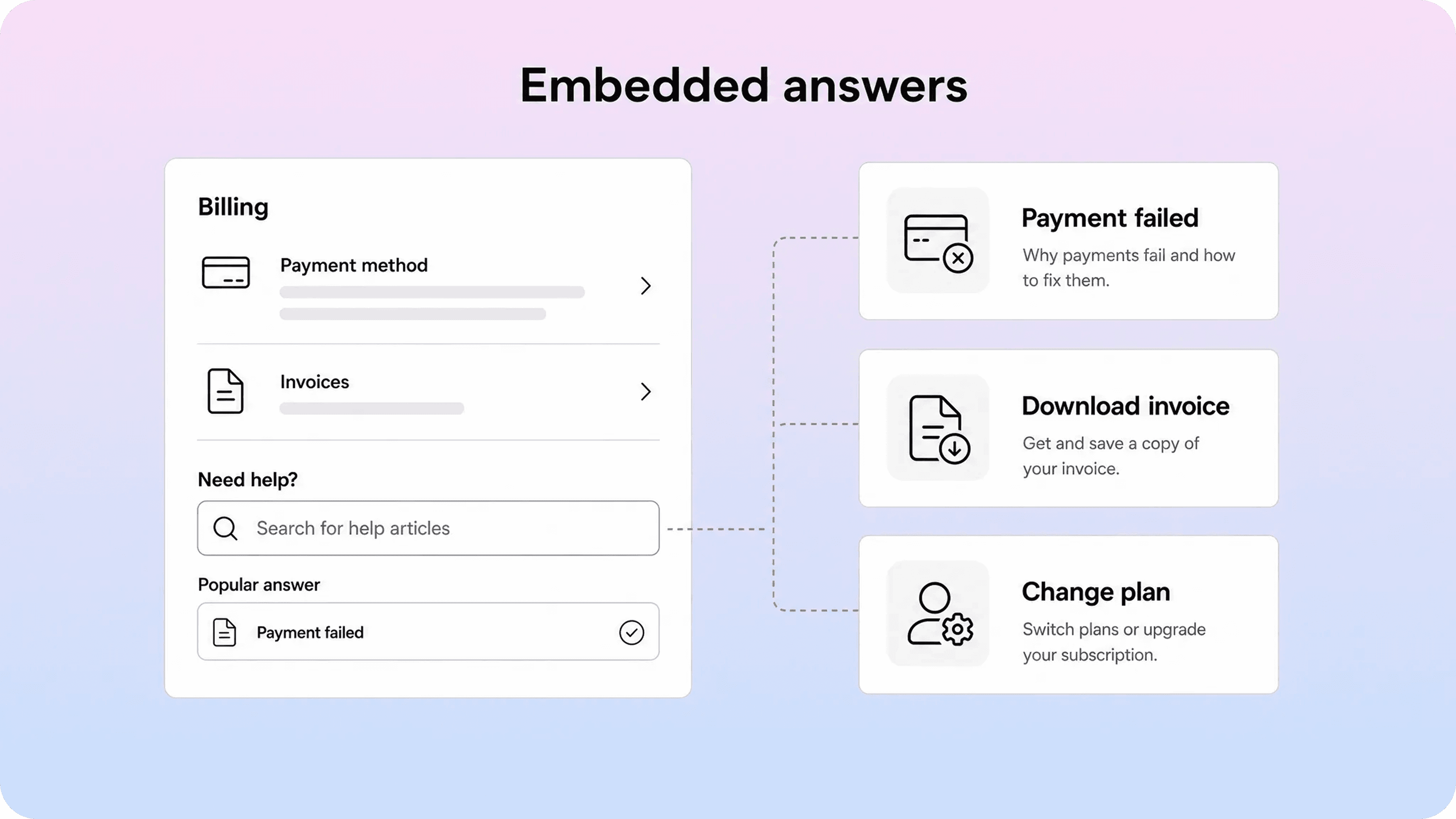
Embedded documentation is usually the foundation of in-app customer support. It gives users access to help articles, setup guides, troubleshooting steps, and policy answers without sending them away from the product. If your team is still shaping the library itself, Helpview's guide to turning support questions into documentation is a good starting point because it begins with repeated customer intent instead of an internal feature list.
The most common pattern is a help widget that opens a searchable article panel. Zendesk describes its web widget as a way to place help center access, contact forms, voice, and chat in one embedded support interface. Aha! makes a similar case for embedding a support knowledge base inside software so users can search and read answers where they are already working.
For Helpview, this is the natural center of gravity: teams can keep writing docs in Notion, then publish them as a polished help center and surface the same answers through an in-app widget. That avoids the common split where the support team writes in one place, the public help center lives somewhere else, and the product team hardcodes separate in-app explanations that drift out of date.
Embedded documentation works best when the article library is already structured around customer tasks. If the help center uses vague categories, internal product names, or long conceptual articles, embedding it inside the product will not fix the problem. Users will still search, skim, and bounce. Helpview's article on why users can't find answers in your help center covers that findability problem in more detail.
Strong embedded docs usually have these qualities:
The article title matches what the user would ask in the product.
The first paragraph confirms the issue and gives the fastest path forward.
The article focuses on one task, problem, or decision.
Related links move the user to the next likely answer.
The same article can work in the help center, in a widget, and as a suggested answer before contact.
The best place to start is not "all docs." Start with the screens that create support demand: billing, login, account settings, onboarding, integrations, checkout, permissions, and export flows. Put the top few articles within reach there. Then expand once you know which answers users actually open.
Help widgets, launchers, and support panels
A help widget is the most recognizable form of in-app support. It usually appears as a small launcher in the corner of the product. When opened, it might show search, featured articles, recent conversations, AI answers, chat, or a contact form.
The launcher matters because it is the user's support entry point. Intercom defines a launcher as the button in the corner of an app or site that opens Messenger. Zendesk's web widget follows the same general idea: one embedded place where users can search knowledge base content, start chat, or leave a message depending on the setup.
The mistake is treating the widget as a generic mini help center. If every user sees the same articles on every screen, the widget is technically in-app but not truly contextual. A better pattern is to make the widget aware of the user's moment:
On the billing page, feature invoices, payment failures, plan changes, and refunds.
On the integrations page, feature setup guides, connection errors, and permissions.
During onboarding, feature getting-started guides and short workflow explainers.
Inside account settings, feature passwords, two-factor authentication, roles, and email changes.
In a checkout or upgrade flow, feature payment methods, taxes, cancellation, and plan limits.
This does not require a complicated system on day one. Even a few page-level article groups can make the widget feel more useful. The point is to shorten the path between confusion and answer.
A good in-app support widget should also make escalation obvious. Self-service is not a wall. If the answer is missing, outdated, private, or risky, the user should be able to contact support from the same surface without starting over. The widget can carry context into the request: current page, account ID, plan, recent search query, article viewed, error state, and optional screenshots.
That context is where in-app customer service becomes better than a standalone contact page. The user does less explaining, and support gets a cleaner starting point.
Live chat, messaging, and human contact options
Live chat is useful when the issue is urgent, ambiguous, account-specific, or emotionally loaded. It is also expensive to staff, easy to overpromise, and frustrating when the launcher says "chat" but the user only gets a delayed email reply.
That is why chat should be treated as one option inside a broader in-app support experience, not the whole strategy.
Use live chat when speed or judgment matters:
A customer is blocked during payment or onboarding.
A high-value account is stuck in a critical workflow.
The issue depends on account-specific context.
The user has already tried the relevant article.
The product is in a category where trust and reassurance matter.
Use asynchronous messaging or a contact form when the issue can wait, requires investigation, or needs attachments. A good form is not just a blank box. It should ask for the minimum useful details based on the current screen. For example, a billing support form might ask for invoice month, payment method, and error message. An integrations form might ask for provider, workspace, permission level, and connection status.
In-app contact options also need honest availability. If chat is not staffed 24/7, say so before the user starts typing. If email replies usually take one business day, say that. If AI will answer first, label it clearly and give users a path to a human.
The best in-app support experiences do not hide people behind automation. They use self-service to solve repeat questions, then make human support cleaner when it is actually needed.
Contextual help, tooltips, and product guidance
Contextual help is support that appears near the specific feature, field, setting, or workflow that caused confusion. It can be a small inline explanation, an info icon, a tooltip, a checklist step, a product tour, or a suggested article.
Pendo's in-app guidance product is built around this idea: deliver relevant onboarding, tooltips, and walkthroughs inside the app, with segmentation so different users can see different guidance. Intercom's glossary describes product tours as multi-page interactive guides that take customers through a product step by step.
These tools are helpful, but they are easy to overuse. A tooltip should not explain every visible button. A product tour should not force a new user through ten steps before they have a reason to care. A checklist should not become a second navigation system.
Good contextual help is narrow and timely:
Use an inline hint when a field label is not enough.
Use a tooltip when a feature is important but easy to miss.
Use a short checklist when the user has a real activation path to complete.
Use a product tour when the workflow is unfamiliar and benefits from sequencing.
Use an article link when the question needs more than a sentence.
The best product guidance is triggered by intent, not vanity. A new feature tooltip is useful when the user is likely to need that feature. It is annoying when it appears just because marketing wants attention. A product tour is useful when it helps the user complete a job. It is weak when it only points at parts of the UI.
As a rule, contextual help should make the product feel more obvious, not more narrated.
AI assistants for in-app support
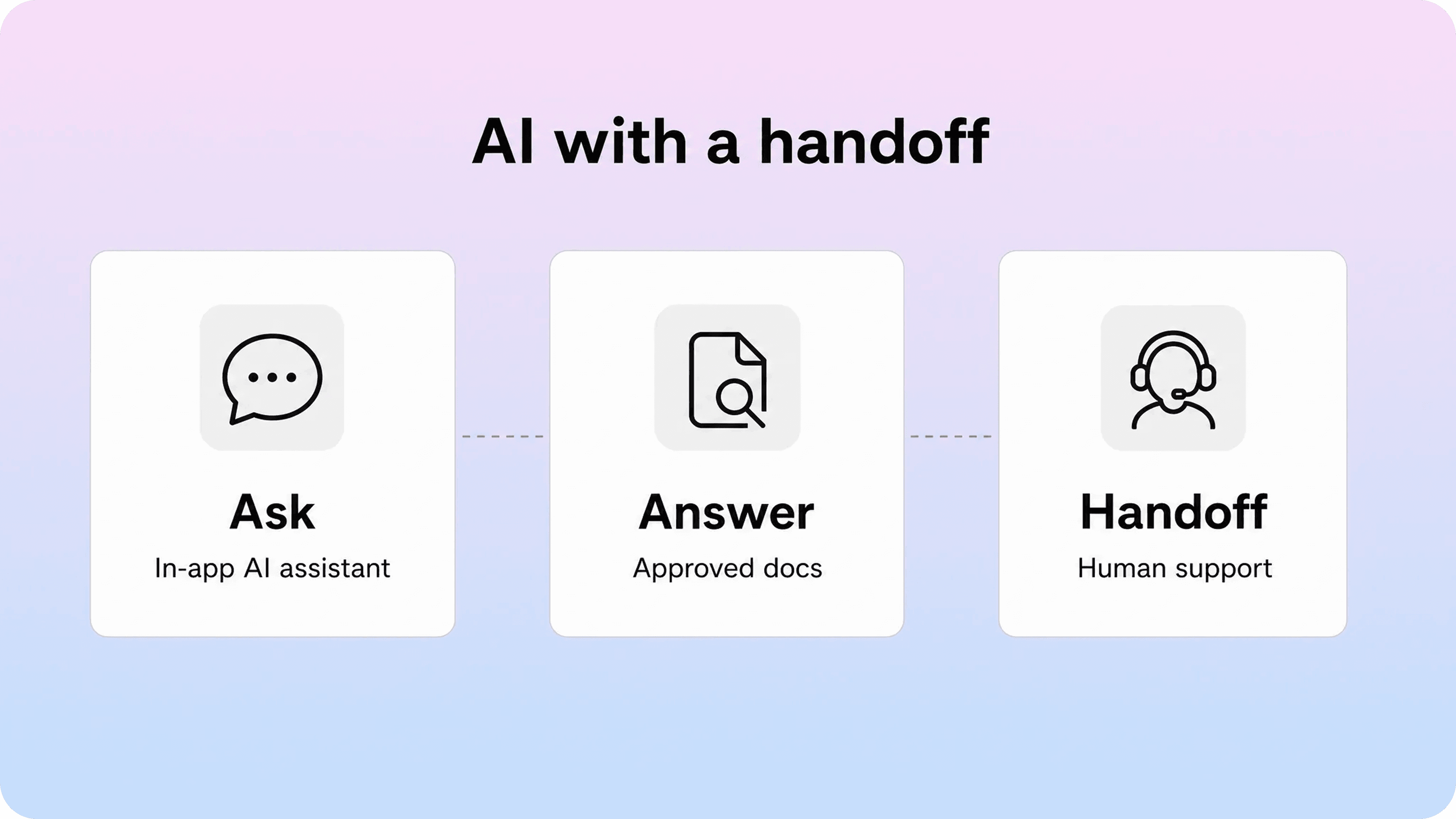
AI assistants have become a common layer in in-app support because they can turn existing documentation into conversational answers. Instead of asking users to search, click, and scan, an assistant can interpret the question, retrieve relevant content, and answer inside the product.
This can be valuable when the knowledge base is large, users phrase questions in many different ways, or the product has lots of setup and troubleshooting paths. Intercom describes Fin as using support knowledge sources such as help center articles, internal content, PDFs, and webpages, with escalation to humans when needed.
But an AI assistant is only as good as the support system behind it. If the docs are stale, duplicated, vague, or written around internal terminology, the AI layer will amplify those weaknesses. If there is no clear escalation path, users may get stuck arguing with automation instead of reaching support.
Use AI in-app support for:
Answering repeat questions from approved knowledge sources.
Summarizing relevant article steps.
Helping users find the right article when their wording is different.
Collecting issue context before handoff.
Suggesting next steps when a user is unsure where to go.
Avoid using AI as the only path for:
Billing disputes, cancellations, refunds, or account-sensitive decisions.
Security, privacy, legal, or compliance issues.
Bugs that need investigation.
Situations where the product state is unknown or changing quickly.
Angry or high-stakes conversations where tone and judgment matter.
AI assistants work best with boundaries. Tell users when they are talking to AI. Train the assistant on approved content. Give it a limited set of actions. Track unresolved questions. Review conversations that escalate. Most importantly, make the human handoff feel like a continuation, not a reset.
How to design an in-app support experience
Designing in-app support starts with the customer's support journey, not the tool list. The question is not "Should we add chat?" It is "Where do users get stuck, what kind of help do they need there, and what should happen if self-service fails?"
A practical design process looks like this:
Map the friction points.
Review recent tickets, chat logs, product analytics, onboarding drop-off, help center searches, and zero-result searches. Look for pages where users repeatedly ask for help.
Classify the question type.
Decide whether each issue needs a short hint, an article, a guided flow, AI answer, chat, or human review. Not every support problem deserves the same surface.
Place help where intent is strongest.
Add support entry points to the screens where questions happen. A small "Need help?" link on a billing form can outperform a perfect help center article that users never find.
Keep the first layer lightweight.
Start with the top two or three articles, one short explanation, or a targeted contact option. Do not overwhelm the user with every possible help path.
Preserve the fallback.
If self-service does not solve the problem, the next step should be clear. Let users contact support and carry their context forward.
Measure what happens.
Track searches, article opens, AI answers, chat starts, form submissions, unresolved questions, and follow-up tickets. The goal is not just fewer tickets. It is fewer unnecessary tickets and better context for the ones that remain.
This is also where maintenance matters. In-app help breaks quietly. A renamed UI label, changed permission rule, new plan limit, or moved settings page can make a once-useful article confusing. Build a review habit around product launches, support spikes, and searches that fail.
Best practices for in-app support
Strong in-app support is calm, contextual, and honest. It should feel like the product is helping, not like another channel is competing for attention.
Start with real support demand. The best in-app help ideas come from repeated tickets, failed searches, article feedback, and product screens that create hesitation. Do not build a tour because tours are trendy. Build one because a specific workflow needs guidance.
Keep copy short in the product. In-app surfaces are small. Use them to confirm the issue, give the next step, or open the full article. If the explanation needs several paragraphs, it belongs in documentation, not a tooltip.
Use customer language. Helpview's guidance on help center navigation stresses direct labels and customer-friendly wording. The same rule applies inside the product. If users search "download invoice," do not label the help entry "billing documents."
Make help contextual but not hidden. Users should know where support lives, but the content inside that support surface should adapt to the screen, role, plan, or task where possible.
Do not interrupt experienced users. Segment guidance by behavior. New users may need onboarding prompts. Experienced users may only need a searchable widget and occasional release guidance.
Avoid dead-end automation. AI answers, article suggestions, and forms should all have a next step. If the answer does not help, users should be able to keep going without repeating themselves.
Connect support content to product changes. Every release that changes a workflow should trigger a documentation and in-app help check. Update the article, the widget suggestions, the tooltip, the AI source content, and the contact form prompts together.
Keep ownership clear. In-app support often sits between product, support, customer success, and documentation. Decide who owns article accuracy, widget configuration, chat routing, AI review, and guidance cleanup. Without ownership, the experience slowly becomes stale.
Common mistakes to avoid
The most common mistake is adding more in-app support surfaces without improving the answers behind them. A widget cannot save a weak help center. An AI assistant cannot make stale documentation trustworthy. A product tour cannot fix a confusing workflow.
Another mistake is treating in-app support as ticket deflection at all costs. Deflection is useful when the user gets a real answer. It is damaging when the user feels blocked from contacting support. The best systems reduce avoidable tickets while improving the quality of necessary ones.
Teams also overuse proactive guidance. Banners, tooltips, tours, and checklists all compete for attention. If everything is highlighted, nothing is. Reserve interruption for moments where the user genuinely benefits from guidance.
Finally, many teams forget mobile and smaller screens. A support widget that feels comfortable on desktop can cover important controls on mobile. A long article panel can become painful to read. A tour step can point at an element that moves across breakpoints. Test in-app support where users actually use the product.
Conclusion
In-app customer support works when it respects the user's context. The best systems combine embedded documentation, searchable widgets, contextual guidance, AI answers, chat, and contact options into one practical support experience. Start with the places customers already get stuck, keep each support method focused, and use the signals from in-app behavior to improve both your documentation and your product.
Frequently asked questions
What is in-app customer support?
In-app customer support is support delivered inside a product experience. It can include embedded help articles, support widgets, live chat, AI assistants, tooltips, product tours, checklists, contact forms, and contextual article suggestions. The goal is to help users solve problems without leaving the workflow they are already in.
What is the difference between in-app support and a help center?
What are the best in-app support tools?
When should a company add in-app help?
Can AI replace in-app customer service?
Share article:

2 free months of Pro
Turn Notion pages into help center answers.
Keep writing in Notion and publish a real, searchable Notion help center.

Articles
Keep reading