Tips
Why users can’t find answers in your help center

9 Min Read
Help center navigation fails when customers cannot quickly connect their question to the right category, article, or next step. Here is how to structure a help center so answers are easier to find, scan, and trust.
Share article:


What help center navigation really includes
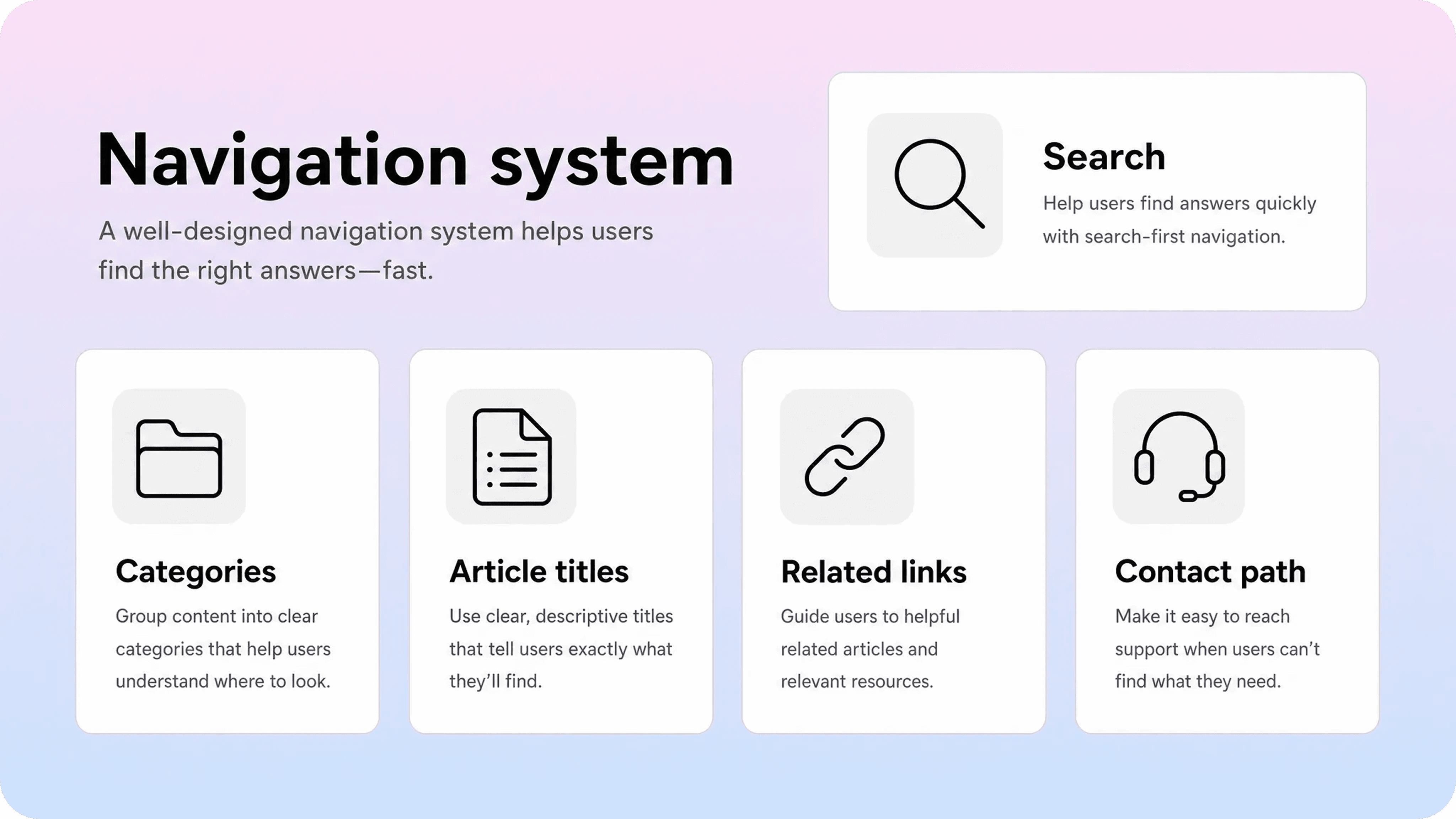
Help center navigation is the full path a customer uses to move from question to answer. It includes the homepage, category structure, search box, article titles, breadcrumbs, sidebar links, related articles, and contact paths.
That matters because users do not experience these parts separately. A customer may search first, open a category second, scan three article titles, click one result, then use related links when the first answer is not enough. If any part of that path is confusing, the answer can feel missing even when the article exists.
A help center with poor navigation often looks complete from the team’s point of view. The content is there. The categories seem tidy. The articles are published. But customers still open tickets because they cannot translate their question into the structure your team created.
That is the real problem: navigation fails when the help center reflects the company’s mental model more than the customer’s moment of need.
Good navigation helps customers answer a few questions quickly:
Where should I start?
What words should I search?
Which category matches my problem?
Which article is the right one?
Does this answer apply to my role, plan, or situation?
What should I do if this does not solve it?
If the help center cannot answer those questions, customers are forced to guess. Some will keep clicking. Some will search again. Many will contact support because support feels easier than decoding the help center.
Why users can’t find answers in your help center
Most help center navigation problems are not caused by one broken page. They come from small mismatches across the whole self-service path.
Categories use internal language
Internal category names often make sense to the team and very little sense to customers. A product team may group articles under feature names, modules, or internal product areas. Customers usually think in tasks and problems.
For example, a category called Workspace administration may be accurate, but a customer looking for invite a teammate, change permissions, or remove a user may not know that is where to click. A category called Team members and permissions is easier to understand because it matches the support moment.
Use category labels customers would recognize without training:
Getting started
Account and login
Billing and invoices
Team members and permissions
Integrations
Troubleshooting
Plans and limits
The goal is not to make categories clever. The goal is to make the first click feel obvious.
The structure is too deep
Deep navigation feels organized to the team because every article has a precise home. It feels slow to customers because common answers require too many decisions.
A customer should not need to choose a product family, product area, feature group, subfeature, and article type before they can reset a password or find an invoice. If a common answer is buried four clicks deep, the help center is asking customers to understand your taxonomy before solving their own problem.
Keep the structure shallow where possible:
Use a small number of top-level categories.
Add subcategories only when they reduce confusion.
Keep common tasks close to the surface.
Avoid nesting articles under internal team ownership.
Use search and related links to handle cross-category paths.
A shallow structure is not less sophisticated. It is more practical.
Article titles are too vague
Navigation depends heavily on article titles. A title is often the moment where a customer decides whether to click, keep searching, or give up.
Weak titles are usually broad or internal:
Billing settings
User management
Account overview
Integration behavior
Workspace configuration
Stronger titles describe the task, issue, or question:
Download an invoice
Invite a teammate
Change your billing email
Fix a failed payment
Connect Slack to your workspace
Reset two-factor authentication
Specific titles make the help center easier to browse and easier to search. They also reduce the chance that one broad article tries to answer too many different questions.
Search and browse do not support each other
Some users search first. Others browse because they do not know what to type. Strong help centers support both behaviors.
Search fails when article titles and intros do not include customer language. Browse fails when categories are vague or overloaded. The best structure makes both routes stronger: categories clarify the main areas, while titles and article scope help search return the right page.
Nielsen Norman Group has long argued that search should be visible and simple because users often turn to search when they feel stuck in navigation. That principle applies directly to help centers: if people cannot find a reasonable path by browsing, search becomes their escape route.
But search should not be an excuse for weak navigation. If customers keep searching the same terms and opening tickets anyway, the issue may be titles, synonyms, article scope, or missing links between related pages.
Helpview’s guide to zero-result searches in help centers goes deeper on this search side. Navigation work should use the same evidence.
Articles are hard to scan after the click
Navigation does not end when someone opens an article. If the article is hard to scan, the customer may still feel like they did not find the answer.
This happens when articles start with long context, hide the fix under several paragraphs, use vague headings, or mix too many topics on one page. The customer technically landed in the right place, but the page does not help them confirm that quickly.
Nielsen Norman Group’s classic guidance on how users read on the web is still useful here: people scan pages, so headings, bullets, short paragraphs, and front-loaded answers matter.
In a help center, scannability is part of navigation. Clear headings help users move inside the article. A strong intro confirms they are in the right place. Related links help them continue when their question is slightly different.
Related articles are missing or random
Related articles should guide the next likely step. Too often, they are either missing or filled with generic suggestions.
A billing article should connect to payment method, invoices, plan changes, taxes, and cancellation if those are natural next questions. A permissions article should connect to roles, invites, ownership, and account access. A troubleshooting article should connect to the setup guide, error details, and support contact instructions.
When related links are useful, customers do not have to start over. When they are random, the bottom of the article becomes a dead end.
How to structure a help center for fast answers
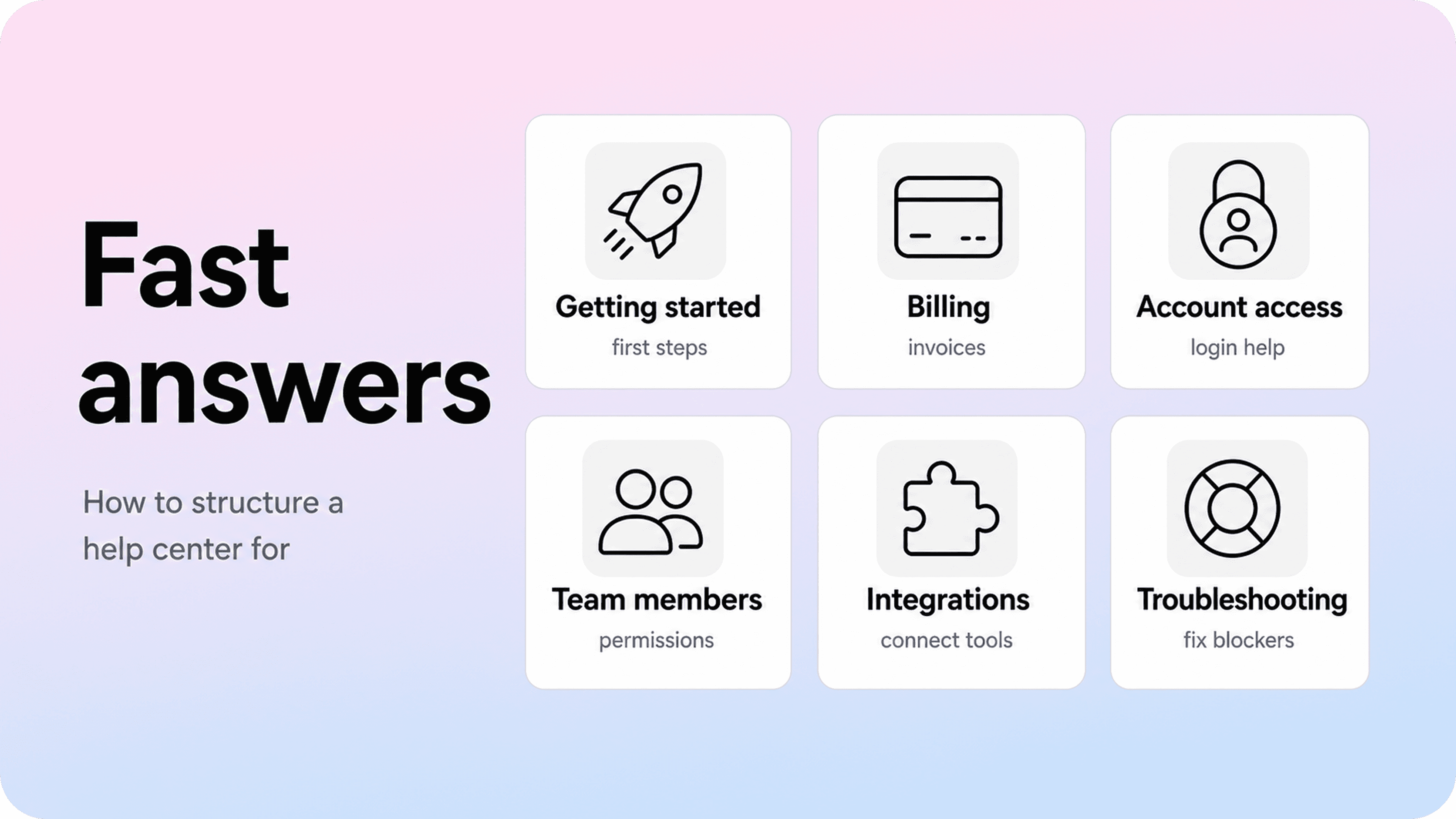
To structure a help center for fast answers, start with customer intent. The navigation should reflect what users are trying to do, fix, understand, or decide.
Start with real support demand
Do not begin by listing every feature. Begin by collecting the questions customers already ask.
Useful inputs include:
support tickets
chat transcripts
help center search terms
zero-result searches
article feedback
onboarding questions
product release questions
saved replies and macros
Group these by intent, not exact wording. Invoice, receipt, billing history, and download invoice may all point to one customer need. Invite teammate, add user, and member access may belong in the same team management cluster.
This prevents the structure from becoming either too broad or too fragmented. You are not trying to mirror every phrase customers use. You are trying to understand the jobs behind those phrases.
Helpview’s article on finding content gaps in your help center is useful for this step because many navigation problems are really findability gaps: the answer exists, but customers cannot reach it.
Choose task-based top-level categories
Top-level categories should help customers self-sort quickly. Most SaaS help centers can start with a simple set like this:
Getting started
Account and login
Billing and plans
Team members and permissions
Product workflows
Integrations
Troubleshooting
Security and data
Your exact list will depend on the product, but the principle stays the same. Each category should match a recognizable customer moment.
Avoid category names that require internal knowledge. If users would not search for the phrase, hesitate before making it a category. Some product names need to appear in navigation, especially for complex products, but they should not replace task-based paths where customers need plain guidance.
Keep each article focused on one job
Navigation becomes harder when articles are too broad. A broad article may feel efficient because it covers more ground, but it often performs poorly in search and scanning.
Instead of one article called Billing settings, consider focused articles such as:
Download an invoice
Change your billing email
Update your payment method
Change your plan
Cancel your subscription
Understand taxes on invoices
This creates clearer entry points. It also makes related links more useful because each article can point to the next specific task.
The rule is simple: one article should answer one main reader job. If a page needs many branches, conditions, or unrelated sections, it probably needs to be split.
Make common answers visible sooner
High-volume questions should not be buried. If a task creates repeat tickets, make it easier to reach from the homepage, category page, search results, or relevant product screen.
This is especially important for:
login and access issues
billing and invoice questions
invite and permission problems
setup blockers
integration errors
cancellation or plan-change questions
common troubleshooting issues
Fast-answer structure does not mean every common article must be on the homepage forever. It means the most likely questions should have obvious paths. If support keeps sending the same link manually, that article probably needs a stronger place in navigation.
Use labels that match customer language
A help center becomes easier to scan when labels are direct. Use customer language for category names, article titles, headings, and related links.
For example:
Internal wording | Customer-friendly wording |
|---|---|
Billing documents | Download invoices |
Workspace users | Invite teammates |
Authentication methods | Set up two-factor authentication |
Data portability | Export your data |
Subscription lifecycle | Change or cancel your plan |
Customer-friendly wording does not mean oversimplifying the product. It means using the words people recognize when they are trying to get unstuck.
Make help center pages easy to scan
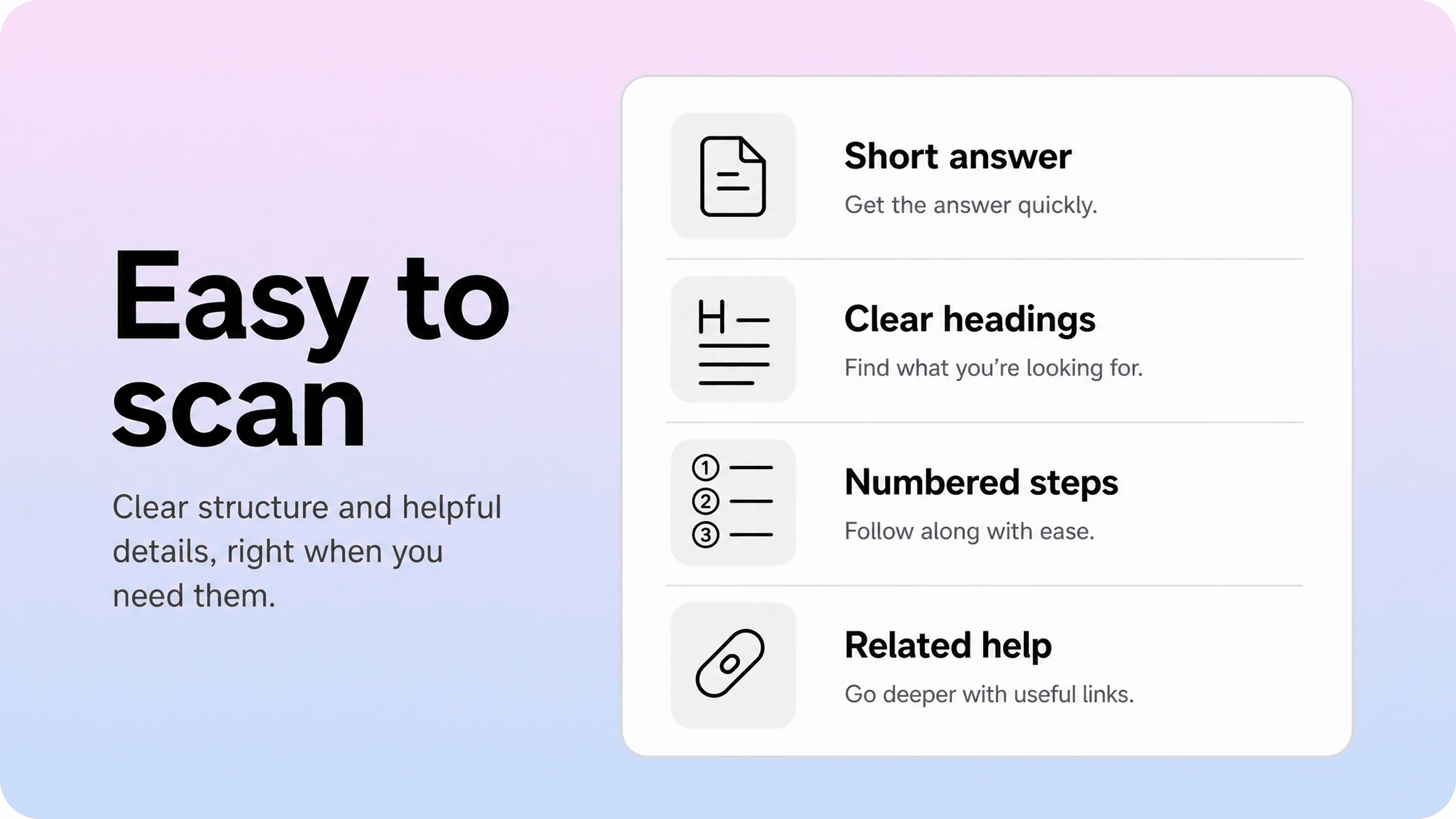
Navigation gets customers to the article. Readability helps them use it.
A page can have the right answer and still fail if the reader cannot see the answer quickly. To make help center pages easy to scan, design every article for the first 10 seconds.
Put the answer near the top
Start with the main answer, fix, or path. Do not make readers sit through background before they know what to do.
A good opening tells the reader:
what this article helps with
who it applies to
the fastest path to the result
any key condition that changes the answer
Example:
To download an invoice, go to Settings → Billing → Invoices. You must be a workspace admin or billing contact to access invoices.
That opening is short, specific, and useful. It confirms the task, names the path, and explains the permission requirement before the steps begin.
Use headings that describe the next action
Headings are navigation inside the article. They should help readers jump to the right part without reading everything.
Weak headings sound generic:
Overview
Details
More information
Notes
Stronger headings describe what the reader needs:
Before you start
Invite a teammate
Change a teammate’s role
If the invite email does not arrive
What to send support
Clear headings improve article readability and reduce backtracking. They also make long articles feel less intimidating.
Keep steps short and ordered
Use numbered steps when order matters. Keep each step to one action where possible.
A strong step list looks like this:
Go to Settings.
Select Team members.
Click Invite teammate.
Enter the teammate’s email address.
Choose a role.
Click Send invite.
Avoid burying warnings, exceptions, and alternative paths inside long step text. If a condition matters, place it before the step or directly under the step it affects.
Add troubleshooting blocks where users get stuck
Some articles need a short troubleshooting section, especially when support sees the same follow-up question repeatedly.
Useful blocks include:
If you do not see this option
If the button is disabled
If the invite email does not arrive
If the payment fails
If the integration disconnects again
If the result looks different
These blocks help customers recover without leaving the page. They also make the article more useful for support agents who need to send one link instead of several explanations.
End with the next likely step
Every article should end with a useful next move. That might be a related article, a troubleshooting guide, or a support contact path with clear instructions.
Do not end important articles with a generic list of links. Choose the next links based on what the reader is likely to need after finishing the task.
For example, after Invite a teammate, useful links might include:
Change a teammate’s role
Remove a teammate
Troubleshoot invite emails
Understand workspace permissions
That is navigation by intent. It keeps the user moving instead of making them restart their search.
Improve help center navigation with search data
Search data shows where navigation is failing. Customers tell you what they expected to find before they open a ticket.
Review these signals regularly:
zero-result searches
high-search terms with low clicks
searches that lead to support contact
repeated searches after article views
article titles that get impressions but few clicks
common support tickets that already have articles
Each signal points to a different fix.
Search signal | Likely issue | Possible fix |
|---|---|---|
Zero results for repeated terms | Missing article or wording mismatch | Create article, rename title, add synonyms |
Many searches, few clicks | Results look irrelevant | Improve titles and intros |
Search after article view | Article did not complete the job | Add missing detail or next step |
Contact after search | Self-service path failed | Improve article, escalation, or category placement |
Different words for same task | Synonym gap | Add customer wording to titles, intros, or search settings |
Search data is especially useful because it reveals customer language. If customers search invoice and your help center says receipt, the problem is not the customer. The problem is the mismatch.
Do not respond to every search term by creating a new article. First ask whether the answer already exists. If it does, improve the path to it. Rename the title, add the missing term, move the article to a clearer category, or link it from a related page.
New articles are useful when the intent is distinct and repeated. Navigation fixes are useful when the answer exists but customers still miss it.
Common help center navigation mistakes
Most navigation issues are fixable once you know what to look for.
Too many top-level categories
If every product area becomes a category, the homepage turns into a decision tree. Customers have to understand the product map before they can choose a path.
Keep top-level categories limited. Use subcategories only when they make the next click easier.
Categories named after teams
Categories like Finance, Operations, Customer success, or Platform may match internal ownership, but they rarely match customer questions.
Use customer-facing labels such as Billing, Orders, Account settings, or Integrations instead.
One article answering too many questions
Large overview articles often become catch-all pages. They may rank for several searches but fail to answer any of them directly.
Split broad articles into focused task pages when the reader intent changes.
Article titles that start with abstract nouns
Titles like Configuration, Management, Settings, and Overview are hard to scan. Lead with verbs or visible problems where possible.
Better patterns include:
Set up \[thing\]
Change \[setting\]
Fix \[problem\]
Download \[file\]
Invite \[person\]
Understand \[policy or limit\]
No path back or forward
Breadcrumbs, category links, and related articles help customers recover when they click the wrong page or need the next answer. Without them, every article becomes a dead end.
Ignoring mobile scanning
Many customers open help articles on smaller screens, especially from email, chat, or in-app help. Long paragraphs, wide tables, tiny screenshots, and deep sidebars can make a page that works on desktop feel painful on mobile.
Use short sections, clear headings, and concise steps so the answer survives smaller screens.
A practical help center navigation audit
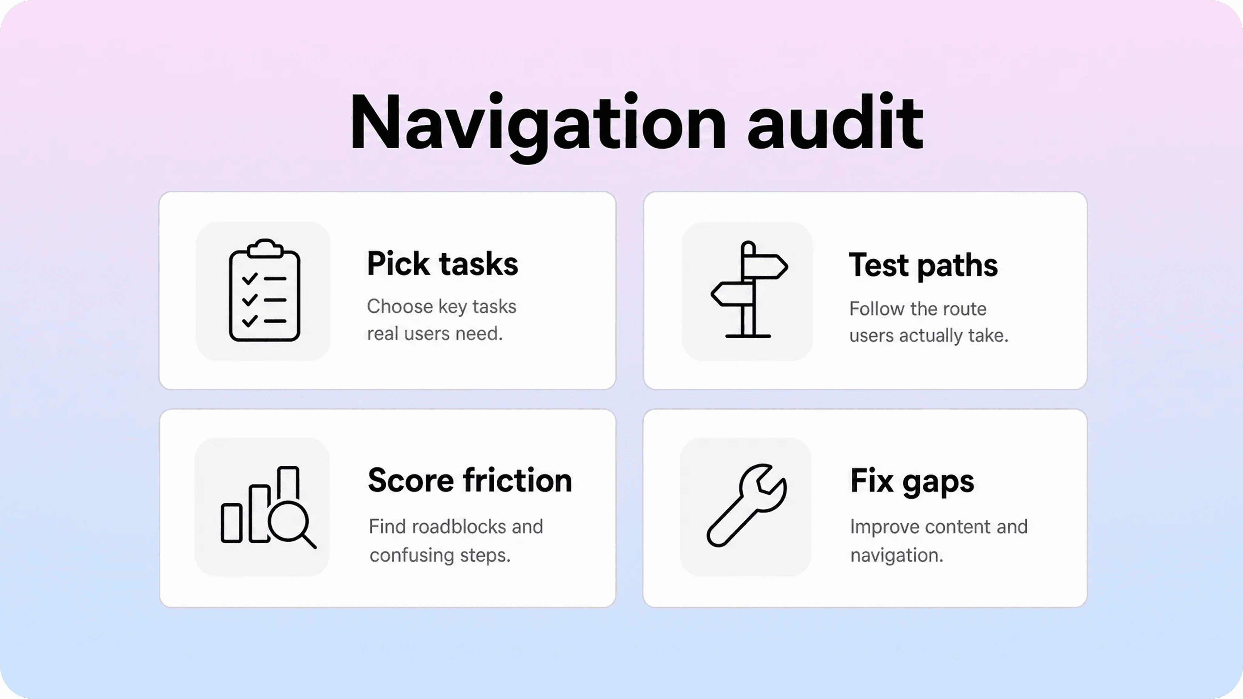
You do not need a huge information architecture project to improve help center navigation. Start with a focused audit.
Step 1: Pick common customer tasks
Choose 10 to 20 common tasks or issues from tickets and search data. Include a mix of setup, billing, access, troubleshooting, and product workflow questions.
Examples:
reset password
download invoice
invite teammate
change plan
connect integration
fix sync error
export data
cancel subscription
Step 2: Try to find each answer three ways
For each task, test three routes:
Search the obvious customer phrase.
Browse from the homepage categories.
Start from a related article and use links to continue.
If one route fails, note where it failed. Was the category unclear? Did the search return the wrong page? Was the article title too vague? Did the related links miss the next step?
Step 3: Score the path
Use a simple scorecard:
Question | Good path | Needs work |
|---|---|---|
Can users guess the category? | Yes | No |
Does search return the article? | Top result | Missing or buried |
Is the title specific? | Clear task/problem | Vague or internal |
Does the intro confirm intent? | Immediate | Too slow |
Is the answer easy to scan? | Headings and steps | Wall of text |
Is there a useful next step? | Related link or support path | Dead end |
This creates a practical fix list instead of a vague complaint that “navigation is confusing.”
Step 4: Fix the smallest thing first
Start with the fixes that reduce the most friction fastest:
rename vague article titles
move high-volume articles to clearer categories
add missing customer synonyms
rewrite intros to confirm intent faster
split overloaded articles
add related links between common next steps
update category labels
add troubleshooting blocks to high-contact articles
You do not have to rebuild the whole help center at once. Small navigation fixes can make a large difference when they target high-volume questions.
Step 5: Review after product changes
Navigation drifts when the product changes. A new permission level, renamed setting, changed billing flow, or new integration can make old help paths less reliable.
Add a short documentation check to every meaningful product release:
Does an existing article need an update?
Did a setting, label, or screenshot change?
Do related articles still point to the right next step?
Will customers search for a new term after this release?
Should an in-product help link point to an article?
This keeps navigation aligned with the product instead of waiting for support tickets to reveal the gap.
How Helpview helps with clearer navigation
If your team writes docs in Notion, navigation can become messy when pages grow organically. Notion is flexible, but a customer-facing help center needs more than a folder of pages. It needs clear categories, search, article paths, and a polished reading experience.
Notion help center software like Helpview lets teams turn Notion docs into a structured help center without moving the writing workflow out of Notion. That makes navigation improvements easier to maintain because the team can keep editing where the documentation already lives.
A practical Helpview workflow looks like this:
Use Notion as the source of truth for support articles.
Group pages into clear customer-facing categories.
Publish them through Helpview as a searchable help center.
Review search terms, repeat support questions, and article feedback.
Update the Notion source when navigation or readability needs work.
The value is not only a nicer public layer. It is a cleaner system: familiar writing for the team, better structure for customers, and a more polished self-service experience than sharing raw Notion pages directly.
Make the answer easier to find before writing more articles
When users cannot find answers, the instinct is often to write more documentation. Sometimes that is right. But often the better fix is navigation: clearer categories, better titles, stronger search language, more scannable articles, and related links that match the next likely question.
Start with the customer’s path. What do they search? Where do they click? Which words do they recognize? Which article do they open? Where do they get stuck?
Then improve the smallest piece of that path that is causing the most friction.
A help center becomes useful when customers can move from question to answer without learning your internal structure first. That is the real job of help center navigation: make the next right step obvious.
Frequently asked questions
What is help center navigation?
Help center navigation is the system that helps customers move from a question to the right answer. It includes categories, search, article titles, breadcrumbs, related links, article headings, and contact paths.
How do I improve help center navigation?
How should I structure a help center for fast answers?
Why can’t users find answers even when the article exists?
What makes a help center easy to scan?
Share article:

2 free months of Pro
Turn Notion pages into help center answers.
Keep writing in Notion and publish a real, searchable Notion help center.

Articles
Keep reading