Tips
In-App Knowledge Base: How Embedded Help Works

9 Min Read
An in-app knowledge base lets users search, read, and act on help content without leaving the product screen where they got stuck.
Share article:


What an in-app knowledge base actually is
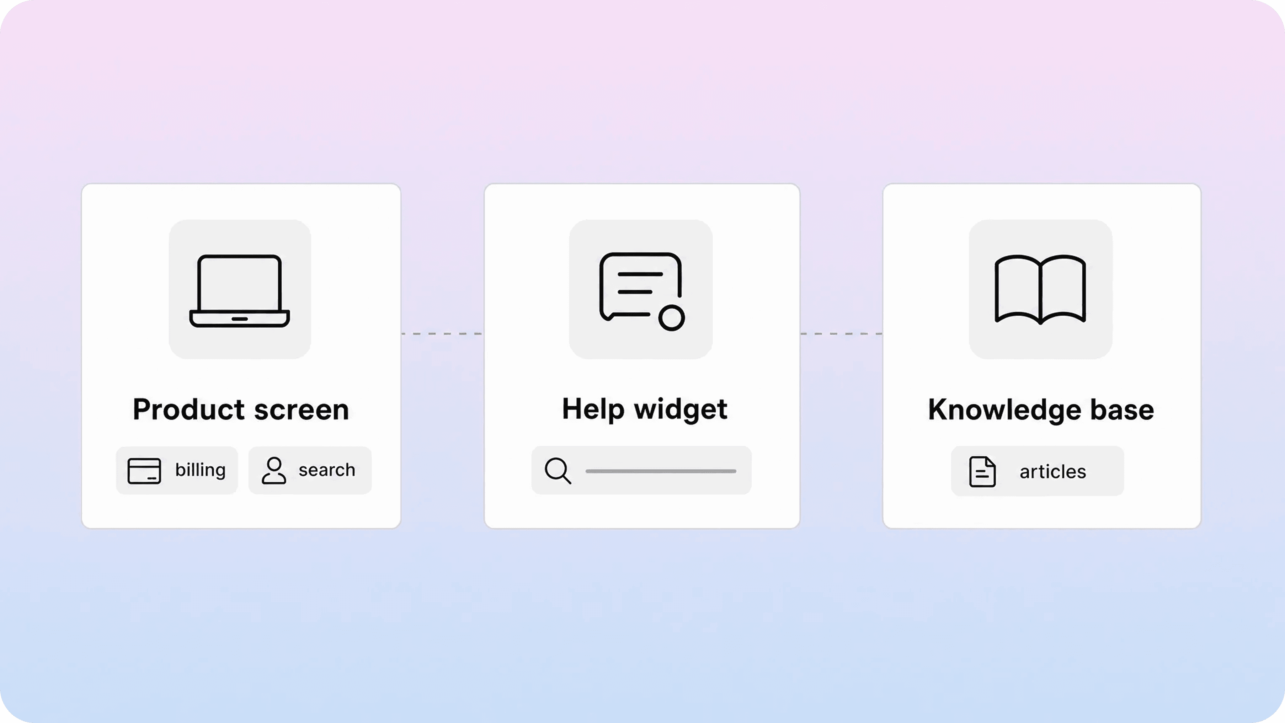
An in-app knowledge base is a searchable help experience that appears inside your product, website, portal, or app instead of sending users to a separate help center first. It usually opens from a help icon, support launcher, sidebar, command menu, or contextual link near the feature the user is trying to understand.
The important word is not only “in-app.” It is “knowledge base.” A tooltip can explain one field. A product tour can guide one setup path. A chat widget can start a conversation. An in-app knowledge base goes further: it gives users access to structured articles, search results, related answers, and next steps while they are still inside the task.
That makes it different from a public help center link in the footer. A public help center asks the user to leave the product, search from scratch, and translate their current problem into the right article. An embedded knowledge base keeps the help surface close to the moment of confusion. The user can search for “change invoice email,” read the article, and return to the billing screen without losing context.
This is why the best embedded knowledge base setups do not replace a full help center. They reuse it. The same articles can power the public help center, the help center widget, article suggestions, and support handoff. The team maintains one source of truth, while users get several entry points into the same content.
For teams already writing documentation in Notion, this is also where a dedicated Notion help center layer becomes useful. Notion remains the writing workspace, but the customer-facing experience can include better search, clearer categories, embedded access, and a more polished support path than a shared Notion page.
How embedded widgets make articles searchable
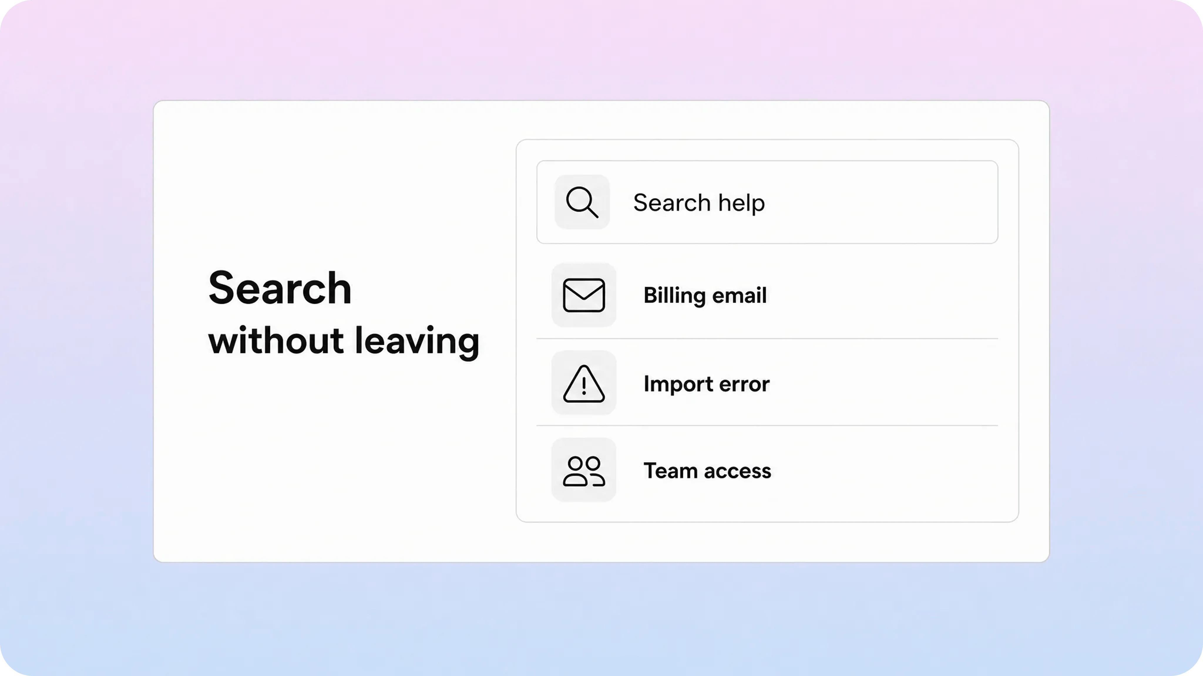
Most in-app knowledge base experiences start with a support knowledge base widget. The widget is usually installed with a small script, SDK, or product integration, then configured to show article search, popular articles, suggested articles, contact options, or some mix of those surfaces.
From the user’s point of view, the flow should feel simple:
Open the help widget from the current screen.
Type a question in their own words.
See article results without opening a new tab.
Read the answer inside the widget, drawer, modal, or side panel.
Return to the product action they were trying to complete.
Behind that simple flow, the team needs a few practical pieces. The search index has to include the right public or authenticated articles. Article titles need to match customer language, not only internal product labels. Short intros should confirm the reader is in the right place. Search results should show enough context to help the user choose without opening five articles.
This is where many embedded help projects fail. The team adds a help center widget, but the articles were written for internal precision instead of customer search behavior. Users search “receipt,” the article is titled “billing documents,” and the result feels missing even though the answer exists. The fix is not always a new widget. Often it is better titles, synonyms, cleaner categories, and attention to zero-result searches.
Good searchable in-app help also respects scope. A user on a billing page does not need every onboarding article at the top of the widget. A user in an integrations flow should not have to scroll past account-management content. Filters, collections, tags, product areas, and audience rules help keep search useful without making the user understand your full content model.
There is a technical side too. Some products can show the same public help center to everyone. Others need role-aware or account-aware content because certain articles apply only to admins, paid plans, students, merchants, or internal users. If the widget can access private articles, the permission model needs to be clear. Embedded help should make answers easier to find, not expose content to the wrong audience.
Suggested articles and contextual recommendations
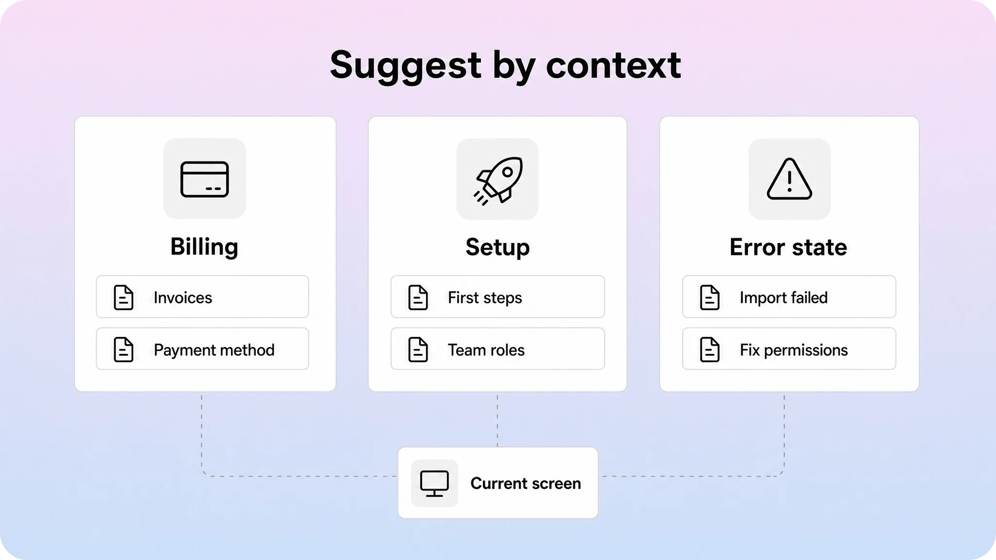
Search is powerful, but it still asks the user to do work. Suggested articles reduce that effort by offering likely answers before the user types anything.
Contextual recommendations can come from several signals:
the current URL or route
the product area, such as billing, onboarding, or integrations
the user role or plan
the current state, such as an empty list, failed payment, or setup error
the action the user just attempted
common tickets from the same screen
Zendesk’s contextual help model, for example, uses the page URL and help center content to suggest relevant articles in a web widget. Help Scout’s Beacon documentation describes ways to search, suggest, and open Docs articles through a JavaScript API so the help experience can react to what the user is doing. Those examples point to the same product principle: the article should appear where the question happens, not only after the user abandons the task.
That does not mean every screen needs a dense recommendation panel. The best in product knowledge base experiences are selective. A billing settings page might show two articles: update payment method and download invoices. An import error might open a targeted troubleshooting article. A blank integrations page might suggest a setup guide and a permissions article. The recommendations are useful because they are narrow.
This is also the main difference between an embedded knowledge base and general in-app contextual help. Contextual help can include tooltips, checklists, prompts, empty states, and short explanations. An embedded knowledge base is the content system behind the deeper answers. It gives the user a way to move from a small hint into a maintained article when the issue needs steps, screenshots, exceptions, or follow-up links.
Use contextual recommendations when the user’s intent is predictable. Use search when the intent is open-ended. Use both when the screen creates a common set of questions but users may still phrase them differently.
Navigation, reading, and escalation inside the product
An embedded help center still needs navigation. A widget that only shows a search box can work for urgent questions, but it leaves users stranded when they want to browse a category, compare related articles, or understand where they are in the help system.
A strong help center widget usually includes a few navigation basics:
Element | What it should do inside the product |
|---|---|
Search | Let users ask in their own words and see useful article results quickly. |
Categories | Give users a browse path when they do not know the exact phrase to search. |
Article view | Make the answer readable in a narrow panel without breaking the task. |
Related articles | Point to the next likely answer instead of forcing a new search. |
Contact path | Let users escalate when self-service has clearly not solved the issue. |
The contact path matters. Embedded help should not become a wall between the customer and the support team. If the article solves the issue, great. If it does not, the user should be able to contact support with the right context attached: the article they viewed, the search they tried, the screen they were on, and the account or feature area involved.
This is where an in-app knowledge base can improve both sides of support. Customers get a faster answer for simple problems. Agents get better context when a ticket still needs human help. Instead of “it does not work,” the ticket can include the page, route, attempted search, viewed article, and failed step.
The order of the experience matters too. Lead with self-service when the answer is likely to exist. Offer contact when the issue is account-specific, sensitive, blocked, or unresolved. Do not hide contact behind endless article loops. The goal is to reduce repetitive support, not punish users for needing help.
For more on the broader self-service path, the Helpview guide to reducing support tickets with a help center covers the loop behind this: identify repeat questions, improve article quality, improve findability, and surface the answer before someone opens a ticket.
Mobile behavior and embedded help constraints
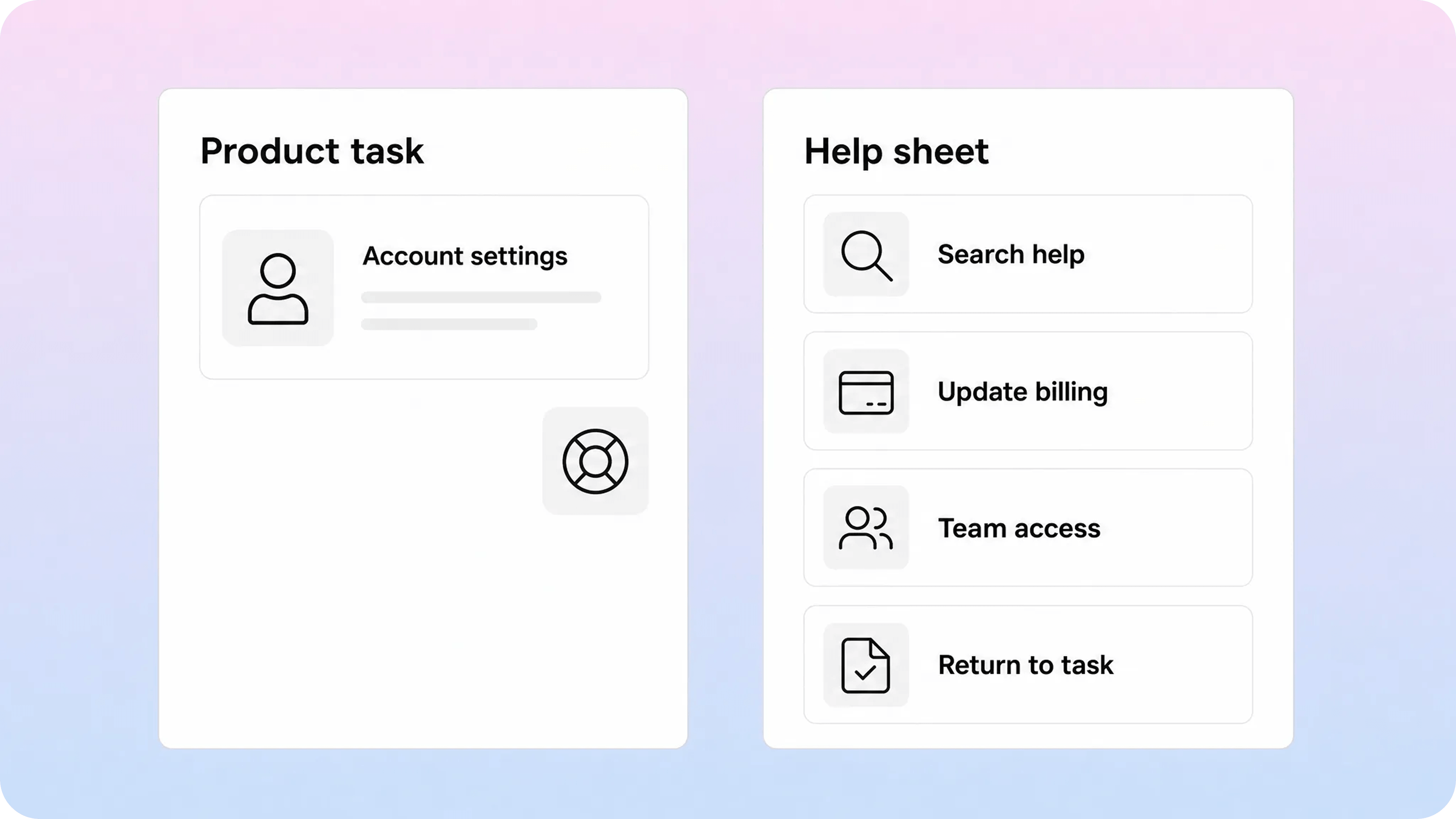
Mobile is where embedded help either becomes useful or gets in the way.
On desktop, a help center widget can open as a side panel while the user keeps the product screen visible. On mobile, the same pattern often becomes a full-screen sheet, bottom drawer, or separate view because there is not enough space to show the task and the article comfortably at once. That is not a failure. It just means the mobile design needs different rules.
A mobile in-app knowledge base should keep the launcher reachable without covering primary actions. It should use a large search input, readable article text, clear back behavior, and tap targets that do not fight the product UI. Long article pages should remain scannable, with short sections, visible headings, and related links that do not feel cramped.
There are also product constraints. A web widget inside a desktop browser may not behave the same way inside an iOS or Android app, especially if the product uses native screens, webviews, strict authentication, or custom navigation. Before choosing a widget, teams should check where it needs to appear: marketing site, logged-in web app, mobile web, native app, internal admin tool, or customer portal.
Mobile also raises a content question: should the full article open inside the widget, or should the widget show a short answer and link to the full help center? For quick questions, in-widget reading is better. For long setup guides, legal explanations, or screenshot-heavy articles, the better experience may be a compact summary followed by a full article link.
The safest rule is to design around interruption cost. If leaving the screen would make the user lose progress, keep the answer embedded. If the answer requires careful reading and the user can return safely, opening the fuller article may be fine. Either way, the user should not have to start the search again.
How to build an in-app knowledge base without creating a second help center
The biggest operational risk is duplication. Teams often start with a public help center, then add in-app snippets, widget-only answers, onboarding copy, agent macros, and AI answers that all say slightly different things. That feels fast at first, but it creates a maintenance problem. Users and support agents stop trusting the content because the answer depends on where they found it.
Treat the embedded knowledge base as another delivery surface for the same content system. The source article should still live in one maintained place. The widget, contextual suggestions, search results, and contact flow should point back to that source instead of becoming a separate content library.
A practical setup looks like this:
Choose the source of truth. Decide where help articles are written, reviewed, and updated.
Map product screens to likely questions. Start with billing, login, onboarding, setup, and other high-friction areas.
Improve article titles and intros. Match the words customers use in support conversations and searches.
Configure widget entry points. Decide where users can open help and which article groups appear first.
Add contextual suggestions carefully. Use screen, route, role, plan, or error state only when it improves relevance.
Connect escalation. Let users contact support with article and screen context when self-service does not solve the issue.
Review the data. Track searches, clicks, article feedback, contact-after-search behavior, and repeated tickets.
This is where knowledge base analytics becomes practical. You are not only measuring article views. You are checking whether users can find the right answer from the product surface where the question started. If many users open the widget from the billing page, search “invoice,” read nothing, and contact support, that is a specific improvement queue: title, article coverage, suggested article mapping, or product copy.
You can start small. Pick three screens that create repeat tickets. Add a help launcher or embedded panel. Map two or three articles to each screen. Watch what users search. Fix the content and routing before expanding. A small embedded knowledge base that works on high-friction screens is better than a widget everywhere with weak results.
For article consistency, pair this with a repeatable knowledge base article template. Embedded help is only as useful as the articles behind it. If articles are long, vague, outdated, or inconsistent, the widget will simply make bad content easier to open.
Where Helpview fits
Helpview is useful for teams that already keep support docs in Notion but need those docs to work like a real customer help center. Instead of asking customers to browse raw Notion pages, teams can turn Notion content into a searchable, structured, branded help center with clearer browsing paths and a more polished reading experience.
That matters for in-app help because the widget should not be a separate writing workflow. If your team already updates documentation in Notion, the best embedded help setup is usually to keep Notion as the source and publish the customer-facing layer from there. The public help center, embedded help center, suggested articles, and support paths should all point to the same maintained content.
Helpview’s angle is simple: write where the team already works, then give customers a better surface for finding answers. For an in-app knowledge base, that means support articles can become easier to search, easier to browse, and easier to surface near the product moments where users need them.
Conclusion
An in-app knowledge base works when it is treated as part of the product experience, not a small help bubble added at the end. The real value comes from connecting maintained articles to the user’s current task through search, suggested articles, contextual recommendations, readable in-widget articles, and a contact path that carries context when self-service is not enough. Start with the screens that create the most repeated questions, keep the content source unified, and improve the embedded help experience from real search and support data.
Frequently asked questions
What is an in-app knowledge base?
An in-app knowledge base is a searchable help experience inside a product, app, portal, or website. It lets users find and read support articles without leaving the screen where they need help. It may appear as a widget, side panel, drawer, modal, or embedded help surface.
What is the difference between an in-app knowledge base and a help center widget?
Should embedded help replace a public help center?
How do you make help articles searchable inside an app?
What should happen when the article does not solve the issue?
Share article:

2 free months of Pro
Turn Notion pages into help center answers.
Keep writing in Notion and publish a real, searchable Notion help center.

Articles
Keep reading