Tips
7 best help center examples and what they get right

10 Min read
A lot of companies have a help center, but far fewer have one that genuinely helps people solve problems without opening a ticket. That is the gap this article is about. The best help center examples are not just tidy or on-brand. They make answers easier to find, easier to follow, and easier to trust. They use clear categories, prominent search, readable articles, and smart next steps to turn self-service into something that actually works. In this post, we break down seven strong examples and pull out the patterns behind them, not just what looks good, but what helps users move from problem to answer with less friction.
Share article:


What makes the best help center examples worth studying
A lot of support content looks finished long before it is actually useful. That is the gap between a real help center and a docs graveyard. A docs graveyard stores information. A strong help center helps someone solve a problem fast, without making them think too hard about where to click, what to search, or which article might maybe have the answer.
So before getting into examples, it helps to set the bar.
A genuinely useful help center usually gets five things right:
Findability: users can reach the right answer quickly through search, categories, or both
Clarity: articles are written in plain language, with obvious steps and outcomes
Structure: topics are grouped in a way that matches user intent, not internal team org charts
Consistency: page layouts, naming, and article depth feel predictable across the whole experience
Support deflection potential: the content actually reduces repeat questions instead of sending people back to support
That last point matters most. The best help center examples are not just tidy. They are built for self-service. And when that self-service is structured well, it can directly reduce support tickets instead of just storing answers in one place.
It is also worth looking past aesthetics. Nice branding can make a help center feel polished, but polish is not the same as usability. A beautiful homepage with vague categories, weak search, and half-finished articles will still create friction. What matters more is the underlying logic: how content is grouped, how users move from homepage to category to article, and how easy each page is to scan.
That is the lens for the examples in this post.
“Best” here does not mean biggest brand or flashiest design. It means useful, navigable, readable, and clearly built to help people find answers on their own. The examples were chosen for the things that actually shape the experience: structure, search, navigation, and article clarity.
A good help center should not just look organized. It should make getting help feel easy.
Best help center examples to learn from
The best help center examples do not all look the same. That is the point. Different products, audiences, and support volumes call for different decisions. What stays consistent is the underlying logic: clear paths in, clear paths through, and clear answers at the end.
Example 1: Airbnb
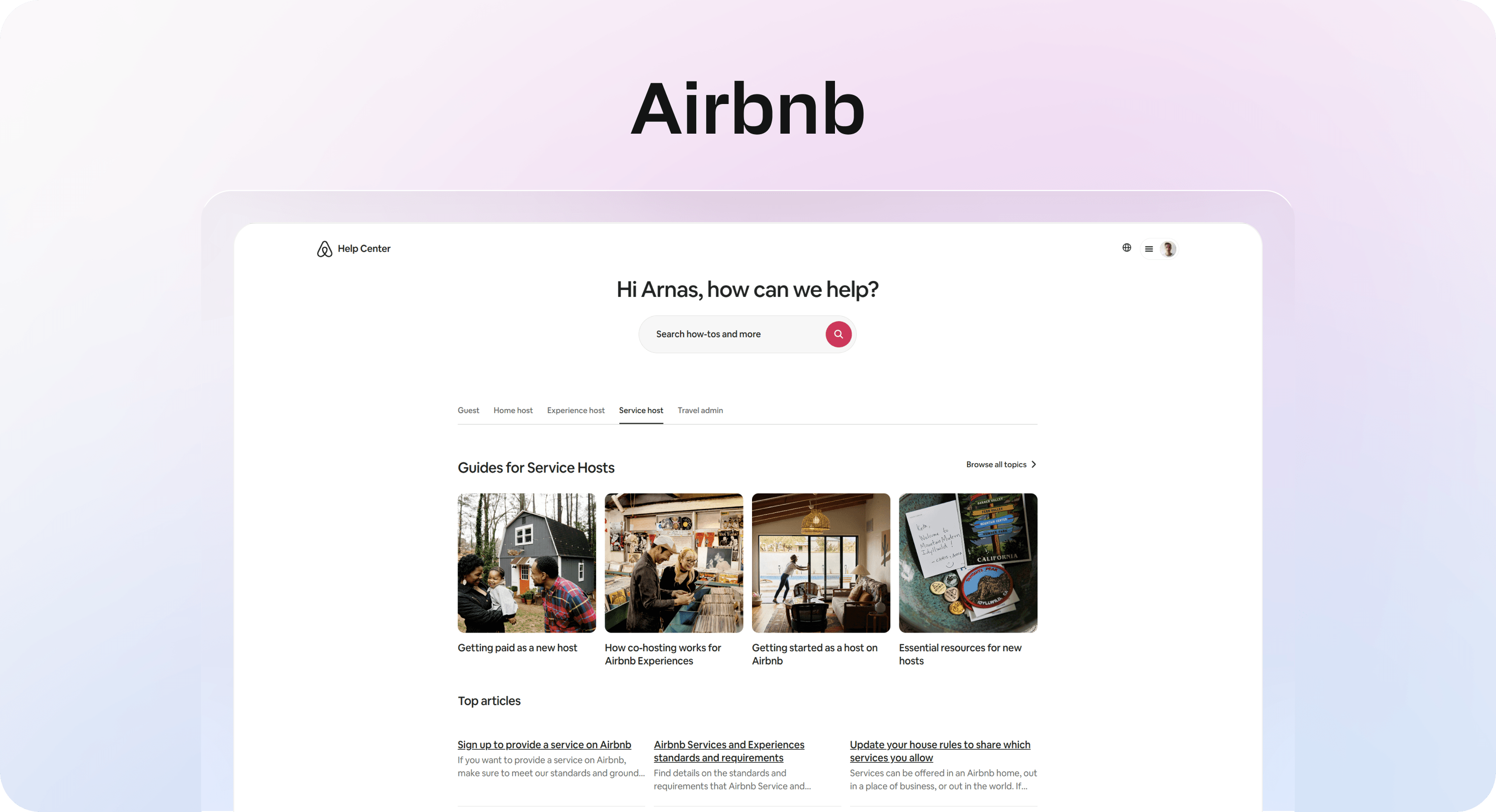
Airbnb is strong at narrowing. You land with a broad problem, then move quickly into a more specific one without feeling buried under options. Its Help Center also makes it easy to scan major topics and narrow down by context, which is exactly what high-volume support environments need.
What stands out:
category flow is built around common user needs, not internal terminology
homepage organization helps users self-sort fast
the path from broad topic to answer feels guided, not cluttered
The lesson is simple: a help center works better when users can reduce ambiguity in a few clicks.
Example 2: Notion
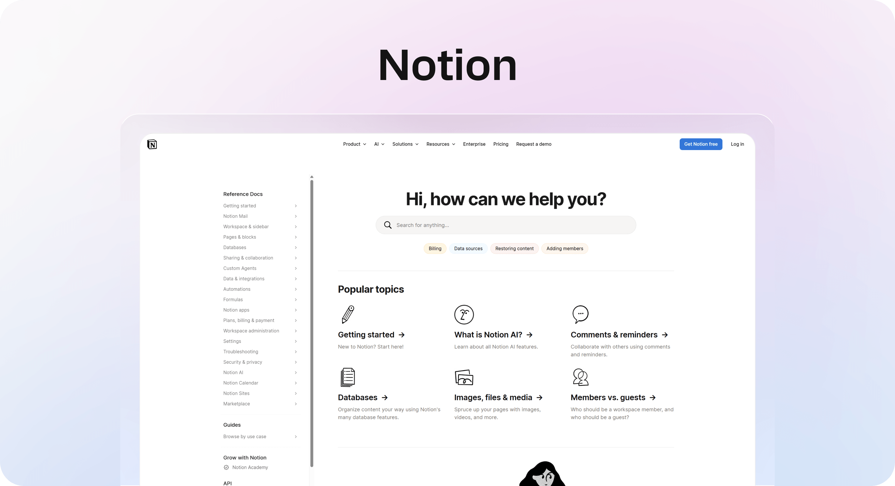
Notion is a good reminder that calm design can support clarity instead of competing with it. The structure feels light, but not empty. In Notion’s help center, the information architecture stays clean, and the article layouts feel readable without trying too hard to impress.
What works:
information architecture stays clean and restrained
article layouts are readable, with enough spacing and hierarchy to reduce friction
branding is present, but it never overpowers the content
This is useful for teams that want a polished help center page without turning it into a design exercise.
Example 3: Intercom
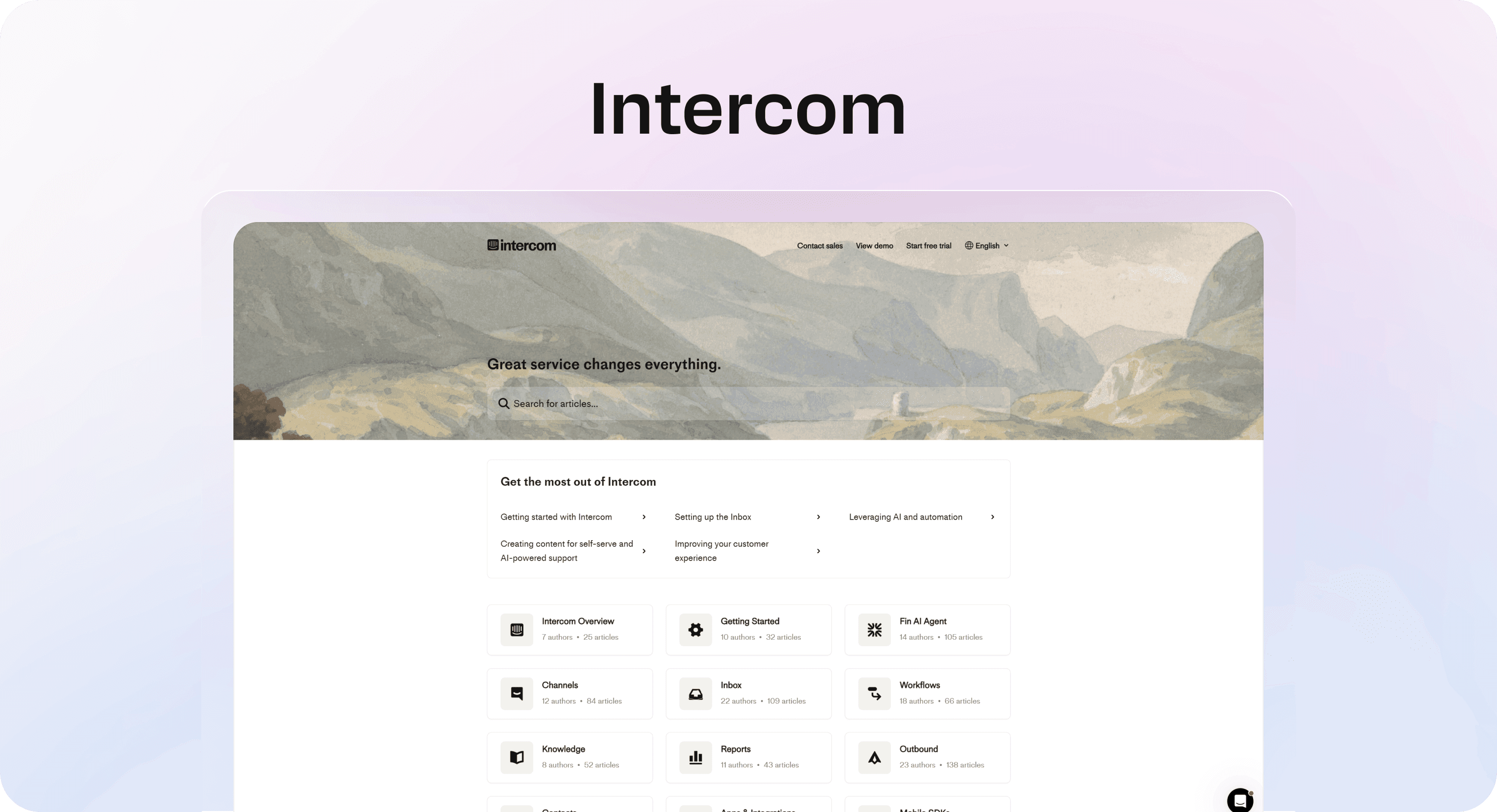
Intercom puts search to work early. It treats it like a primary route, not a secondary feature hiding in the corner. In Intercom’s help center, article discovery is front and center, and the support handoff feels intentional rather than bolted on later.
What makes it effective:
search is prominent from the start
articles are grouped in a way that supports common support journeys
support handoff feels intentional when self-service is not enough
That is why Intercom help center examples keep showing up in this conversation. They are built around real user flow, not just article storage.
Example 4: Zendesk
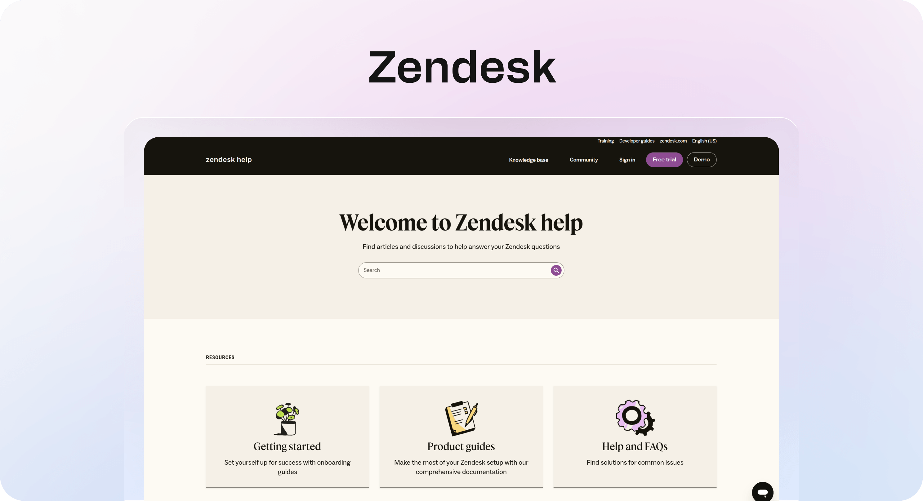
Zendesk shows how a large, deep help center can still stay usable if the category logic is strong. Browse Zendesk’s support center and you can see how a broad content library can still feel structured instead of sprawling.
What to study:
structure depth without total sprawl
clear grouping between product areas, account help, and support workflows
navigation that supports large content libraries
When people look for Zendesk inspiration, they are usually looking for exactly this: how to keep a big support system understandable.
Example 5: Stripe
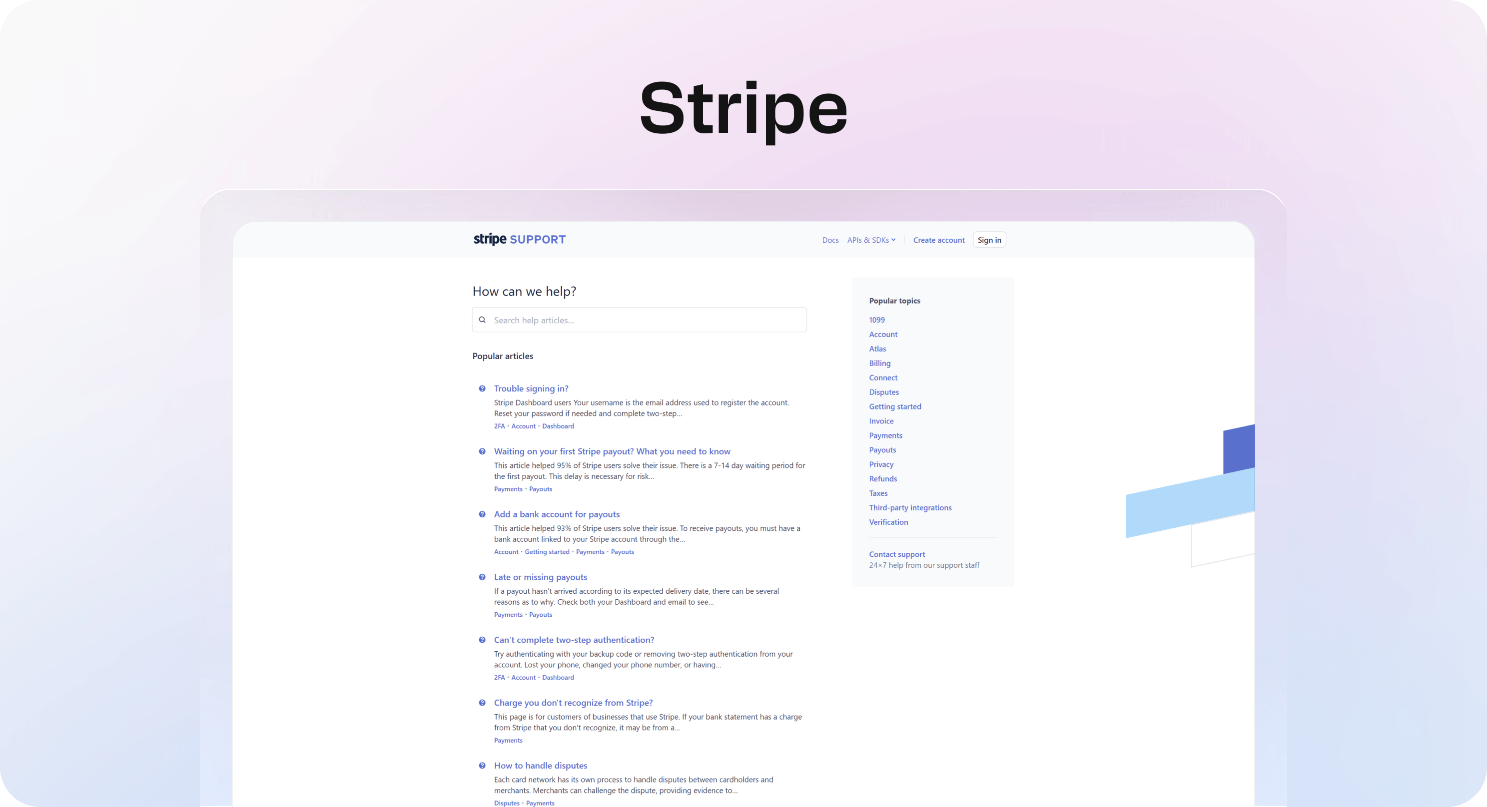
Stripe is one of the clearest examples of technical content done well. It handles complexity without making the reader feel lost. In Stripe’s support center, dense topics still feel approachable because the content is broken into clear paths, readable steps, and focused troubleshooting flows.
What stands out:
article scannability is strong even when topics are dense
layout supports step-by-step comprehension
paths through setup, troubleshooting, and implementation feel deliberate
For product and developer-focused teams, this is the lesson: technical depth does not excuse weak structure.
Example 6: Slack
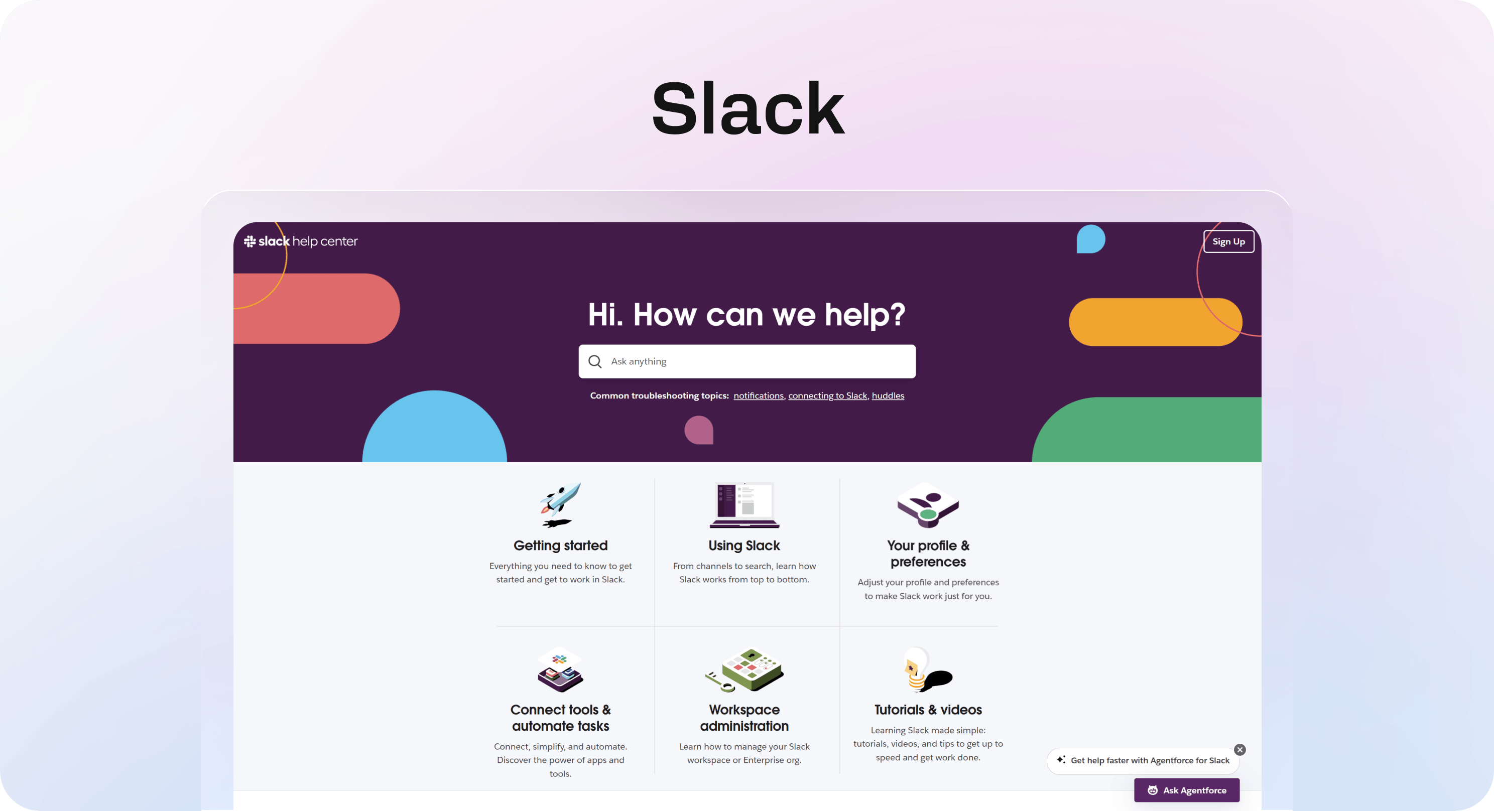
Slack is especially good at using plain language. It does not make support content sound smarter than it needs to be. In Slack’s help center, the task-based organization and straightforward wording make common issues feel easier to solve.
What works:
task-based organization around common problems
simple wording that reduces hesitation
quick pathing for everyday support needs
This is easy to underestimate. A lot of knowledge base examples look polished but still make users work too hard to decode the wording.
Example 7: Shopify
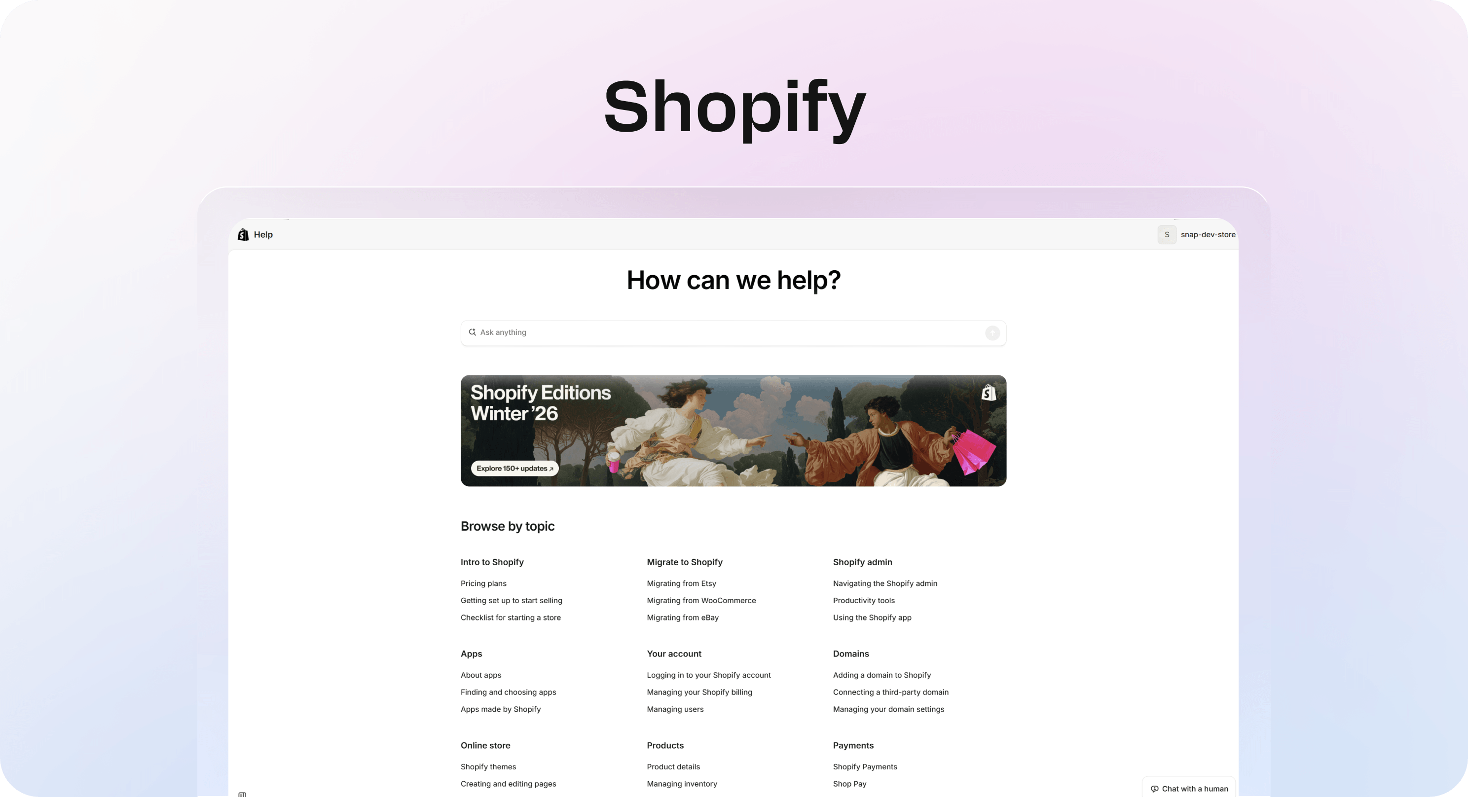
Shopify handles scale by separating needs clearly. New merchants, growing stores, and operational questions all have different support jobs, and the structure reflects that. In Shopify Help Center, the sections for setup, troubleshooting, and day-to-day store operations are clearly divided, which matters when support needs evolve quickly.
What to borrow:
clear sections for setup, troubleshooting, and ongoing operations
useful support pathways for high-volume ecommerce questions
structure that respects both discovery and speed
For fast-moving teams, especially in ecommerce, this is a strong model for balancing breadth with usability.
Example | What it does especially well | Best lesson to borrow |
|---|---|---|
Airbnb | Fast issue narrowing | Reduce ambiguity early |
Notion | Calm, readable structure | Keep branding secondary to clarity |
Intercom | Search-first self-service | Make search a main route |
Zendesk | Deep but usable navigation | Scale categories carefully |
Stripe | Clear technical guidance | Make dense content scannable |
Slack | Plain-language support | Write for speed, not impressiveness |
Shopify | Support at operational scale | Separate core support journeys cleanly |
Quick example:
If your current help center has one giant “Getting started” section, vague category names, and article titles that only make sense to your team, these examples are useful because they show the opposite. The common thread is not style. It is friction removal.
That is what makes the best help center examples worth studying in the first place.
The design patterns these help center examples share
Once you strip away brand colors, illustration styles, and layout polish, the strongest help centers start to look surprisingly similar. That is useful. It means good support UX is less about copying a visual style and more about repeating a few decisions that make answers easier to find.
And if you are still choosing what to build on, our guide to the best help center software compares seven tools based on search, publishing quality, support workflow fit, and Notion-friendly content operations.
Clear category structure beats endless menus
The best help centers group content by user intent, not by how the company is organized internally.
That sounds obvious, but it is where a lot of teams go wrong. They create categories around product teams, feature names, or internal language. Users do not think that way. They are usually trying to do something specific:
change billing details
fix login access
connect an integration
track an order
update account settings
Strong knowledge base categories examples usually reflect those jobs clearly. Instead of forcing users to decode your product map, they give them a faster route to the outcome they want.
A simple test helps here: if a first-time visitor lands on your help center page, can they tell where to click in under five seconds?
If not, the structure probably serves the company more than the customer.
Search is treated like the main route, not a backup
The strongest examples do not treat search like a small utility sitting in the corner. They make it central because they know many users arrive with a question already formed in their head.
That changes the job of the page. A help center homepage is not just a directory. It is often a starting point for search-first behavior.
Good patterns here are simple:
place search high on the page
make it visually obvious
support natural wording, not just exact product terms
use article titles that match how users ask questions
This matters because users rarely want to browse longer than necessary. They want to type a problem, scan a few likely matches, and get to the answer fast.
If search is weak, everything else has to work harder. That is also why help center SEO is not just a traffic topic. It affects whether people can actually find the right answer in the first place.
Article layouts are built for scanning
A strong homepage cannot save a weak article.
That is why the best help centers put just as much thought into article readability as they do into navigation. Once someone clicks through, the page should make progress feel easy.
The patterns show up again and again:
clear headings
short paragraphs
numbered steps where order matters
screenshots where context helps
summaries or troubleshooting notes where confusion is common
next actions when the main fix does not solve it
This is where a lot of self-service breaks. The answer exists, but it is trapped inside a wall of text.
A good article should help users do three things quickly: confirm they are in the right place, follow the steps without rereading, and know what to do next if the issue is not resolved.
Every page has a clear next move
Good help centers do not leave users stranded at the bottom of an article.
They reduce dead ends with helpful continuation points:
related articles
breadcrumbs back to the broader topic
links to connected setup steps
a contact path when self-service is not enough
This matters more than it seems. When users hit a dead end, confidence drops fast. They stop trusting the help center, even if the content itself was decent.
The best examples keep momentum going. They guide the user to the next likely step instead of making them start over.
Quick example:
A user reads an article about fixing team invite issues. A weak help center ends there. A strong one adds links to permission settings, workspace management, and contact support if the issue is account-specific.
That small difference is often what makes self-service feel complete rather than frustrating.
If you are building in Helpview or any other modern knowledge base, this is the pattern to keep in mind: every page should answer the current question and smoothly support the next one.
How to judge whether a help center example is actually good
A help center can look polished and still fail at its actual job. That is why the fastest way to judge one is not by asking whether it looks modern. It is by asking whether a new user can solve a basic problem without friction.
Check how fast a new user can find a basic answer
Start with simple tasks, not edge cases.
Try common support questions like:
how to reset a password
how to update billing details
how to connect an integration
how to track or return an order
how to change account permissions
Then watch how long it takes to reach a useful answer.
This is a better benchmark than homepage polish because it measures what users actually experience. It also aligns with the practical checks in our guide to help center best practices, where structure and findability matter more than visual polish alone.
A strong help center usually lets a first-time visitor do three things quickly:
identify the right topic
trust that the article matches their problem
follow a clear path to resolution
If that takes too long, the structure is probably not doing enough work.
Look for structural clarity, not just visual polish
Clean UI can create a false sense of quality.
A lot of help and support page design looks good in screenshots because it uses whitespace, good typography, and branded visuals. But that does not automatically mean the experience is clear. If categories are vague, article titles are generic, or navigation feels too broad, the support UX is still weak.
That is the real test: does the design improve comprehension?
Look for signs that it does:
categories reflect user questions clearly
the hierarchy makes scanning easy
headings tell users exactly what they will get
the page reduces choices instead of multiplying them
Good help center design is not about looking minimal. It is about making the next move obvious.
Review article consistency across categories
One excellent article can hide a messy system.
That is why it is worth checking multiple categories before deciding a help center is strong. If one section is clear and another feels thin, outdated, or oddly structured, the overall experience is not reliable yet.
Consistency usually shows up in a few places:
article titles follow a predictable pattern
content depth feels appropriate across similar topics
templates are reused well
screenshots, steps, and summaries appear where users expect them
tone stays steady across different sections
This matters because users do not experience your content as isolated pages. They experience it as a system. If each section feels like it was written by a different team with a different standard, trust drops fast.
Test whether the experience supports self-service end to end
The real benchmark is the full journey.
A good help center is not just a nice homepage or a few solid articles. It is a connected self-service flow from start to finish:
homepage helps users choose a route
category pages narrow the problem cleanly
article pages answer the question clearly
escalation paths appear only when needed, and in the right place
That end-to-end view matters because support efficiency depends on more than content quality alone. If the user has to restart their search, bounce between vague categories, or contact support because the next step is unclear, repeat questions will keep coming.
Quick example:
If someone lands on your homepage with a billing issue, they should be able to move from search or category to article to next step without second-guessing the path. That is the standard worth copying from the best help center examples.
When judging any help center, focus less on whether it looks impressive and more on whether it helps users finish the job.
What different teams can take from these examples
The best help center examples are useful because they solve different support jobs in different ways. You do not need to copy an enterprise setup page for page. You need to borrow the patterns that match your product, your users, and the questions your team keeps answering every week.
For SaaS teams
SaaS support usually revolves around recurring friction points: onboarding, account setup, billing, permissions, integrations, and troubleshooting. That makes structure especially important.
A strong SaaS help center should make those journeys obvious from the start:
getting started
account and workspace setup
integrations and technical connections
billing and plan management
troubleshooting and known issues
This matters for more than support load. Good self-service also helps product adoption. When users can find setup answers quickly, they move faster, get value earlier, and rely less on reactive support.
That is where strong help center examples are especially practical. They show how to reduce repeat tickets by turning common blockers into easy-to-find, easy-to-follow content, which is exactly what we cover in how to reduce support tickets with a help center. If you want to see how that applies to product-focused teams specifically, our page on a Notion help center for SaaS shows the same logic in a more concrete SaaS setup.
For ecommerce teams
Ecommerce support has a different rhythm. Questions tend to come in waves, and the volume can spike fast around promotions, holidays, launches, and shipping delays.
That changes what a help center needs to do well.
The core categories usually need to be very clear:
orders and tracking
shipping and delivery
returns and refunds
subscriptions
payments
product or store policies
Category clarity matters even more here because users often arrive stressed and want answers quickly. They are not browsing for context. They are trying to solve one urgent issue.
A cluttered structure creates more tickets at exactly the moments when support teams can least afford it.
For devtools and technical products
Technical products need deeper documentation, but the best knowledge base examples show that depth does not have to create friction.
What matters most is how the content is broken down:
setup and authentication
integrations and environments
API or implementation guidance
troubleshooting and error resolution
edge cases and limitations
Users in technical products also search differently. They are more likely to use specific terms, code language, or exact error phrasing. That means article titles, headings, and structure need to support that behavior.
A strong technical help center does not just contain the answer. It makes dense answers easier to scan, verify, and act on.
For internal support and operations
Internal support content often gets treated like a lower-priority version of customer-facing help. That is usually a mistake.
Internal knowledge base examples and IT support knowledge base examples still benefit from the same core principles:
clear categories
predictable article templates
useful search
obvious next steps
The difference is mostly in the subject matter. Instead of billing or shipping, internal teams may be looking for device setup, office tools, access permissions, HR workflows, or onboarding steps.
But the user behavior is similar. People still want the shortest path to the right answer.
Quick example:
If a new hire is trying to get access to core tools on day one, weak internal docs create delays immediately. Strong internal help content makes the process feel clear, fast, and repeatable. For agencies and studios, a similar pattern applies to onboarding docs, handover notes, and shared client answers. A Notion help center for clients and projects shows how that kind of information can live in one cleaner structure.
That is the bigger lesson across all these examples: the best help center patterns are flexible. Whether you support customers, merchants, developers, or employees, the same fundamentals still win.
Common mistakes teams make when copying help center examples
A strong help center can be inspiring. It can also be misleading if you only copy what is visible on the surface. That is where a lot of teams slip. They borrow the look of a polished support experience but miss the decisions underneath it. The result is something that feels organized from a distance and frustrating up close.
Copying layout without copying information logic
Screenshots are easy to imitate. Information logic is not.
You can copy a hero search bar, a three-column category grid, or a clean article layout in a day. What takes more thought is the structure behind it: why those categories exist, how articles are grouped, what terminology is used, and how users are expected to move through the system.
That is the part worth studying.
When reviewing help center examples, ask:
why these categories, not others?
why this order?
why this wording?
what user problem is each section trying to reduce?
If you skip those questions, you risk building something that looks polished but still forces users to guess where to click.
Overloading the homepage with too many choices
A help center homepage should reduce friction, not create a second navigation problem.
One common mistake is trying to surface everything at once:
too many categories
too many featured links
too many banners
too many promo blocks
too many widgets competing for attention
The intention is understandable. Teams want to be helpful. But when every topic is treated like a priority, the page becomes slower to parse.
A better approach is to prioritize the top intents first. Put the most common support tasks front and center, then let the rest sit one level deeper. That usually creates a faster path for more users and makes the whole experience feel calmer.
Writing articles that answer half the question
This is one of the most expensive mistakes because it creates the illusion of self-service.
The article exists. The topic is covered. But the user still ends up contacting support because the content only answers half the problem.
Common signs:
vague intros that delay the actual answer
missing steps in the middle of a process
no screenshots where context would help
no troubleshooting guidance when something goes wrong
no explanation of what success should look like
Incomplete content does not reduce tickets. It often creates more, because users arrive at support already annoyed and only partially informed.
If an article solves the ideal scenario but ignores the common failure points, it is not finished.
Treating search as a box to tick
Search is not just a feature you add because every help center has one.
Weak search can quietly undermine an otherwise decent knowledge base. Even with good categories, a lot of users will still type first. If search results are poor, they lose trust fast.
Search quality depends on more than the tool itself. It is shaped by:
article titles
headings
the exact words used in the body
how clearly topics are separated
whether common phrases match how users actually ask for help
Quick example:
If users search “change invoice email” but your article is titled “update billing contact preferences,” the answer may exist and still feel invisible.
That is why search should be treated as a content problem as much as a product feature. Good help centers align titles, wording, and structure so search works like a shortcut, not a dead end. It is also why a lot of useful help center SEO work starts with titles, structure, and query matching rather than publishing more pages.
Quick checklist for building a better help center after reviewing these examples
If you have read through a few strong help center examples and thought, “ours is not terrible, but it still feels harder than it should,” this is the section to use. You do not need a full content overhaul on day one. You need a quick way to spot where friction is hiding.
Homepage and category checks
Start at the front door.
Ask:
is search obvious the moment the page loads?
are categories grouped by user tasks and questions, not internal team language?
can a first-time visitor tell where to click in a few seconds?
are the top support topics clearly prioritized?
If the homepage feels busy, vague, or too broad, users will hesitate before they even begin.
Article quality checks
Then click into a few common support articles.
Check whether they are:
easy to scan
up to date
focused on action, not filler
clear about what the user should do next
Strong articles usually include:
direct headings
steps where sequence matters
screenshots where context helps
a clear result or expected outcome
links to the next useful resource when needed
If users have to reread paragraphs to figure out the point, the content is doing too little work.
Self-service flow checks
Now test the experience as one journey.
Can users solve common issues without contacting support? Do related articles, breadcrumbs, or escalation options appear before they get stuck? Does moving from homepage to article feel smooth and predictable?
This is often where weak help centers break. Individual pages may be fine, but the overall flow still feels patchy.
Maintenance checks
Finally, check whether the system can stay useful as it grows.
Ask:
do categories still make sense as more content gets added?
do article templates stay consistent across sections?
is outdated content reviewed before it quietly becomes misleading?
does ownership exist, or is the help center only updated reactively?
Mini template:
Use this as a fast internal audit:
Red: hard to find, outdated, inconsistent
Amber: usable, but unclear in places
Green: easy to find, easy to scan, easy to act on
If you are publishing from Notion in Helpview or a similar setup, this kind of review is easier to maintain because structure and updates stay closer to the source content. For a broader audit lens, it also helps to review your help center SEO basics alongside structure and content quality.
Frequently asked questions
What makes a good help center example?
A good help center example is easy to navigate, easy to search, and easy to read once you land on an article. The strongest ones do not just look polished. They help users get from problem to answer with less friction. The most useful patterns to borrow are clear categories based on user questions, prominent search, article titles that match real wording, and scannable layouts with steps, visuals, and next actions. That is the real benchmark. If a help center helps users solve common problems quickly and confidently, it is worth studying.
What should a help center include?
What is the difference between a help center and a knowledge base?
How many categories should a help center have?
What are the best help center websites to learn from?
Share article:

2 months free
Turn Notion pages into help center answers.
Keep writing in Notion and publish a real, searchable Notion help center.

Articles
Keep reading