Tips
7 documentation website examples and what good docs sites get right

10 Min Read
Strong documentation websites do more than publish articles. They help users find the right path, understand the next step, and trust the answer they land on. These documentation website examples show what good docs sites get right across structure, search, technical depth, help content, and self-service UX.
Share article:


What makes a documentation website worth studying
A documentation website is not good because it has a clean homepage. It is good when a user can arrive with a question, choose the right path, and leave with enough confidence to act.
That is the difference between a docs site and a folder of published pages. A folder stores information. A documentation website creates a self-service experience around that information.
The strongest documentation examples usually get a few things right:
Clear entry points: users can start from a product, task, role, problem, or search query
Predictable structure: pages follow familiar patterns instead of changing shape every time
Scannable articles: headings, lists, steps, and examples make the answer easy to inspect
Useful depth: simple answers stay short, while technical topics go deep without becoming a wall of text
Next steps: related links, setup paths, and troubleshooting routes help users keep moving
Maintenance signals: the docs feel current, organized, and owned
This matters whether you are building customer support docs, public product documentation, developer docs, an external knowledge base, or internal software documentation. The surface can look different, but the job is similar: reduce the effort it takes to find and use an answer.
It is also why documentation websites overlap with help centers and knowledge bases. A help center usually focuses on customer support journeys. A knowledge base focuses on reusable answers. A technical documentation site may include API references, SDK guides, release notes, and developer workflows. In practice, a mature documentation website often blends all of these into one structured experience.
For Helpview’s audience, the useful question is not “Which site should we copy?” It is “Which patterns would make our own Notion docs easier to browse, search, and trust?”
7 documentation website examples to learn from
The best documentation website examples do not all solve the same problem. Some are technical. Some are product-led. Some are closer to help centers. That range is useful because most teams need more than one kind of documentation as they grow.
Example 1: Stripe docs
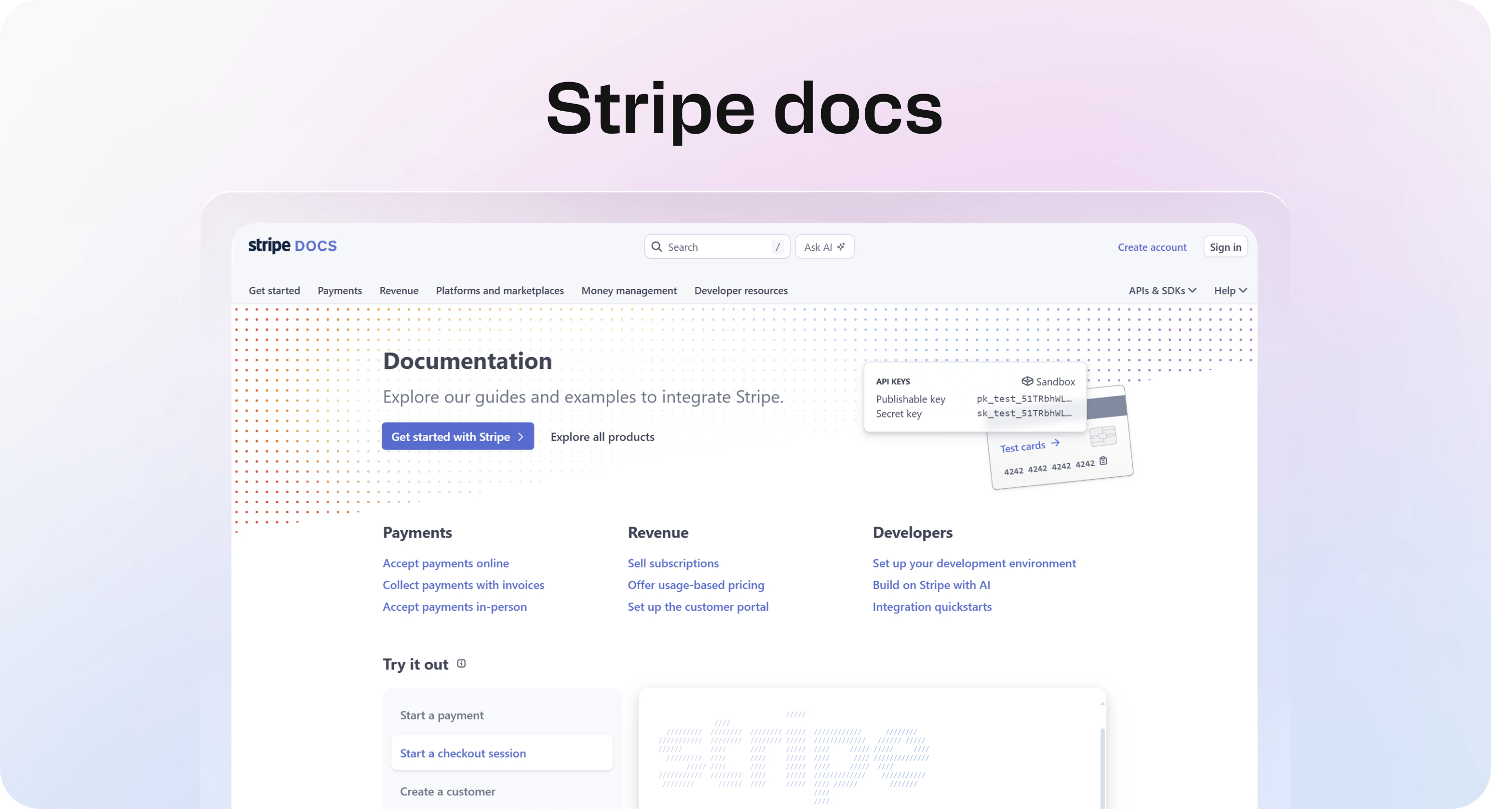
Stripe docs are one of the strongest technical documentation examples because they organize a complex product around concrete jobs. The homepage does not only list products. It also gives users use-case paths such as accepting payments online, selling subscriptions, setting up a development environment, and exploring integration quickstarts.
That matters because Stripe serves different readers at once: founders, developers, finance teams, product teams, and operations teams. A weaker docs site would force everyone into one product map. Stripe gives readers practical routes based on what they are trying to do.
What Stripe gets right:
use-case entry points sit beside product navigation
technical topics are broken into focused guides
quickstarts help readers reach a working first step
dense product areas still feel organized
developer tasks and business outcomes are connected
The lesson to borrow: do not make users understand your product architecture before they can find an answer. If people usually arrive with a goal, make those goals visible on the docs homepage.
Example 2: GitHub Docs
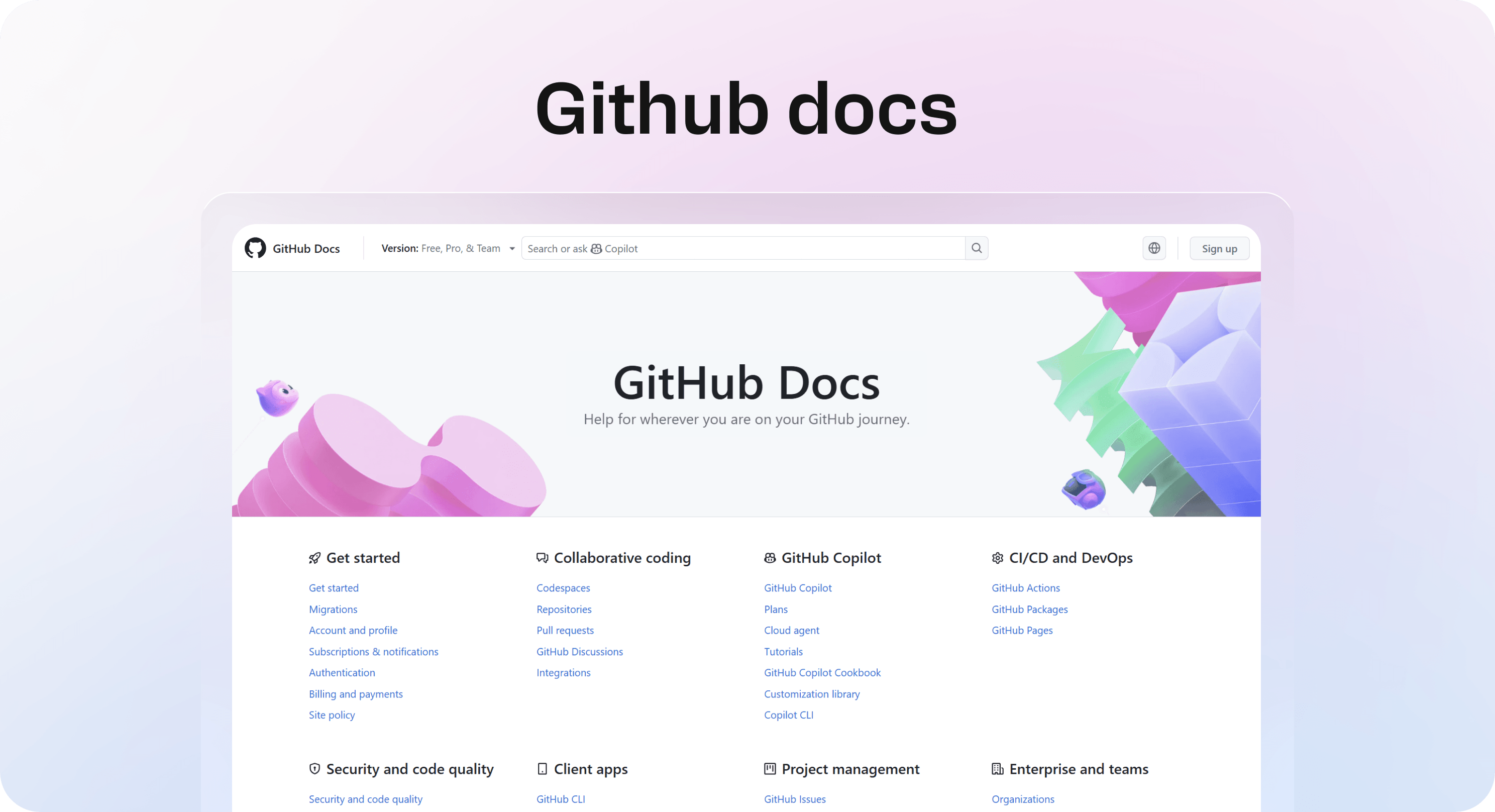
GitHub Docs works well because it has to support an unusually wide range of users without collapsing into chaos. A beginner learning repositories, an enterprise admin setting up policies, a developer building with the REST API, and a team configuring GitHub Actions all need different paths.
The site handles this by separating major areas clearly: getting started, accounts, authentication, repositories, organizations, security, pull requests, Actions, Copilot, Codespaces, APIs, webhooks, and more. That breadth could feel overwhelming, but the labels are specific enough to help users self-select.
What GitHub gets right:
broad documentation is split into recognizable product and task areas
beginner, admin, developer, and policy content each has a clear home
technical reference is not mixed randomly with onboarding articles
search and navigation support a large content library
article titles are direct and descriptive
The lesson to borrow: if your documentation is growing, do not solve everything by adding more articles to the same category. Add structure before the library becomes hard to use.
Example 3: Notion help center
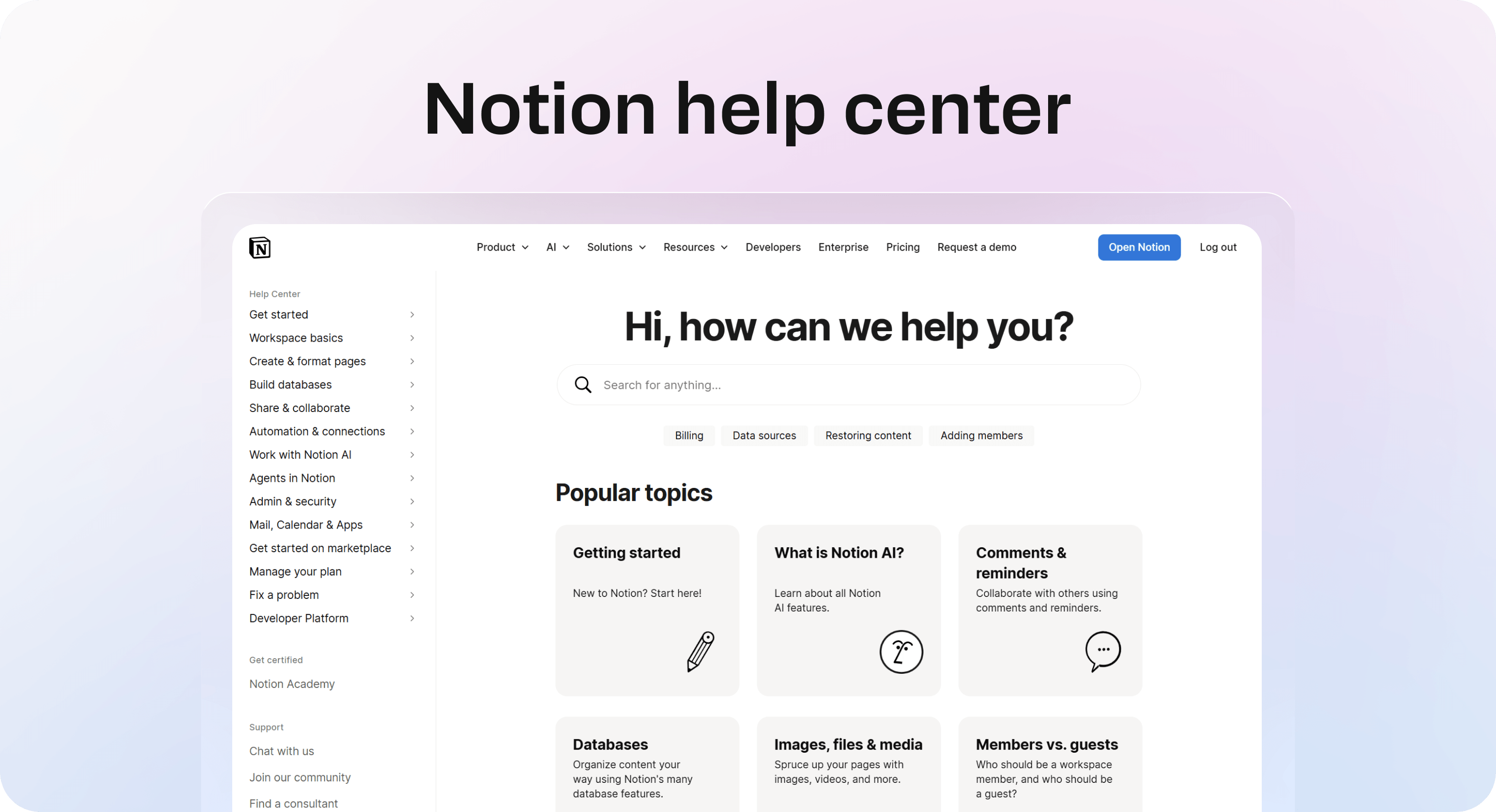
Notion’s help center is a useful documentation website example because it makes a flexible product feel calmer. Notion can be used for notes, databases, wikis, projects, AI workflows, team collaboration, and file organization. That flexibility creates a documentation challenge: different users describe the same product in different ways.
The help center handles this with simple popular topics, clean category language, and a readable homepage. Topics such as getting started, databases, comments and reminders, images and files, members and guests, and Notion AI give readers a way to start without learning internal product labels first.
What Notion gets right:
popular topics give casual users a fast starting point
category labels are plain and recognizable
the homepage feels calm instead of overloaded
learning content is separated from support content where useful
the design supports reading instead of competing with the answer
The lesson to borrow: documentation for a flexible product should reduce choice. Make the most common paths obvious before asking users to browse a full library.
Example 4: Slack help center
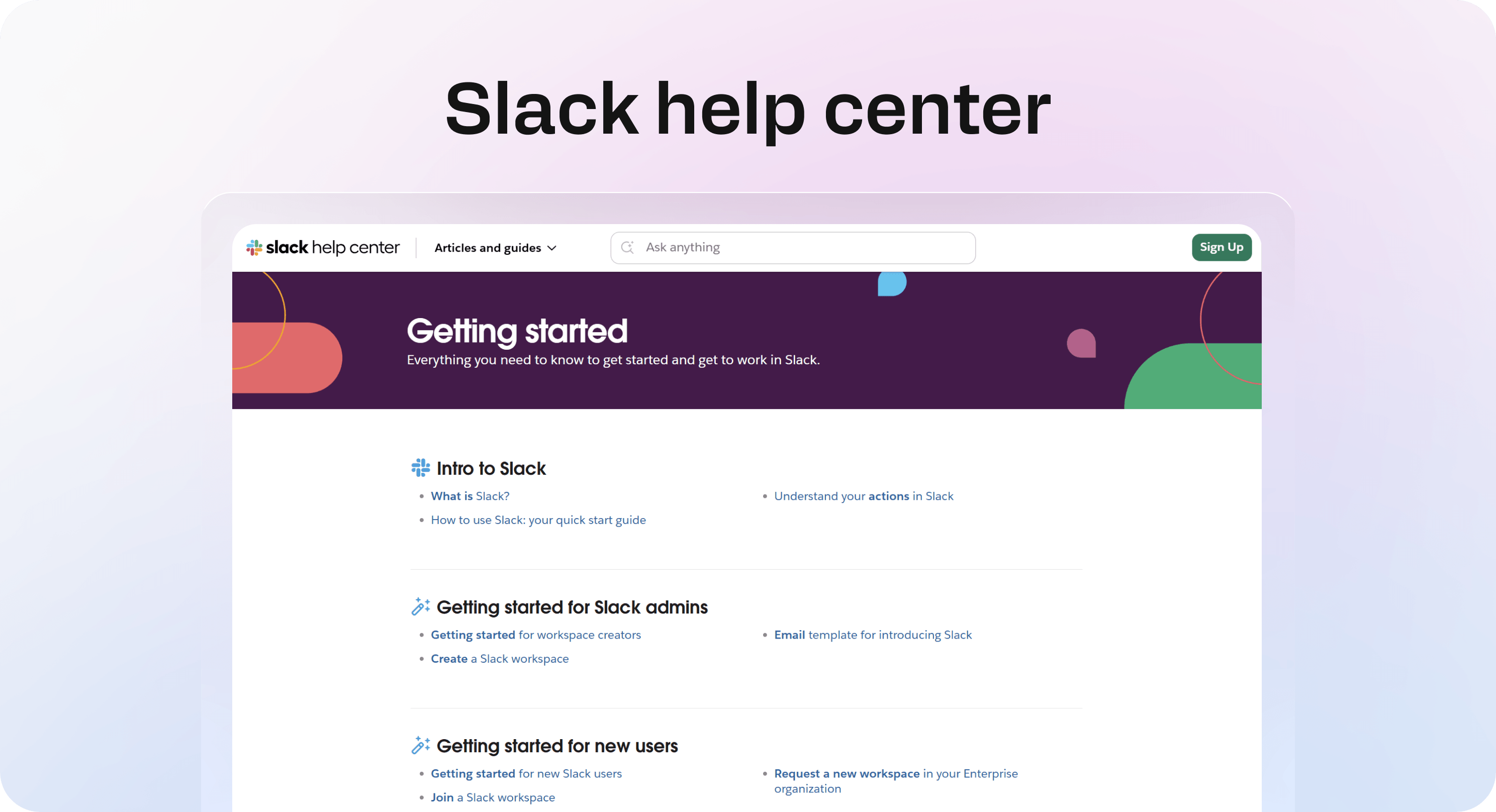
Slack’s help center is a strong example of documentation written for everyday tasks. Slack is a broad workplace product, but most help center visitors are not looking for a deep product theory. They want to adjust notifications, invite someone, manage channels, fix access, understand billing, or learn how a feature works.
That is why plain language matters. Good software documentation does not always need to sound technical. In many support situations, technical language slows the reader down. Slack’s documentation style is useful because it keeps the user’s immediate task close to the surface.
What Slack gets right:
article language is direct and user-friendly
support content is organized around common workplace tasks
everyday questions are not buried under technical terminology
the help experience feels approachable for non-technical users
support topics are written for speed and clarity
The lesson to borrow: write documentation in the language users already use. If customers say “notifications,” do not hide the answer under “communication preferences.”
Example 5: Shopify dev docs
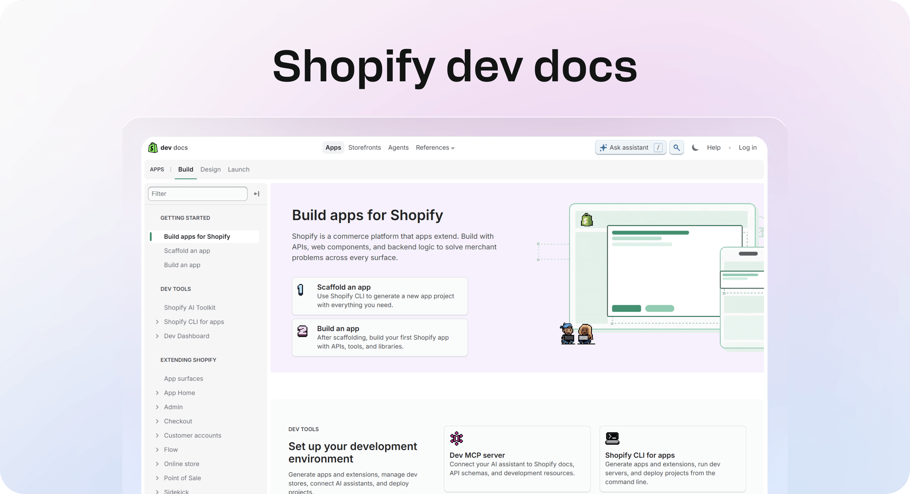
Shopify Dev Docs are useful because they separate different developer jobs clearly. Someone building an app, customizing a storefront, working with themes, or creating a custom shopping experience does not need the same first path.
The homepage makes those routes visible. It also frames the docs around where the developer is in the process: getting started, building, distributing, and monetizing. That is an important distinction for technical documentation examples. Developers need reference material, but they also need orientation. They need to know which path fits their project before they need every detail.
What Shopify gets right:
developer documentation is grouped by build path
apps, storefronts, themes, and agents have separate entry points
the homepage explains who each path is for
technical material is paired with project context
the docs support both early exploration and deeper implementation
The lesson to borrow: technical docs should help readers choose the right lane before sending them into detailed instructions. Otherwise, even accurate documentation can feel hard to start.
Example 6: Docker docs
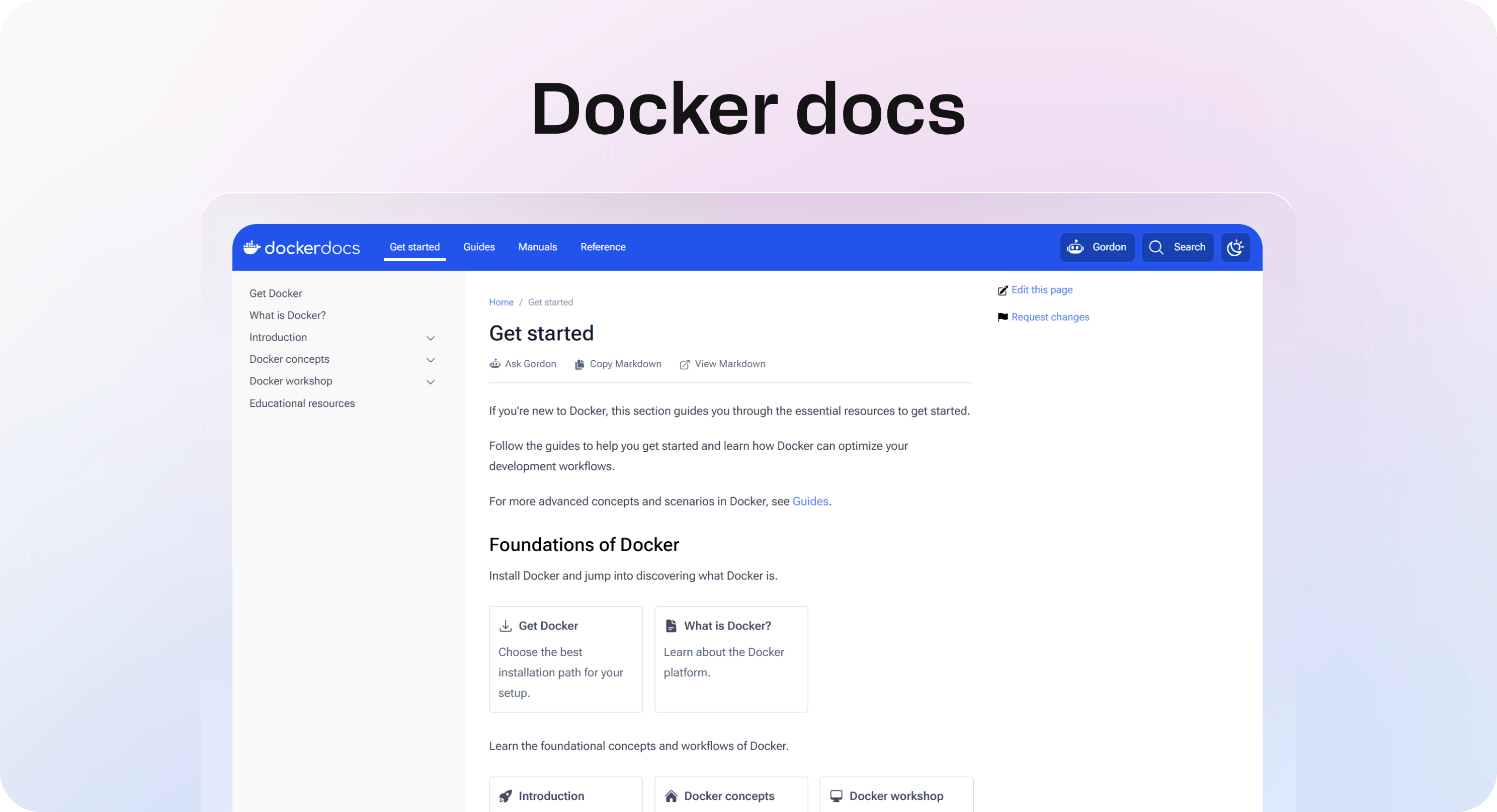
Docker documentation is a good example of separating learning paths from reference material. The homepage distinguishes between getting started, guides, manuals, and reference docs. That sounds simple, but it solves a common documentation problem: different readers need different levels of detail.
A new user may need concepts and a beginner path. A returning user may need a task-focused guide. An experienced user may need CLI, API, or file format reference. If all of those live in one undifferentiated list, everyone has to work harder.
What Docker gets right:
learning, guides, manuals, and reference material are separated
common questions are surfaced for quick discovery
core concepts are available for beginners
reference material remains findable for advanced users
the site supports both education and operations work
The lesson to borrow: do not force beginner guides, troubleshooting pages, and reference docs into the same format. The reader’s job should decide the page type.
Example 7: Cloudflare developer docs
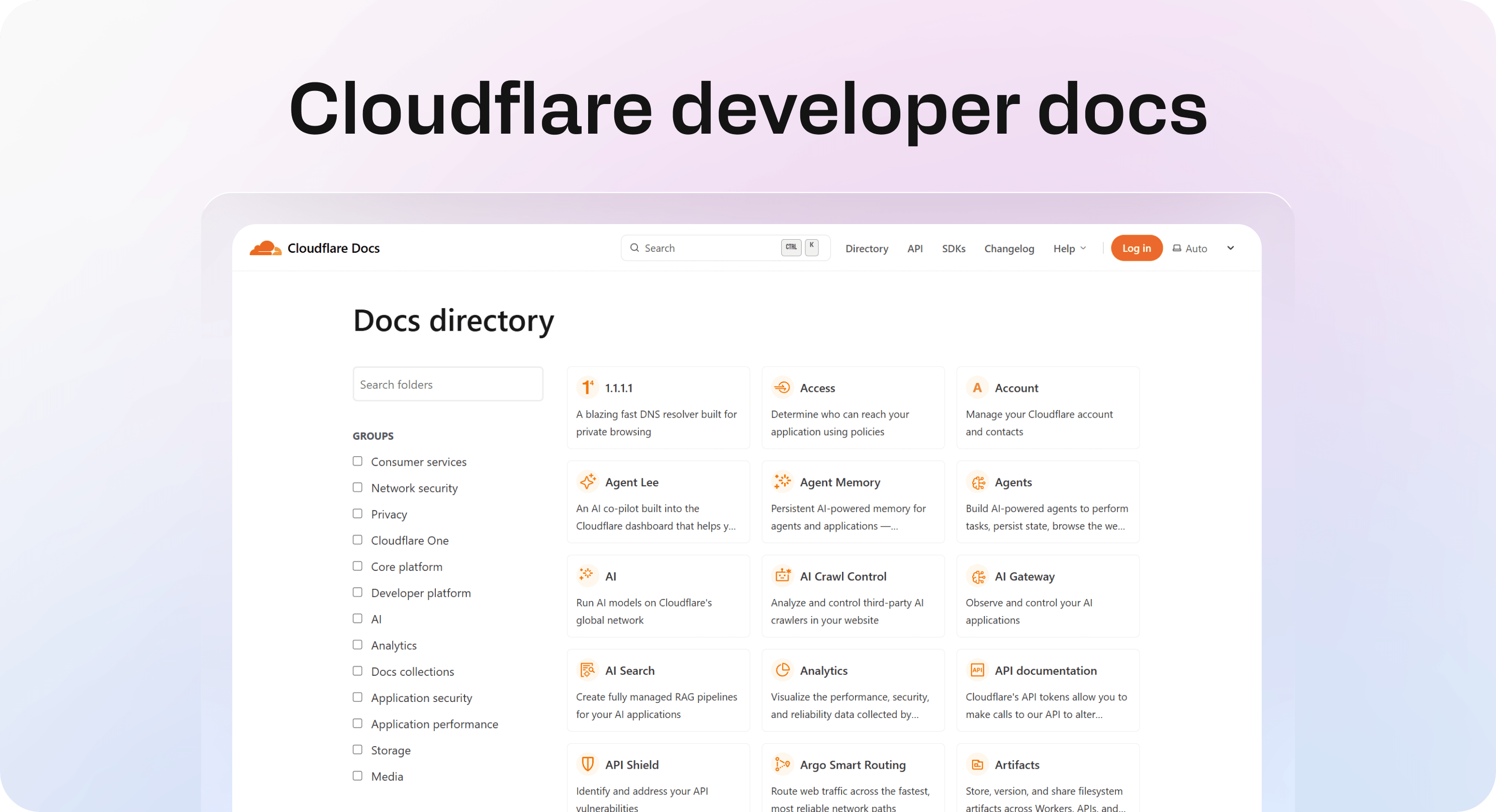
Cloudflare developer docs show how a very large documentation site can still work when the directory logic is explicit. Cloudflare has many products across security, performance, networking, analytics, developer platforms, storage, AI, and more. Without a strong directory, the site could easily feel impossible to browse.
The docs directory helps by grouping product areas and giving each section a short description. That makes the documentation website feel less like a search-only archive and more like a map.
What Cloudflare gets right:
large product documentation is organized into clear groups
each docs area has a short explanation
technical users can browse by product family
the site supports discovery when users do not know the exact page name
the structure makes a broad documentation library feel more manageable
The lesson to borrow: when your docs library gets large, the category page becomes part of the product experience. It should explain the map, not just list links.
The patterns these docs website examples share
The examples above look different, but the underlying patterns are surprisingly consistent. Good documentation websites are built around how people look for answers.
They offer more than one path into the same knowledge
Some users search. Some browse categories. Some start from a product area. Some start from a problem. Some need a tutorial. Some need reference documentation.
Strong docs sites account for this. Stripe uses use cases and products. GitHub uses product areas and developer references. Docker separates getting started, guides, manuals, and reference. Cloudflare uses a directory for a large product ecosystem.
Your own documentation does not need every path on day one. But it should have at least two reliable routes: search for users who know what they want, and clear categories for users who do not.
They do not treat every article as the same kind of page
A setup guide, troubleshooting article, API reference, billing explanation, and release note should not all use the same structure.
Good documentation websites use different formats for different reader jobs:
getting-started guides for first-time setup
how-to articles for repeat tasks
troubleshooting pages for symptoms and fixes
reference pages for exact technical details
concept pages for explaining how something works
policy pages for rules, billing, permissions, or limits
release notes for product changes
This is one of the easiest ways to improve website documentation examples inside your own team. Before writing more content, decide which article types you actually need.
They make category labels boring on purpose
Good docs navigation is not the place to be clever. Users are usually trying to solve something quickly. Familiar labels beat branded labels almost every time.
That is why strong documentation examples use direct labels like getting started, billing, authentication, repositories, apps, guides, reference, support, and account settings. These labels are not exciting, but they are useful.
If your docs categories sound like internal team names, campaign names, or product metaphors, users may not know where to click. Rename categories around the words readers already recognize.
They keep technical depth scannable
Technical documentation examples fail when accuracy comes at the cost of usability. A page can be correct and still hard to use.
The better pattern is layered depth:
Start with what the page helps the reader do.
Show the simplest path first.
Use headings to separate steps, concepts, warnings, and examples.
Put reference detail where advanced users expect it.
Link to deeper pages instead of overloading one article.
This helps both technical and non-technical readers. Beginners get a path. Advanced users get enough structure to jump to the exact detail they need.
They connect related questions
A documentation website should not make the reader restart after every article.
If someone reads about inviting a teammate, they may also need permissions, billing seats, roles, and workspace settings. If someone reads about API authentication, they may also need tokens, webhooks, rate limits, and error handling.
Related links are not decorative. They are part of the self-service flow. They help users move from one answer to the next without opening a ticket or guessing a new search term.
How to choose the right documentation model for your team
Studying docs website examples is useful only if it leads to better decisions for your own content. The right model depends on what your users need most.
If customers mostly ask support questions, start with a help center model. Use clear categories, search, troubleshooting articles, account help, billing content, and short how-to guides. Helpview’s guide to 7 best help center examples and what they get right is a good reference for this lane.
If your team needs a reusable answer library, start with a knowledge base model. Focus on repeated questions, article templates, ownership, and maintenance. Helpview’s guide to 7 best knowledge base examples to learn from covers that angle more directly.
If your product has developer workflows, integrations, APIs, SDKs, or technical setup, you need a technical documentation model. Separate getting started, tutorials, how-to guides, conceptual explanations, API reference, and troubleshooting.
If your documentation is public and customer-facing, you also need to think about safety and polish. Helpview’s article on external knowledge bases explains when public docs make sense and what should stay private.
A simple way to decide is to map your reader’s first question:
“How do I solve this problem?” → help center
“Where is the answer our team keeps repeating?” → knowledge base
“How do I build or integrate this?” → technical docs
“What changed?” → release notes
“What does this feature mean?” → product documentation
“What rule applies here?” → policy or billing docs
Most teams eventually need a blend. The mistake is blending everything without structure.
What to borrow when your docs live in Notion
Many teams start documentation in Notion because it is fast, familiar, and easy for the team to update. That is a good starting point. The problem is that raw Notion pages do not always feel like a polished documentation website for customers.
The examples above show what the public layer needs:
a clear homepage
searchable content
customer-friendly categories
consistent article formats
readable pages
related links
a branded experience
a structure that does not expose internal clutter
That does not mean you need to leave Notion. It means Notion should stay the writing layer, while the public documentation experience should be shaped for readers.
A Notion-based help center lets teams keep writing and maintaining docs in Notion, then publish them as a cleaner, searchable customer experience. It is useful when the team likes Notion internally but wants the public documentation to feel more structured and professional.
The practical workflow looks like this:
Audit your existing Notion docs.
Group pages by customer intent, not internal team structure.
Choose a small set of article formats.
Rewrite vague titles into task-based titles.
Add related links between likely next questions.
Publish the polished public layer through Helpview.
Review search terms, content gaps, and repeated tickets over time.
This lets you borrow the best parts of strong documentation websites without rebuilding your writing process from scratch.
Checklist: what good documentation websites get right
Use this checklist when reviewing your own docs site or planning a new one.
A good documentation website should answer yes to most of these questions:
Can a new visitor tell where to start within a few seconds?
Is search easy to find?
Are categories based on user intent instead of internal teams?
Are article titles specific enough to match real search terms?
Are getting-started, how-to, troubleshooting, and reference pages separated?
Do technical pages include examples or clear next steps?
Are long articles broken into useful headings?
Do articles link to the next likely question?
Is outdated or duplicate content easy to spot and fix?
Can non-technical users understand support content without internal context?
Can technical users find reference details without reading beginner material first?
Does the site feel like a maintained product experience, not a document dump?
If several answers are no, the fix is usually not “write more docs.” It is structure. Improve the path to the answers you already have before adding another batch of articles.
Build a documentation website that helps people move
The best documentation website examples are not useful because they give you a layout to copy. They are useful because they show how good docs behave.
They give users a clear starting point. They separate different kinds of content. They use plain category labels. They keep dense information scannable. They connect related questions. And they make the documentation feel like part of the product experience, not an afterthought.
If your team already writes in Notion, you may not need a heavier authoring workflow. You may need a better public layer: one that turns scattered Notion docs into a structured documentation website customers can search, browse, and trust.
That is the real lesson from strong documentation examples. Good docs do not just contain answers. They help people move from question to outcome.
Frequently asked questions
What are good documentation website examples?
Good documentation website examples include Stripe docs, GitHub Docs, Notion’s help center, Slack’s help center, Shopify Dev Docs, Docker documentation, and Cloudflare developer docs. Each one shows a different useful pattern, from technical quickstarts and API reference to plain-language help content and large-scale docs navigation.
What should a documentation website include?
What is the difference between documentation examples and help center examples?
What are technical documentation examples?
What are software documentation examples?
Share article:

2 free months of Pro
Turn Notion pages into help center answers.
Keep writing in Notion and publish a real, searchable Notion help center.

Articles
Keep reading